By Stuart Jones - Thursday, May 4, 2023
Hello,
I was wondering if it is possible to produce a plot, with Nevron, similar to this:
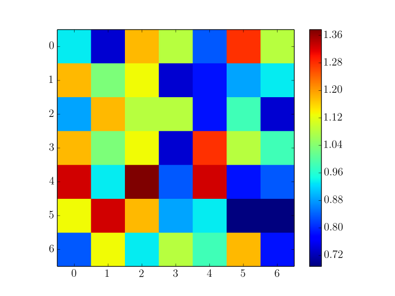
The labels on the x and y axes will refer to the indices of entries of a matrix. The matrix contains values that are represented as the square blocks of colour (discretely) with a corresponding colour bar. Each axis label should be displayed from the midpoint (not corners) of the block edges, as shown in the above picture. Being able to reverse the ordering on the y-axis would be ideal too.
Any help is much appreciated.
Best regards,
Connor Rourke
(Software Engineer at SMT)
(Sent from my colleague's account since your Register button is not currently working, at least from our end.)
|
By Nevron Support - Thursday, May 25, 2023
Hi Stuart,
Yes you can easily produce this plot. There are two options:
1. You can use the Heat Map series (check out "Chart gallery \ Heat map" examples).
2. You can use a NRangeSeries by adding ranges that correspond to each square in the heat map grid (check out "Chart gallery \ Range" examples).
We hope this helps - let us know if you meet any problems or have any questions.
|
|