Nevron Logo

High-Low Chart

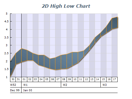
High-Low charts are a powerful data visualization tool used to represent changes in data over time. This chart type is particularly effective for displaying high and low data, such as stock prices or weather conditions. High-Low charts use a vertical line to represent the range of high and low values over a specific time, with optional additional information such as the opening and closing prices. This chart type is easy to read and interpret, allowing users to quickly gain insights into complex data sets. When used correctly, High-Low charts can be an essential tool for decision-making in various fields, from finance to meteorology.

Sample Table Format

DateHighLowOpeningClosing
2022-01-01100.287.395.195.5
2022-01-0298.589.793.291.1
2022-01-03104.691.293.4104.2
2022-01-04110.196.598.5107.3
2022-01-05115.1104.1106.2110.2

Each row in this sample table represents a specific date, with columns for that day's high and low values and the opening and closing values (optional). This format allows for easy input of data and the creation of a High-Low chart to visualize trends and changes over time.

Best practices for using high-low charts

  • Choose the appropriate data: High-Low charts are most effective when used with data ranging from high to low values, such as stock prices or weather conditions. Ensure that the data you are using is suitable for this chart type.
  • Use clear labeling: Make sure to label each axis clearly and concisely to help users understand the displayed data. This includes marking the x-axis (usually time) and the y-axis (usually values).
  • Use consistent scaling: Ensure that the scaling on the x and y axes is constant, so users can easily compare data points over time.
  • Use color coding or shading: Consider using color coding or shading to help users differentiate between different data sets or to highlight specific trends or changes over time.
  • Include relevant information: Additional information such as opening and closing prices or other data points may be useful depending on the data displayed.
  • Keep it simple: High-Low charts can quickly become cluttered and difficult to read if too much information is included. Focus on displaying the most important data points and trends, and avoid including unnecessary details.