When it comes to developing enterprise level, visually stunning and immersive WPF applications, the NOV UI Framework will do the job right.
NOV comes with WPF Example Solution including hundreds of examples with source code. It will help with your WPF application development, whether you are working on a new or extending an existing WPF project - you can integrate NOV WPF UI Controls to existing WPF application.
The NOV Framework will not only help with your WPF application development, it will also allow you to start with your cross-platform .NET development and target multiple platforms and devices.
That is correct - when you start developing with NOV, you will be able to build cross-platform applications and User Interfaces using single code base.
Currently NOV includes the following UI Widgets for WPF:

Backgrounds

Borders

Clipboard

Cursor

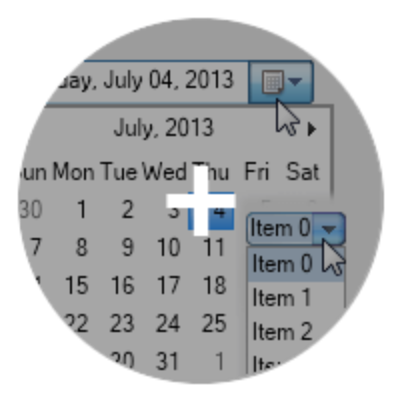
Date Time Box

Dock Panel

Document Box

Drag And Drop

File Dialogs

Flow Panel

Group Box

Image Box

Label Box

Layout Panels

List Box

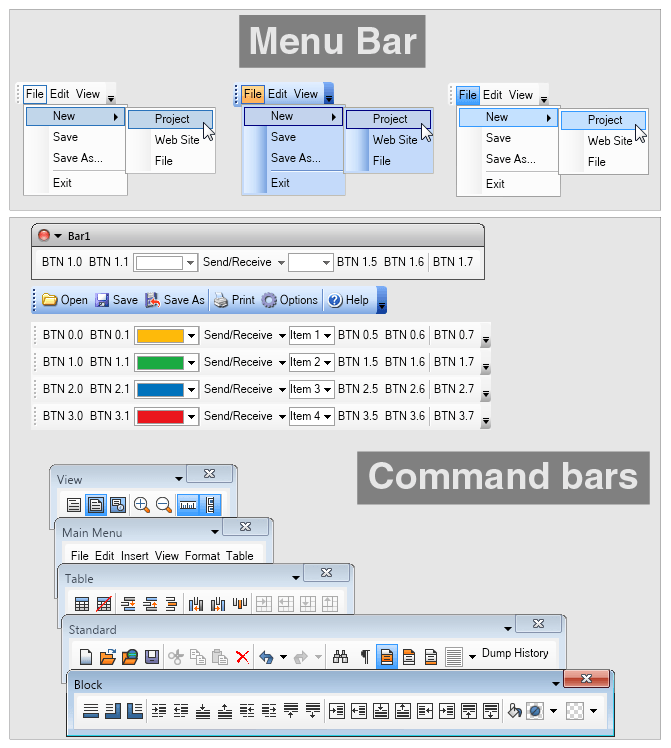
Menu Bar

Message Box

Meta Image Box

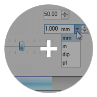
Numeric Up Down

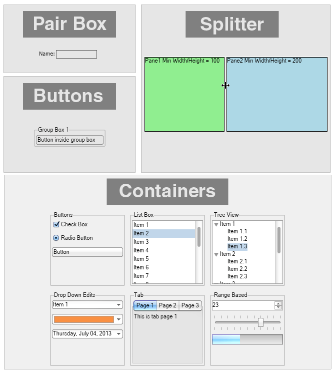
Pair Box

Print Dialog

Progress Bar

Radio Button

Range Slider

Scroll Content

Split Buttons

Splitter

Stack Panel

Symbols

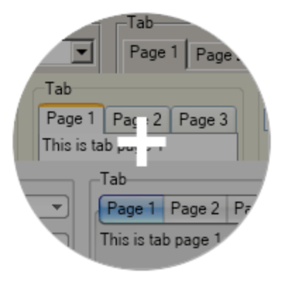
Tab

Table Panel

Text Box

Tool Bar

Tooltip

Tree View

User Panels

Windows
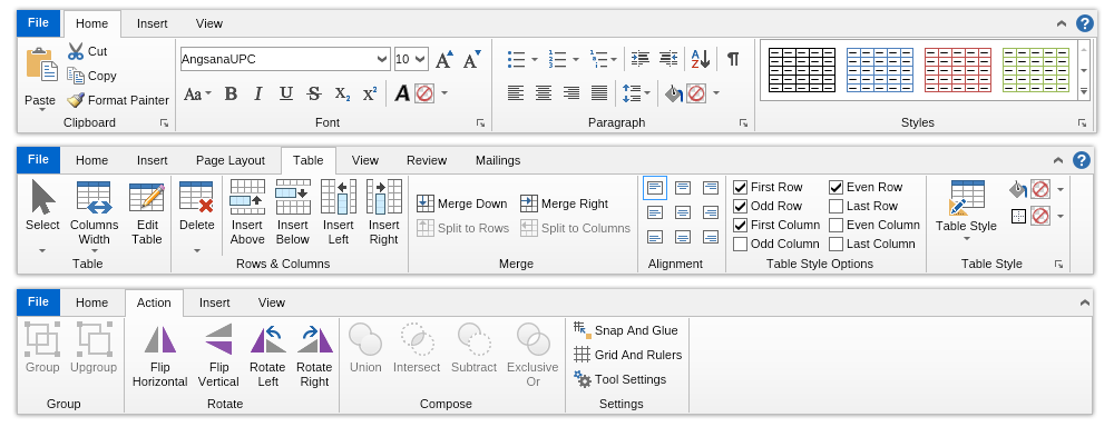
The WPF Ribbon is a widget that lets developers easily enrich their WPF applications with Microsoft Office-like Ribbon UI. NOV WPF Ribbon is fully customizable and scales its child widgets automatically based on the available area. The resizing of the Ribbon is fully customizable as well.
The WPF Ribbon consists of the following main elements:
- Application Menu
- Ribbon Tab
- Collapse Button
- Additional Content
- Ribbon Group
- Dialog Launcher
- Ribbon Wrap Flow Panel
- Ribbon Stack Panel
- Ribbon Button
- Ribbon Split Button
- Ribbon Menu
- Ribbon Gallery
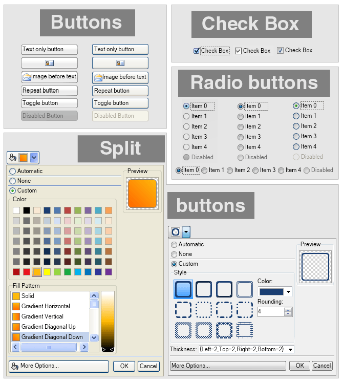
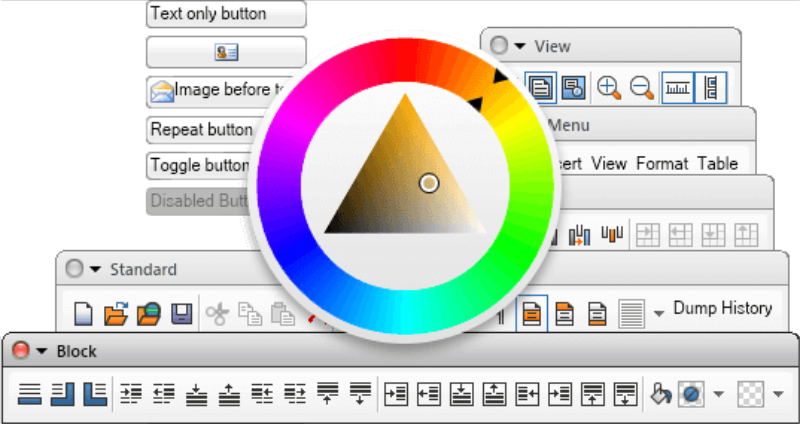
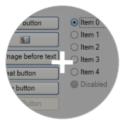
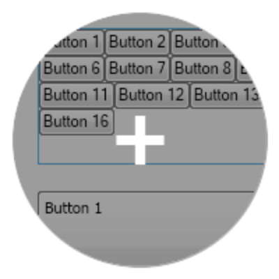
The WPF Buttons are widgets, which are typically used to perform a certain action, when clicked. NOV features a complete set of buttons that can contain arbitrary content (i.e. other widgets). Main types of buttons include:
- Standard buttons
- Repeat buttons
- Toggle buttons
- Check boxes
- Radio buttons
- Split buttons
- Other buttons
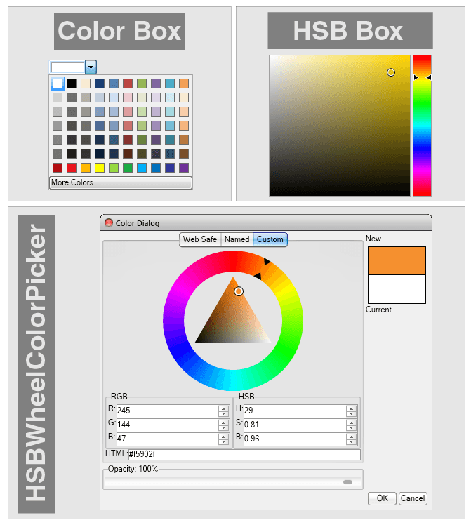
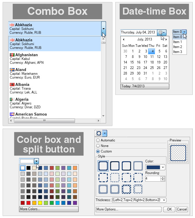
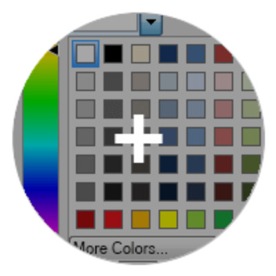
The WPF Color pickers are widgets that allow the user to pick a color by modifying one or all of its color components through a visual interface.
- Palette Color Picker
- Luminance Color Bar
- Hue Color Bar
- Saturation-Brightness Color Box
- HSB Box Color Picker
- HSB Wheel Color Picker
- Color Box
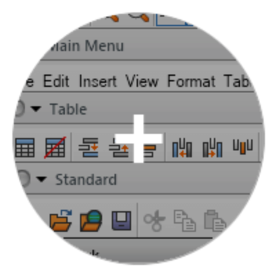
NOV implements advanced WPF command bars that mimic the commanding logic of Microsoft Office 2003, Visual Studio etc. NOV WPF command bars can contain any other widget, and have support for many advanced features. Specific subtypes of commands bars include:
- Menu Bar
- Tool Bar
- Status Bar
The WPF Container widgets are used to contain other widgets and provide different adorner features to their content.
- Group Box
- Pair Box
- Uni Size Box
- Splitter
- Tab
- Document Box
- Scroll Content
- And many other...
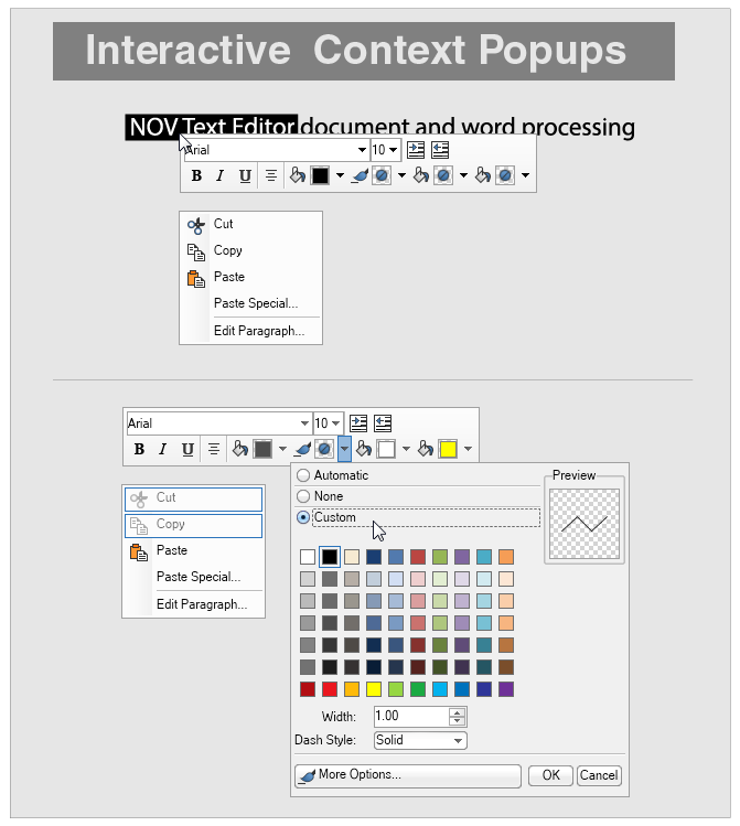
The WPF context popups are Popup Windows opened that are opened in a context fashion. Context popups are usually used for:
- Context Menus
- Custom Context Popups
The WPF drop down edits consist of a specific editing area and a drop down button located at the right side. When the drop down button is clicked the drop down edit opens popup window, which assists the user with the editing. Notable drop-down edits are:
- Combo Box
- Date Time Box
- Color Box
- Split Buttons
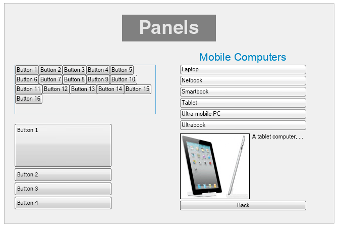
The WPF layout panels are used to arrange content. The layout panels included in NOV have unique features that are a product of our long term dedication to automatic layouts.
- Panel
- Single Visible Panel
- Dock Panel
- Stack Panel
- Wrap Flow Panel
- Table Flow Panel
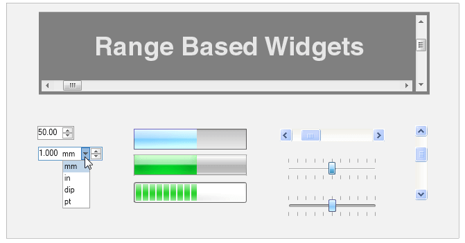
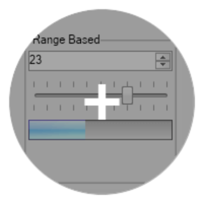
The WPF range based widgets are widgets, which display a range and a current value. Notable range based widgets are:
- Scrollbars
- Slider
- Numeric Up Down
- Progress Bar
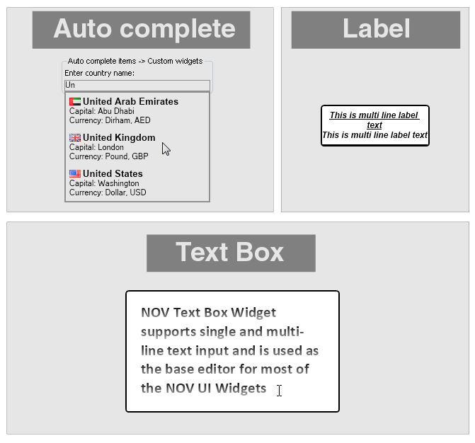
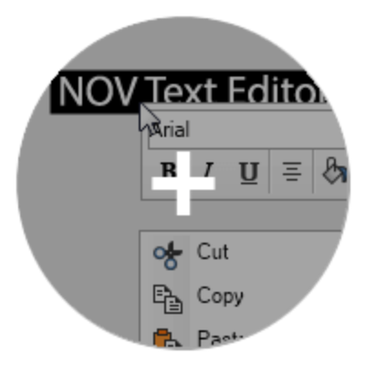
The NOV WPF Label and WPF Text Box widgets allow for the visualization and editing of Unicode text. They are based on our proprietary managed Typography and as such are the only Label and Text Box in the .NET world that can guarantee you 100% identical text quality and speed in all environments.
- Label
- Text Box
- Auto Complete Text Box
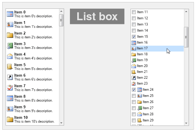
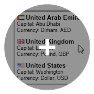
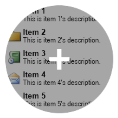
The WPF List Box is used to present the user with a list of items he can choose from. The items of the NOV WPF List Box can be any other widgets. Supported are single and multiple selection modes.
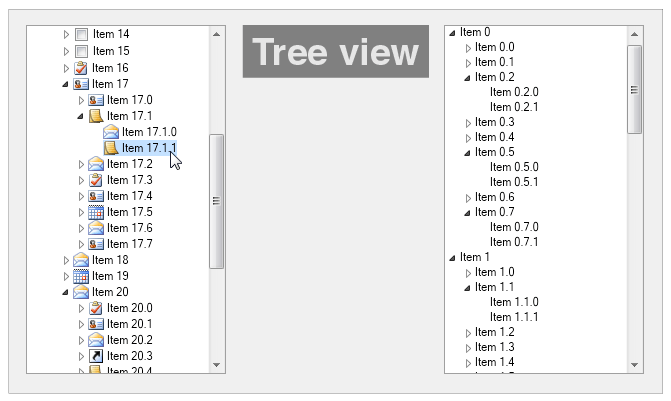
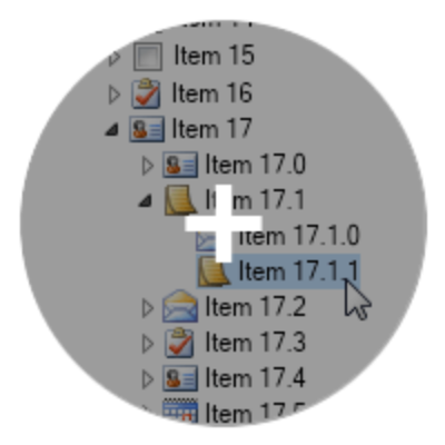
The WPF Tree View is used to visualize a tree hierarchy. Users can navigate the hierarchy visually by expanding and collapsing certain tree branches. The items of the NOV WPF Tree View can be any other widgets.
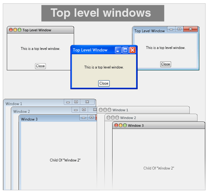
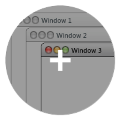
The WPF top level windows are windows that are opened on top of other windows in the specific presentation layer windows stack. The Top Level Windows of NOV UI for WPF are virtualized. The NOV WPF Top Level Windows feature full control over the window frame and title bar, and can be opened in modal fashion. Top level windows are usually used for:
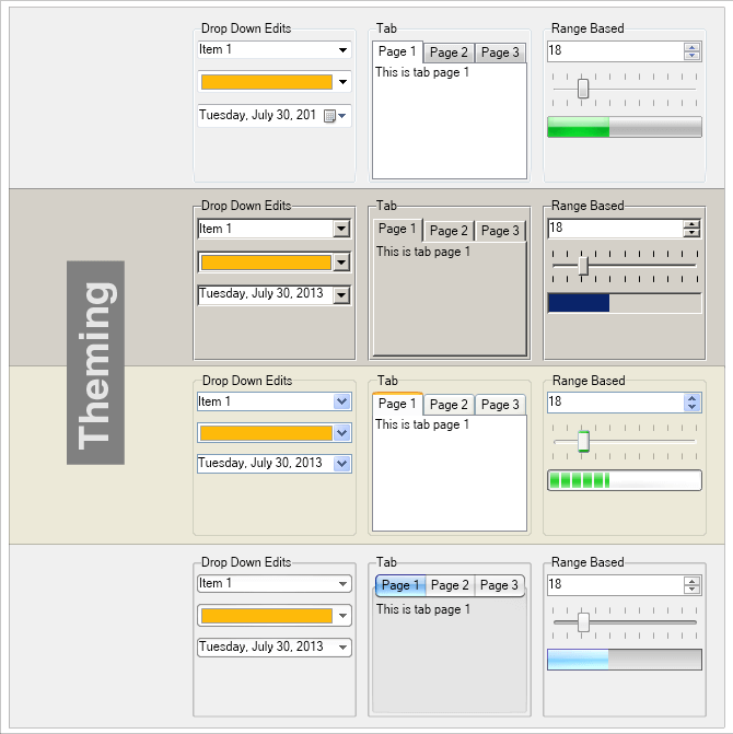
NOV WPF widgets are styled with CSS. NOV initially comes with the following themes:
- Windows 8
- Windows 7
- Windows XP Blue
- Windows Classic (with all color scheme variations)
- macOS Lion
- macOS El Capitan
- Nevron Dark
- Nevron Light
Miscellaneous WPF UI features that apply to all types of widgets include:
- Borders – an implementation of the W3C borders specification, with many additional enhancements.
- Commanding – an extensive framework for implementing diverse commanding logic in Enterprise applications.
- Tooltips – virtualized support for tooltips with many advanced features.
- Cursors – virtualized support for cursors.
- Clipboard – virtualized support for clipboard.
- Drag and Drop– virtualized support for drag and drop.
 Open Vision for .NET
 NOV Chart for .NET
 NOV Diagram for .NET
 NOV Rich Text Editor for .NET
 NOV Grid for .NET
 NOV Schedule for .NET
 NOV Gauge for .NET
 NOV Barcode for .NET
 NOV User Interface for .NET
 Vision for .NET
 Chart for .NET
 Diagram for .NET
 User Interface for .NET
 Vision for SSRS
 Chart for SSRS
 Gauge for SSRS
 Map for SSRS
 Barcode for SSRS
 Vision for SharePoint
 Chart for SharePoint
 Gauge for SharePoint
 Map for SharePoint
 Barcode for SharePoint