ProductsAll Products
.NET Components
DownloadsAll Downloads
For example: while the default chart report item can display clustered bars, you cannot control the gap between the clusters, nor can you create cluster-stack combinations.
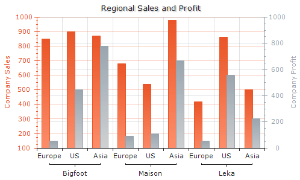
As a total, Nevron supports 174 charting types by counting only the Chart Type/Subtype and availability in 2D/3D combinations - which is an unrivaled industry record.
This number does not include the shape combinations available. For example, the default report item considers Cylinders Columns as a different subtype of the Column chart type - in fact it can display columns only as bars and cylinders. Compare this to the 9 shapes with which you can display columns in Nevron Chart for SSRS.
Also not counted are the possible horizontal charting types that you can author - other currently available charting report items are using different charting types to display either left-to-right or right-to-left horizontal bars. In Nevron Chart any 2D/3D chart can be converted to a horizontal chart in either direction - this includes combo charts too. You should also consider the charts that you can author by creating combo charting types - which in Nevron Chart for SSRS are limitless.
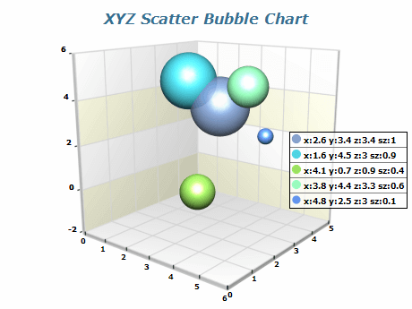
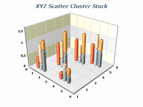
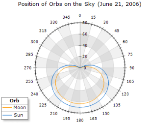
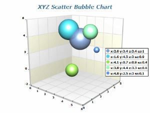
Nevron Chart for SSRS stands in a class of its own when it comes to XY and XYZ scatters of any type and 3D charting.
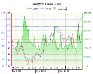

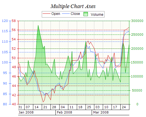
The axes of Nevron Chart can scale all types of axis data - ordinal, hierarchical, numeric, logarithmic, and have the industry-leading support for date-time scales - including value and range timelines scales that are largely used in financial and project management charting. Scaling all types of data is not enough - for each of these distinct types of scales Nevron Chart for SSRS provides advanced and unique options for further tuning. For example: Even though the default chart in SSRS can display hierarchical categorical scale it only supports this in bracket mode - Nevron Chart for SSRS supports three distinct modes for display of such scales with options to control different aspects of the category hierarchy annotation.
Besides scaling, axes have the important role of helping you visually understand the data. Nevron Chart for SSRS supports advanced options for section highlighting, which help you split the axes in visually distinct ranges. Other annotation options include constant lines, stripes, gridlines etc. - all implemented with a wealth of settings. Many of the visual decoration settings are not available in the default chart for SSRS and are generally unique within the industry.
Another important aspect of the visual perception of data is being able to compare it visually. However, when the data is clustered in distant data ranges (for example: half the data points are around 100 and the other half are around 1,000,000) you cannot compare it visually - all small bars will look the same. For the purpose of cases like this, Nevron Chart implements advanced support for manual and automatic scale breaks. Scale breaks are not available in the default chart for SSRS. Chart report items from other vendors that support scale breaks do so only for Y axes in 2D - they do not support scale breaks in 3D, nor do they support axis scale breaks crossing (for example scale breaks that are applied to the X and Y axes of an XY scatter).
Axis positioning is also not left behind. In Nevron Chart for SSRS Cartesian axes can be crossed, docked to chart sides or displayed one above the other. No other report item provides such flexibility in axis positioning - for example many report items can cross the axes at value or percent along another axis, but cannot be docked to the same side (try making the Secondary Y axis appear on the left side docked next to the Primary Y axis - again only Nevron can do this). Another unique feature in axis positioning is the ability to display axes one above the other - for example the Primary Y axis can occupy the bottom part of the chart, while the Secondary Y occupies the top).
To pile the heap of axis features, Nevron Chart for SSRS implements great support for automatic labels arrangement, label value formatting and support for XML formatted titles (see below) that can be aligned and rotated at will. All axis labeling features are crafted to blend with the chart layout - labels and/or chart will grow/shrink to fit perfectly in the available chart area - whatever the data.

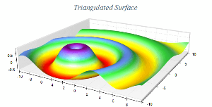

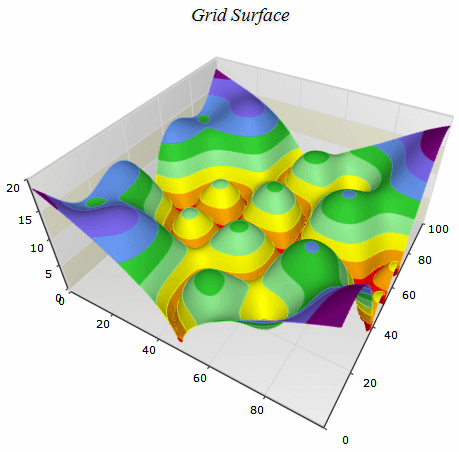
Nevron is one of few companies that make True 3D charting, and implements it with superb quality and a rich set of features. Most of the other charting engines available today are the so-called 2D-Half engines, which generally use 2D technologies to render 3D charts with smart painting tricks like back-to-front rendering, etc. For example, the default chart for SSRS uses a 2D-Half engine for 3D charting.
All 2D-Half engines, however, remain restricted in the following aspects of 3D charting:Using a 3D engine such as OpenGL is not enough to make quality 3D charting. This is why Nevron spared no efforts to implement lots of shapes (for bars, pies, points etc.), enforce perfect chart layout in 3D, ensure that 2D and 3D features behave consistently, and increase the readability of 3D charts in general.
If you need quality 3D charting - look no further.
Besides implementing all chart related features required to produce quality charts in 2D, Nevron Chart for SSRS adds the industry unique support for image filter effects - bevel and emboss, glow, lighting etc. Simply put, no other charting engine can produce charts with better looks.
Image filters help you create pixel perfect charts, only comparable to charts that professional designers can produce with Adobe Photoshop after countless hours of work.
In Nevron Chart for SSRS image filters can be applied to all chart elements including texts in 2D and to all texts in 3D. Image filters are also used internally in shadows and that is why Nevron Chart for SSRS is the only chart that can display soft shadows with pixel perfect quality.
The forward/backward compatibility ensures chart design reuse not only when migrating from one edition of SSRS to another, but also when sharing chart designs between departments possibly using different versions of reporting services.
The state generated by the VS2005 and VS2008 report items is compatible, meaning you can easily convert reports generated with different versions of Visual Studio. The embedded styling support allows you to quickly apply color palettes in order to change the appearance of the chart contents. In addition, you can create your own, custom set of palettes to further accelerate the authoring of company branded charts.
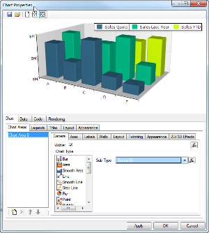
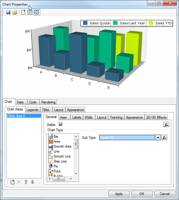
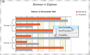
We spared no effort in making the Chart Designer truly improve your report authoring experience. That is why we had to make it multithreaded. You may have noticed that other chart report items for SSRS are edited very slowly and not all changes that you make are instantly previewed. A common limitation of single threaded chart designers (currently all others) is that you cannot make instantly previewed changes very quickly. This is because a single threaded designer will block your UI on preview update and leave it unresponsive. The Nevron Chart Designer is multithreaded - the more cores you have finally matter - it loads blazingly fast and chart customization becomes a real pleasure.
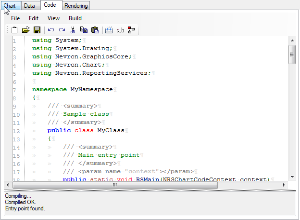
Although Nevron Chart for SSRS already exposes a vast amount of settings, the Nevron Chart engine beneath it has even more. If you cannot do something with the settings already exposed - ask us - it may be doable with code.
This is a truly great and rare feature that helps you standardize on Nevron Charting technology at all levels in your company - from developers to IT professionals.
XML formatted texts use a format similar to HTML, which lets you mix fonts, subscript and superscript, bold, italic, underline formatting and - as you would expect from Nevron - advanced features like different fill styles, borders, shadows, image filters etc. – all inside a single label, title etc.
This helps you display certain mathematical formulas, which would otherwise not be possible. It also helps you replicate nicely titled charts that you can otherwise only see in print magazines (by the way, many print magazines already use Nevron Chart for .NET).
The documentation of Nevron Chart for SSRS is also very thorough, complete and straight forward.