| | A complete and unrivaled set of charting types with many customization options is implemented to ensure that you have a superior set of data visualization methods "out of the box."
Support for standard bar & column chart, clustered bar/column, stacked bar/column, as well as clustered-stacked bar/column chart with numerous customization options. | | A standard line chart, stacked line chart, step line & smooth line with multiple customization options. | | Support for standard area chart, scatter area, stacked area & stacked percent area chart with highly customizable looks. | | Standard 2D pie chart with multiple customization options, including specifying begin and sweep angle. | | Doughnut pie chart (also spelled donut) - a variant of the pie chart, with a blank center allowing for several pie series to be visualized. | | NOV point and XY scatter point series support several point shapes, including rectangle, triangle, inverted triangle, ellipse, cross, diagonal cross, etc., plus lots of styling options. | | Bubbles can be visualized as a rectangle, triangle, inverted triangle, ellipse, cross, diagonal cross, etc. Standard and XY scatter modes are supported. | | Stick and candle styles are supported. Open High Low and Close High Low chart subtypes are also supported. XY Scatter mode (date-time stocks). | | Polar line, point, area, range, and vector types. | | Box and whiskers plots are very helpful in interpreting the distribution of data. Each box and whiskers item represents a set of values and displays statistical information for it like minimum, maximum and median values, upper and lower quartiles, outliers, and optionally a mean value. | | NOV vector charts display arrows in 2D space. A vector data item is defined by two points (begin - end) and is represented by a single arrow. An arrowhead is placed at the endpoint to indicate the vector direction. | | Supports the display of 2D shapes defined by the begin/end values of their bounding boxes. It can be used for the display of histograms, bars with custom sizes, etc. | | Combo Charts are used to combine certain series types within the same chart area. Series types are specified per values data groupings. There are many per series type options. | | Tree maps display hierarchical (tree-structured) data as a set of nested rectangles. Tree maps allow you to easily see patterns that would be difficult to spot in other ways, such as if a certain node value changes by a large amount or the relative node value vs. the other node values. The second advantage of tree maps is that, by construction, they make efficient use of space. As a result, they can legibly display a large number of items simultaneously on the screen. | | A Heat Map is a 2D representation of data where the individual values are contained in a matrix and are represented as colors, which are taken from an associated palette. | | High low area with built-in appearance logic. Supports markers. XY scatter mode is also supported (date-time range chart). |
|
NOV Chart for .NET provides a complete set of axis-related features designed to target even the most compelling charting requirements. The axes are largely automated, allowing you to focus on your project and be able to customize every aspect of the appearance and behavior of the axis if needed. Following is a short list of the axis-related features of the component:
| | Supports an unlimited number of X and Y Axes. You can specify the X and Y axis on which each chart series is scaled. Advanced settings allow you to make use of axis crossings, docking, and percent positioning. | | The axes of the component can be docked to the chart sides (or polar rim) or crossed at value with some other axis. In addition, axes can share parts of the chart plot. | | The special options for Polar axes include advanced settings for Polar axes position and annotation. | | | | Allows you to display ordinal (categorical) data. | | Allows you to display any data in numeric format (profit, sales, percentages, etc.) | | General date time scale suitable for the display of date time data. | | The Value Timeline Scale is an advanced date-time scale most commonly used in financial charts. | | Advanced date-time scale is most commonly used in financial and project management charts.
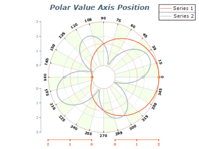
 | | Allows you to display angular data in degrees and grads (used in polar charts). | | 
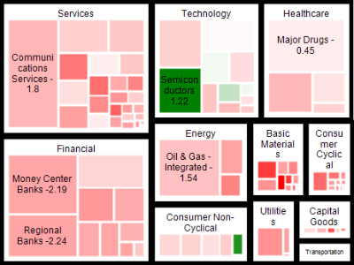
The Hierarchical scale allows you to display grouped categorical data. | | | | The Title functionalities of the component provide control over the chart axis title text, appearance, position, and angle. | | Control over the begin/end ruler caps as well as the option to highlight scale breaks on the ruler. | | Control over the range displayed by the axis. Ability to inflate that range in several modes. | | Control over the major and minor gridline's appearance. | | Ticks are usually represented as lines and can appear on both sides of the scale ruler. In NOV scales, define two types of ticks – major and minor. The Ticks functionalities of the component provide control over the appearance and position of the minor and major ticks on the chart axis. | | Ability to highlight repeating ranges of data on the chart walls, with controllable show/hide pattern. | | Ability to conditionally modify the appearance of axis decorations (tick, gridlines, and labels) if they fall in a specified range. This feature allows you to highlight important ranges of data on the axis. | | Ability to show constant (reference) lines at specified value. Const lines are lines displayed at axis values and are usually used to display some chart-specific limit or targeted value. | | Scale Breaks skip a range of values on the axis to increase the readability of the chart. NOV Chart for .NET provides support for manual and automatic scale breaks with full control over appearance and behavior. X and Y scale breaks can be crossed. | | Ability to control how the axis must resolve label overlapping and layout options. | | Ability to control the label formatting on numeric scales - including many advanced options for currency, percentage, scientific, and date-time label formatting. |
Data point labels of Cartesian, Polar, and Radar charts can be automatically re-arranged in order to avoid overlaps and ensure maximum visibility for the chart elements. | | The Legend functionalities of the component include lots of predefined styles, positions, and data layout strategies. | | Advanced chart margins and fit strategy control. | | Making a chart-type combination chart has never been easier and more flexible. | | Charts can be described in one or more legends. Legends can describe multiple charts. | | Headers, footers as well as custom positioned labels. | | The Interactivity functionalities of the component include tools like Data Zoom, Data Pan, Tooltip, Mouse Cursor, and others. | | Support for hit testing the control in order to get the chart element under a specified position. | | The control supports serialization/deserialization of its state to a file or stream. | | The control supports image export in the following formats: BMP, JPEG, PNG, and PDF. |
|