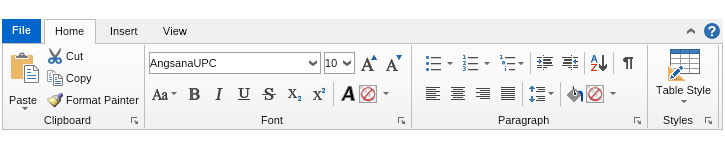
The NOV Ribbon for WPF is a control for implementing Ribbon command interface, similar to the Microsoft Office "ribbon" user interface, in your WPF applications. The Ribbon is fully customizable and scales its child widgets automatically based on the available area. The resizing of the Ribbon is fully customizable, too.
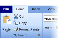
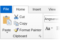
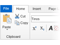
The NOV WPF Ribbon consists of the following main elements:
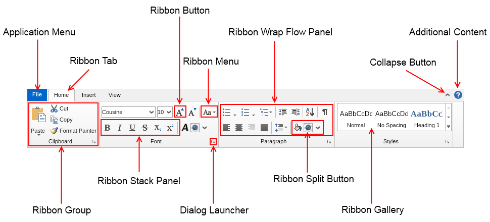
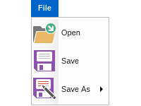
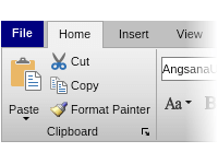
- Application Menu - contains application specific menu options and buttons, equivalent to the File menu in traditional menu based UIs.
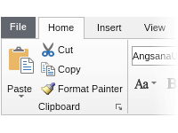
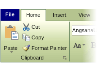
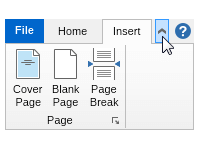
- Ribbon Tab - the main part of a ribbon. Contains the tab pages of the ribbon, the application menu, the ribbon collapse button and the top right content of the ribbon.
- Collapse Button - a button that can be used to collapse/expand the ribbon widgets. When the ribbon is collapsed, the content of its tab pages is not visible.
- Additional Content - the content next to the collapse button. This most commonly is a help button, but can be any widget.
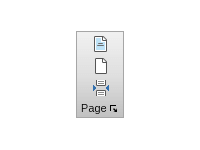
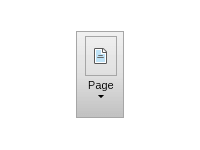
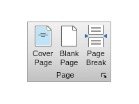
- Ribbon Group - the main building block of a ribbon tab page. The ribbon group is the container in which ribbon buttons, menus, split buttons, galleries, combo boxes and other widgets are placed.
- Dialog Launcher - a button in the header of a ribbon group, which when clicked opens a dialog window that contains additional information and settings related to the ribbon group.
- Ribbon Wrap Flow Panel - places widgets on two or three lanes.
- Ribbon Stack Panel - groups several widgets together. This panel is typically used in a ribbon wrap flow panel in order to prevent a set of widgets to break on several lanes.
- Ribbon Button - extends the regular buttons with support for ribbon widget states and large and small images.
- Ribbon Split Button - extends the regular split buttons with support for ribbon widget states and large and small images.
- Ribbon Menu - extends the regular drop down menus with support for ribbon widget states and large and small images.
- Ribbon Gallery - represents a scrollable list of items, each of which shows visually the result of clicking it.
 Open Vision for .NET
 NOV Chart for .NET
 NOV Diagram for .NET
 NOV Rich Text Editor for .NET
 NOV Grid for .NET
 NOV Schedule for .NET
 NOV Gauge for .NET
 NOV Barcode for .NET
 NOV User Interface for .NET
 Vision for .NET
 Chart for .NET
 Diagram for .NET
 User Interface for .NET
 Vision for SSRS
 Chart for SSRS
 Gauge for SSRS
 Map for SSRS
 Barcode for SSRS
 Vision for SharePoint
 Chart for SharePoint
 Gauge for SharePoint
 Map for SharePoint
 Barcode for SharePoint