Nevron Logo

NOV WPF Slider Control
WPF UI component that allows users to select a distinct value in a given range.

Nov Slider Control

The NOV Slider Control is a range based widget, which display a range and a current value. The range is defined by the Minimum and the Maximum properties of the range based widget, and the current value is stored in the Value property.


WPF Slider Control Features

Horizontal and Vertical Orientation

Nov H V Slider small

The NOV Slider control supports both horizontal and vertical orientations.

Set Min and Max Values

Nov Slider min max

Control the minimum and maximum values of the slider.

Controllable Ticks

Nov Slider tick control

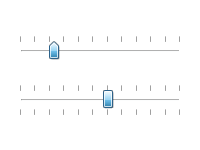
The Slider control provides the ability to control Tick Length, Tick Interval, Ticks Stroke, Tick Placement.

Built-in Themes

Nov Slider themes

NOV Slider widget is styled with CSS. NOV initially comes with the following themes: Windows 8, Windows 7, Windows XP Blue, Windows Classic (with all color scheme variations) and Mac Lion.

Customer Quotes:

QUOTE I really like the fact that standard windows icons are provided with the NOV Ribbon example, avoiding the need to recreate the wheel and giving a more professional appearance. Using the provided Visual Studio NOV solution, it is fairly straightforward to add custom icons with a few extra simple steps. The gallery of C# examples for all controls makes it easy to create custom layouts. For the handful of customizations I could not find in the examples or user forums, the tech support responses got me going within a day. UNQUOTE
Jay Wilson
K2realm, LLC