ProductsAll Products
.NET Components
DownloadsAll Downloads
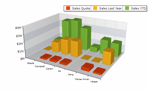
Nevron Chart for SharePoint is an advanced web part that delivers a complete and unmatched set of 2D and 3D charting types, highly customizable axes, advanced data analysis, numerous tuning options, and stunning visual effects to your SharePoint sites.
It combines the industry-leading Nevron Chart for .NET with the powerful Nevron Pivot Data Aggregation Engine. This allows virtually any SharePoint user to visually create advanced pivot charts with unique and impressive visuals. That is why it is considered the Microsoft Excel Pivot Chart analog in the SharePoint context.
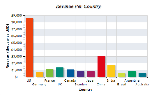
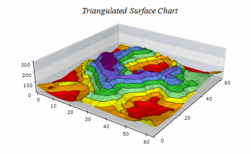
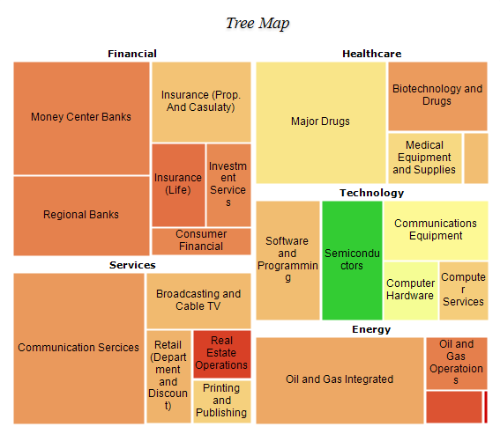
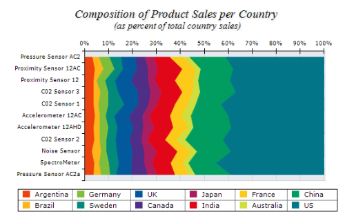
Nevron Chart for SharePoint features include:
Nevron Chart for SharePoint can be purchased as part of the Nevron Vision for SharePoint suite or separately as a stand-alone product.