| | |
 | A Polar Area chart visually represents data in a 2-dimensional polar coordinate system. It shows a filled closed contour created by connecting data points defined by their distance from the center and angle of rotation. This chart is an effective way to display large sets of data with many categories or levels. Polar Area charts help identify trends or patterns in data, especially in circular distributions. They can also compare relative values across different categories or levels. Overall, Polar Area charts provide an intuitive and visually appealing way to communicate complex data in a concise and easily understandable format. |
|
|
![polar point chart]() | A Polar Point Chart is a chart that displays data points in a 2-dimensional polar coordinate system. Each point on the chart is defined by its distance from the center and rotation angle, making it a useful tool for displaying data with both magnitude and direction.
The circular design of a Polar Point Chart allows for easy data comparison across different categories or periods, with each category or period represented by a different angle around the circle. The chart can also identify patterns or trends in the data, with outliers and unusual data points easily identifiable due to their position relative to the other points on the chart. |
|
|
![polar line chart]() | A Polar Line Chart is a chart that displays a sequence of data points connected by a line in a 2-dimensional polar coordinate system. Each point on the chart is defined by its distance from the center and rotation angle, with consecutive points connected by straight line segments.
Polar Line Charts are useful for displaying data that has both magnitude and direction and can be used to visualize trends or patterns over time. The chart's circular design allows for easy data comparison across different categories or periods, with each category or period represented by a different angle around the circle. |
|
|
![polar chart angle axis position]() | Here is demonstrated polar angle axes positioning. In this case there are two axes - the first one denoting degree values (red) and the second one denoting grad values (purple). Note that the axes will decorate by choosing a step which is a devisor of the range [0, 90] in degrees ([0, 100] in grads). |
|
|
![polar chart value axis position]() | A polar chart with optimized value axis positioning conveys complex data sets effectively. In this chart type, the value axis is positioned radially and divided into evenly spaced intervals to ensure optimal display and readability. This allows users to compare and interpret data points at different magnitudes and angles easily. By choosing an appropriate range for the value axis, one can ensure that data points are displayed in a way that highlights meaningful differences and relationships. Additionally, color coding or shading can enhance the user experience by providing a clear visual representation of data. Users can gain insights into complex data sets and confidently make informed decisions using polar charts with optimized value axis positioning. |
|
| |
A Polar Chart, also known as a Radial Chart, is a data visualization tool that displays data points in a polar coordinate system.
In this coordinate system, each data point X value is interpreted as an angle and its Y value as a distance from the coordinate system center.
This type of chart is beneficial for showing patterns and trends in data with directional or periodic characteristics, such as weather patterns, radar and sonar images, seasonal trends, and others.
|
Year | Category 1 | Category 2 | Category 3 |
---|
2010 | 100 | 50 | 75 | 2011 | 120 | 60 | 80 | 2012 | 150 | 75 | 90 | 2013 | 180 | 90 | 100 | 2014 | 200 | 100 | 110 | 2014 | 220 | 110 | 120 |
The table displays data for three categories over five years in this example. Each row represents a different year, and each column represents a
different category. The values in the table are used to create the Area Chart, where the area under each line represents the magnitude or value of
each category.
The chart can be used to visualize trends and patterns in the data over time and compare the relative values of each category.
|
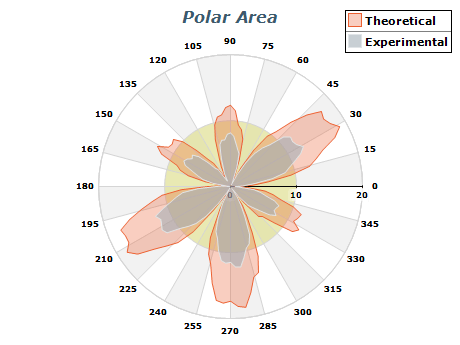
Polar charts are a powerful tool for visualizing data that depends on angle and magnitude. To ensure that your polar charts effectively convey your data and insights, consider the following best practices:
- Choose an appropriate data set: Polar charts are most effective for data sets that depend on angle and magnitude. Consider whether this chart type is the best choice for your data.
- Label your axes: Label your angle and value axes to ensure users can easily interpret the data. Use clear and concise labeling that is easy to understand.
- Use appropriate scaling: Choose a proper scaling for your chart to ensure all data points are visible and easily interpreted. Consider using logarithmic scaling for data sets with a wide range of magnitudes.
- Optimize axis positioning: Ensure that your angle and value axes are positioned to maximize clarity and readability. Use evenly spaced intervals and appropriate ranges to optimize axis positioning.
- Use color coding or shading: To enhance the user experience, consider using color coding or shading to provide a clear visual representation of data.
|
|