|
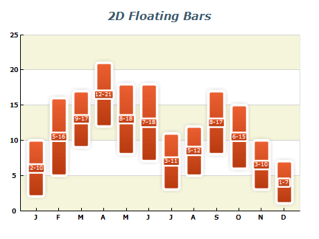 | A 2D float bar chart is a type of bar chart that allows you to display data consisting of ranges of values with bars. This is useful when you want to show the spread of values across categories or dates.
In a 2D float bar chart, each bar is represented by a rectangle that spans a vertical distance based on the range of values it represents. Nevron chart allows to embelish of the bars using rendering effects such as soft shadows, glow effects, bevel/emboss effects others. These features can enhance the visual appeal of your chart and make it easier to read and understand
|
|
|
Cluster Float Bar charts allow visual comparison between corresponding ranges of Y values with synchronized X values. This chart type displays multiple floating bar series side by side, with each series representing a specific category or data range. Cluster Float Bar charts are particularly useful in industries such as finance, where the ability to quickly compare data sets is crucial. |  |
|
|
 | A Date Time Float Bar Chart is a bar chart that displays ranges of values using bars, with the bars' position corresponding to specific dates and times. It can also visualize data with a time component, such as stock prices or project timelines.
With the ability to customize the DateTime values along the X-axis, the chart allows for the accurate representation of time-based data. Additionally, image effects such as shadow, glow, bevel/emboss, and lighting can be applied to enhance the visual appeal of the chart. |
|
|
Gantt charts are an effective tool for project management, allowing users to plan the use of resources over time. A Gantt chart can be created using a Floating Bar chart, where the Y-axis is set to date-time scale mode. Activities within the project are represented by their start and finish dates or times, allowing for easy visualization of the project timeline. Nevron's graphics engine provides high-quality image rendering and supports various visual effects like shadows, glow, and lighting, creating visually appealing and informative Gantt charts. |  |
|
|
 | A 3D Float Bar Chart displays a sequence of horizontal or vertical bars in three dimensions, each representing a one-dimensional value range. This chart shows how multiple variables change over time and allows you to efficiently compare and contrast different data sets. Additionally, you can customize the chart with different colors and markers to highlight specific data points or trends. |
|
|
A Stack Float Bar chart is useful for displaying a range of values in a stacked format. It's created by stacking one or more bar series over a FloatBar series. Each bar in the stack represents a portion of the overall value range, and the stack shows the total value for each data point. This type of chart is advantageous for comparing the relative sizes of different data points in a series and can be customized with various markers, colors, and labels to make the data easier to interpret. |  |
|
|
 | A Date Time Float Bar Chart is a bar chart that displays data using vertical bars, with the bars' position corresponding to specific dates and times. It visualizes data with a time component, such as stock prices or project timelines. The chart displays a range of values for each date and time, with the bars floating at different heights to represent the range.
With the ability to customize the DateTime values along the X-axis, the chart allows for a precise and accurate representation of time-based data. |
|
|


