Choose the Right Chart Type
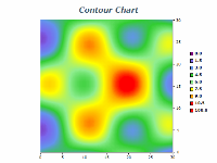
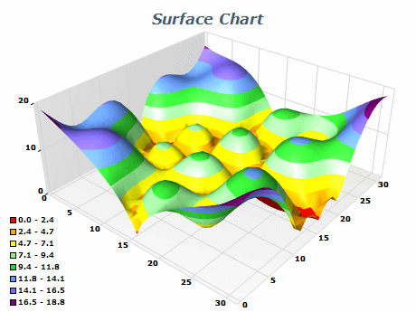
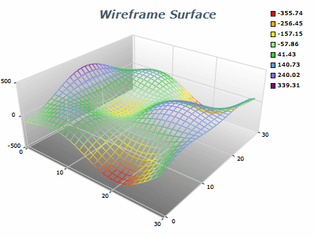
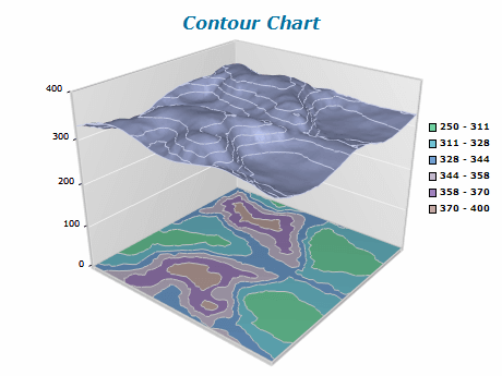
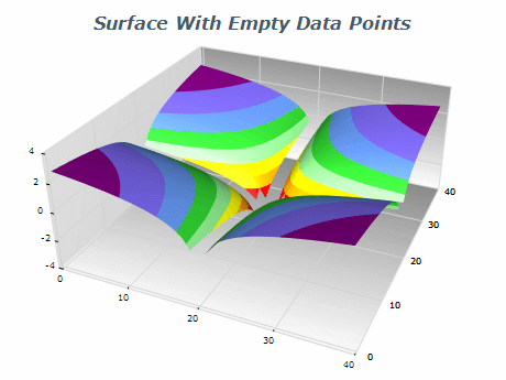
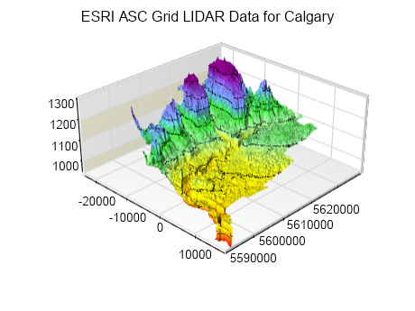
Surface charts are ideal for visualizing data with variable elevations and regularly spaced X/Z coordinates. If the data does not meet these criteria you can consider using the Mesh or Triangulated surface charts.
Use Appropriate Lighting
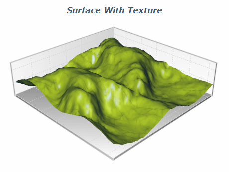
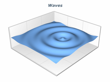
Lighting can significantly impact the appearance of Surface charts. Use lighting that highlights the important aspects of the data, such as areas of high or low value that don't obscure any important details.
Simplify the Data
Grid Surface charts can contain millions of data points, and rendering such a large number of data points, especially interactively is very computationally expensive. You can use various methods to simplify the rendered data set like binning or clustering, which are built into the chart.
Use Appropriate Labeling
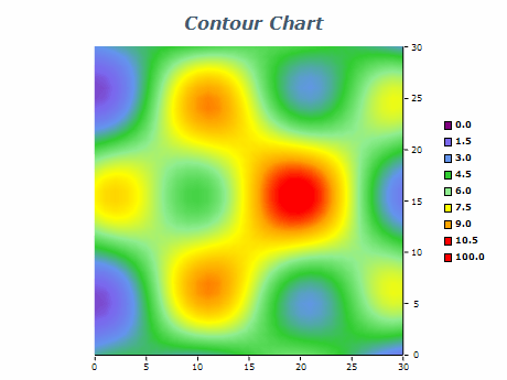
Labeling ensures the viewer understands the presented data. Label the axes and provide a legend explaining the meaning of any color schemes used in the chart.

 Open Vision for .NET
 NOV Chart for .NET
 NOV Diagram for .NET
 NOV Rich Text Editor for .NET
 NOV Grid for .NET
 NOV Schedule for .NET
 NOV Gauge for .NET
 NOV Barcode for .NET
 NOV User Interface for .NET
 Vision for .NET
 Chart for .NET
 Diagram for .NET
 User Interface for .NET
 Vision for SSRS
 Chart for SSRS
 Gauge for SSRS
 Map for SSRS
 Barcode for SSRS
 Vision for SharePoint
 Chart for SharePoint
 Gauge for SharePoint
 Map for SharePoint
 Barcode for SharePoint