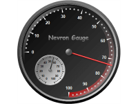
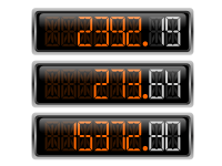
Nevron Open Vision Gauge offers a full range of advanced Gauge types, State Indicators and Numeric Displays that give you a more meaningful way to display KPI's (key performance indicators), dashboards, and other data.
NOV Radial Gauge displays axes, ranges, and pointers in a circular fashion with controllable begin angle, sweep angle, border style, etc.
With the help of this widget, you can display the following radial gauge subtypes: Radial, Quarter North East, Quarter North West, Quarter South West, Quarter South East, Half North, Half South, Half West, Half East, and others.
NOV Linear Gauge linearly displays axes, ranges, and pointers, with controllable orientation (horizontal or vertical).
NOV Numeric Display widget displays values in a LED fashion. The following display styles are available: Seven Segment Normal, Seven Segment Rounded, Seven Segment Rectangular, Fourteen Segment Normal, Fourteen Segment Rectangular, Fourteen SegmentInset, Matrix Rectangle, and Matrix Circle.

 Open Vision for .NET
 NOV Chart for .NET
 NOV Diagram for .NET
 NOV Rich Text Editor for .NET
 NOV Grid for .NET
 NOV Schedule for .NET
 NOV Gauge for .NET
 NOV Barcode for .NET
 NOV User Interface for .NET
 Vision for .NET
 Chart for .NET
 Diagram for .NET
 User Interface for .NET
 Vision for SSRS
 Chart for SSRS
 Gauge for SSRS
 Map for SSRS
 Barcode for SSRS
 Vision for SharePoint
 Chart for SharePoint
 Gauge for SharePoint
 Map for SharePoint
 Barcode for SharePoint