|
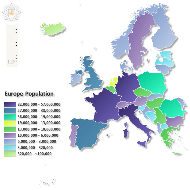 | This map compares European countries by total population, assigning each country a color according to the population ranges shown in the legend. Country boundaries make it easy to identify neighboring nations and compare their population sizes. The example demonstrates how range-based coloring can turn numerical geographic data into a clear visual overview. |
|
|
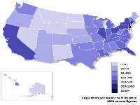
This map shows population density by US state using 2000 census figures. A graduated purple palette represents seven ranges of people per square mile, with darker shades indicating more densely populated states. Separate insets display Alaska and Hawaii, allowing all 50 states to appear in a compact layout while preserving the readability of the contiguous United States. | 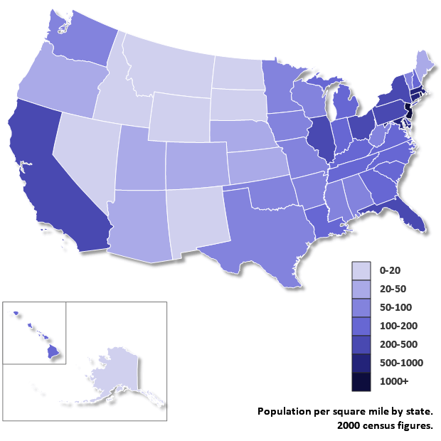 |
|
|
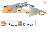
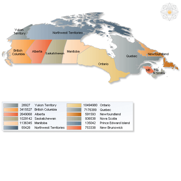 | This example combines a labeled map of Canada with a legend listing population totals for the provinces and territories shown. Distinct fills connect each geographic area to its corresponding legend entry, making it easy to locate a region and read its value. It demonstrates how map labels and a detailed legend can present geographic context alongside precise numerical information. |
|
|
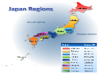
This map groups Japan’s prefectures into geographic regions, using a distinct color and label for each region. A matching table lists regional areas in square kilometers, connecting the map’s geographic divisions with numerical data. The example demonstrates categorical coloring, where colors identify regional membership rather than represent higher or lower values. | 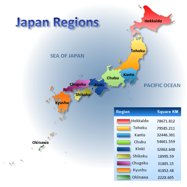 |
|
|
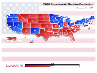
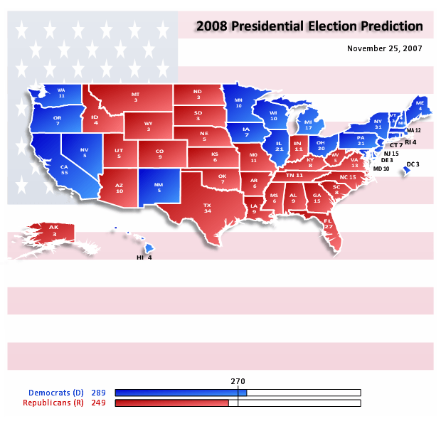 | This example visualizes a forecast for the 2008 US presidential election, dated November 25, 2007. States are colored blue or red according to their predicted Democratic or Republican outcome, and labels show their electoral votes. Summary bars compare the projected totals against the 270-vote threshold, combining state-level predictions with an overview of the anticipated national result. |
|
|
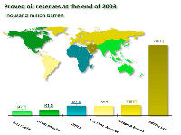
This visualization combines a world map with a bar chart showing proved oil reserves by region at the end of 2003, measured in billions of barrels. Matching colors connect each geographic region to its corresponding bar. The map establishes where the reserves are located, while bar heights and value labels make differences in regional totals easy to compare. | 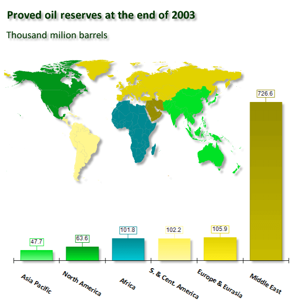 |
|
|

 Open Vision for .NET
 NOV Chart for .NET
 NOV Diagram for .NET
 NOV Rich Text Editor for .NET
 NOV Grid for .NET
 NOV Schedule for .NET
 NOV Gauge for .NET
 NOV Barcode for .NET
 NOV User Interface for .NET
 Vision for .NET
 Chart for .NET
 Diagram for .NET
 User Interface for .NET
 Vision for SSRS
 Chart for SSRS
 Gauge for SSRS
 Map for SSRS
 Barcode for SSRS
 Vision for SharePoint
 Chart for SharePoint
 Gauge for SharePoint
 Map for SharePoint
 Barcode for SharePoint