|
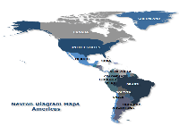
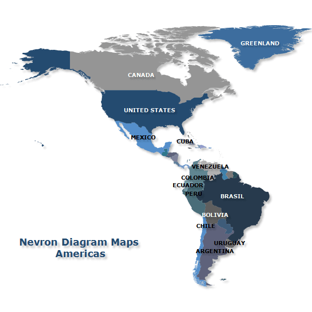 | This map presents North, Central, and South America with distinct country fills and labels for selected countries and territories. Detailed coastlines and contrasting colors make geographic boundaries easy to follow, while subtle shadows separate the land areas from the background. The example demonstrates how geographic shapes, text labels, and consistent styling can create a clear continental overview. |
|
|
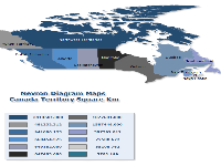
This map displays Canadian provinces and territories using distinct colors, with a matching legend showing their areas in square kilometers. Labels identify the geographic divisions, while the numerical values allow readers to compare their sizes. Based on historical administrative boundaries, the example demonstrates how a map can combine detailed geographic outlines with a compact legend of regional statistics. | 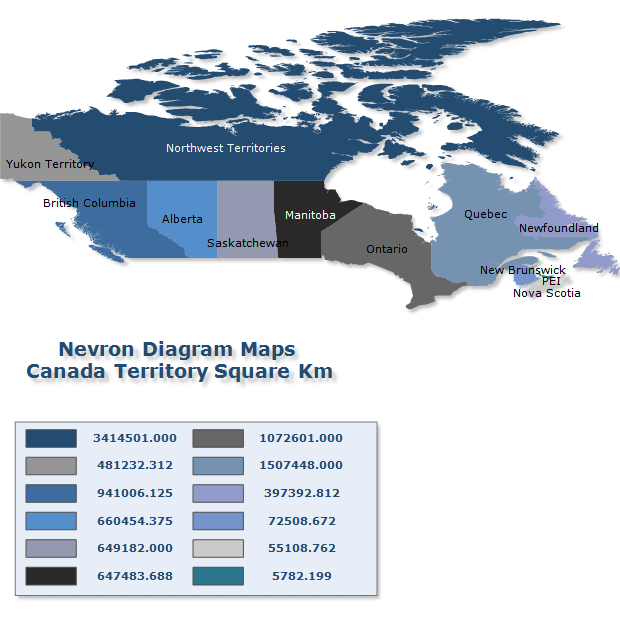 |
|
|
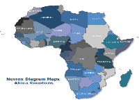
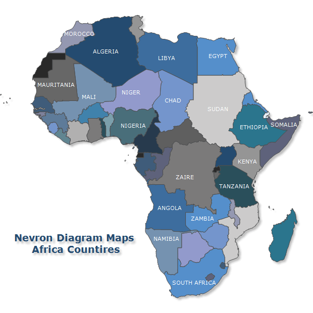 | This political map of Africa uses contrasting fills and boundary outlines to distinguish neighboring countries, with labels identifying selected nations. The coordinated color palette keeps the map readable without distracting from its geographic detail. Historical names and borders reflect the source dataset, illustrating how imported geographic data can be styled as a labeled reference map. |
|
|
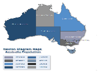
This map pairs Australia’s states and mainland territories with population totals in a color-matched legend. Labels identify each area, and distinct fills connect the geographic shapes to their corresponding values. Using historical population data, the example illustrates how a map and numerical legend can reveal differences between a region’s geographic size and the number of people who live there. | 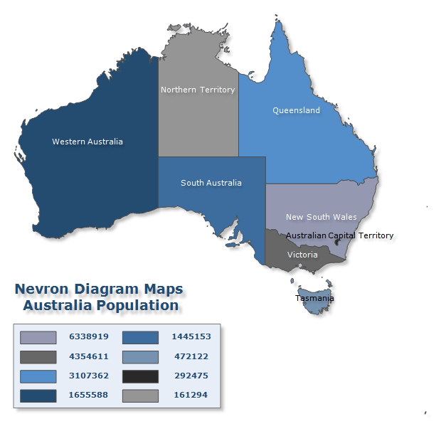 |
|
|

 Open Vision for .NET
 NOV Chart for .NET
 NOV Diagram for .NET
 NOV Rich Text Editor for .NET
 NOV Grid for .NET
 NOV Schedule for .NET
 NOV Gauge for .NET
 NOV Barcode for .NET
 NOV User Interface for .NET
 Vision for .NET
 Chart for .NET
 Diagram for .NET
 User Interface for .NET
 Vision for SSRS
 Chart for SSRS
 Gauge for SSRS
 Map for SSRS
 Barcode for SSRS
 Vision for SharePoint
 Chart for SharePoint
 Gauge for SharePoint
 Map for SharePoint
 Barcode for SharePoint