using Nevron.Nov;
using Nevron.Nov.Chart;
using Nevron.Nov.Diagram;
using Nevron.Nov.Dom;
using Nevron.Nov.Graphics;
using Nevron.Nov.Layout;
using Nevron.Nov.UI;
using Nevron.Nov.Windows.Forms;
using System;
using System.Drawing;
using System.Windows.Forms;

namespace NovWinFormsProject
{
	public partial class Form1 : Form
	{
		#region Constructors

		public Form1()
		{
			InitializeComponent();

			// Set form title
			Text = "NOV WinForms - NStateIndicatorStyleAppearanceExample";

			// Create the NOV example and its controls
			NWidget exampleContent = CreateExampleContent();
			NWidget exampleControls = CreateExampleControls();
			if (exampleControls != null)
			{
				exampleControls.PreferredWidth = 300;
			}

			// Place the example and its controls in a pair box
			NPairBox pairBox = new NPairBox(exampleContent, exampleControls);
			pairBox.FillMode = ENStackFillMode.First;
			pairBox.FitMode = ENStackFitMode.First;
			pairBox.Margins = new NMargins(NDesign.HorizontalSpacing, NDesign.VerticalSpacing);

			// Host the example in the form
			NNovWidgetHost host = new NNovWidgetHost(pairBox);
			host.Dock = DockStyle.Fill;
			Controls.Add(host);
		}

		#endregion

        #region Example

        public NWidget CreateExampleContent()
        {
            NStackPanel stack = new NStackPanel();
            stack.HorizontalPlacement = ENHorizontalPlacement.Left;

            NStackPanel controlStack = new NStackPanel();
            stack.Add(controlStack);

            // create the radial gauge
            m_RadialGauge = new NRadialGauge();
            m_RadialGauge.PreferredSize = defaultRadialGaugeSize;
            m_RadialGauge.Dial = new NDial(ENDialShape.Circle, new NEdgeDialRim());
            m_RadialGauge.NeedleCap.Visible = true;
            m_RadialGauge.SweepAngle = new NAngle(270, NUnit.Degree);
            m_RadialGauge.BeginAngle = new NAngle(-225, NUnit.Degree);

            NAdvancedGradientFill advancedGradient = new NAdvancedGradientFill();
            advancedGradient.BackgroundColor = NColor.RoyalBlue;
            advancedGradient.Points.Add(new NAdvancedGradientPoint(NColor.SteelBlue, new NAngle(10, NUnit.Degree), 0.1f, 0, 1.0f, ENAdvancedGradientPointShape.Circle));
            m_RadialGauge.Dial.BackgroundFill = advancedGradient;
            m_RadialGauge.CapEffect = new NGlassCapEffect(ENCapEffectShape.Ellipse);

            controlStack.Add(m_RadialGauge);

            // configure scale
            NGaugeAxis axis = new NGaugeAxis();
            m_RadialGauge.Axes.Add(axis);
            axis.Range = new NRange(20, 100);

            // add Scale
            m_Scale = (NStandardScale)axis.Scale;
            m_Scale.SetPredefinedScale(ENPredefinedScaleStyle.Standard);
            m_Scale.Labels.Style.TextStyle.Font = new NFont("Arimo", 10, ENFontStyle.Bold);
            m_Scale.Labels.Style.TextStyle.Fill = new NColorFill(NColor.White);
            m_Scale.MajorTickMode = ENMajorTickMode.AutoMaxCount;
            m_Scale.MinorTickCount = 5;

            // add range indicator
            NRangeIndicator rangeIndicator = new NRangeIndicator();
            rangeIndicator.Value = 80;
            rangeIndicator.Palette = new NThreeColorPalette(NColor.Orange, NColor.Red, NColor.Yellow, 80.0);
            rangeIndicator.OriginMode = ENRangeIndicatorOriginMode.ScaleMax;
            rangeIndicator.Stroke.Width = 0;
            rangeIndicator.OffsetFromScale = 3;
            rangeIndicator.BeginWidth = 15;
            rangeIndicator.EndWidth = 25;

            m_RadialGauge.Indicators.Add(rangeIndicator);

            // add radial gauge indicators
            m_ValueIndicator = new NNeedleValueIndicator();
            m_ValueIndicator.Fill = new NStockGradientFill(ENGradientStyle.Horizontal, ENGradientVariant.Variant1, NColor.White, NColor.Silver);
            m_ValueIndicator.Width = 7;
            m_ValueIndicator.OffsetFromScale = -10;

            m_RadialGauge.Indicators.Add(m_ValueIndicator);

            //add state indicator
            NUserPanel userPanel1 = new NUserPanel();

            m_StateIndicator = new NStateIndicator();
            userPanel1.Add(m_StateIndicator);

            m_RadialGauge.Content = userPanel1;

            m_StateIndicator.SetFx(XProperty, "$Parent.Width / 2 - (Width / 2)");
            m_StateIndicator.SetFx(YProperty, "$Parent.Height * 3/ 4");
            m_StateIndicator.SetFx(WidthProperty, "20");
            m_StateIndicator.SetFx(HeightProperty, "20");

            m_StateIndicator.BackgroundFill = new NColorFill(NColor.Transparent);
            m_StateIndicator.States.Add(new NIndicatorState(new NRange(0, 100), ENSymbolShape.Ellipse, new NSize(10, 10), new NColorFill(NColor.Silver), null));


            // timer
            m_DataFeedTimer = new NTimer();
            m_DataFeedTimer.Tick += OnDataFeedTimerTick;
            m_DataFeedTimer.Start();

            return stack;
        }

        public NWidget CreateExampleControls()
        {
            NStackPanel stack = new NStackPanel();

            // Dash/Border properties group
            NGroupBox dashGroupBox = new NGroupBox("Dash Properties");
            stack.Add(dashGroupBox);

            NStackPanel dashPropertiesGroupBoxGroupBoxContent = new NStackPanel();
            dashGroupBox.Content = new NUniSizeBoxGroup(dashPropertiesGroupBoxGroupBoxContent);

            // create a hatch fill properties group
            NGroupBox fillPropertiesGroupBox = new NGroupBox("Fill Properties");
            stack.Add(fillPropertiesGroupBox);

            NStackPanel fillPropertiesGroupBoxGroupBoxContent = new NStackPanel();
            fillPropertiesGroupBox.Content = new NUniSizeBoxGroup(fillPropertiesGroupBoxGroupBoxContent);

            // create a combo box for state indicator style
            m_StateIndicatorStyleComboBox = new NComboBox();
            m_StateIndicatorStyleComboBox.Items.FillFromEnum();
            //m_StateIndicatorStyleComboBox.Items.Add(new NComboBoxItem("Rectangular Led"));
            //m_StateIndicatorStyleComboBox.Items.Add(new NComboBoxItem("Circular Led"));
            //m_StateIndicatorStyleComboBox.Items.Add(new NComboBoxItem("Rounded Led"));
            //m_StateIndicatorStyleComboBox.Items.Add(new NComboBoxItem("Text"));
            m_StateIndicatorStyleComboBox.SelectedIndexChanged += OnStateIndicatorStyleComboBoxSelectedIndexChanged;
            stack.Add(new NPairBox("Indicator Style:", m_StateIndicatorStyleComboBox, true));

            // create a combo box for  indicator fill color
            m_StateIndicatorFillComboBox = new NComboBox();
            m_StateIndicatorFillComboBox.Items.Add(new NComboBoxItem("Red"));
            m_StateIndicatorFillComboBox.Items.Add(new NComboBoxItem("Lime"));
            m_StateIndicatorFillComboBox.Items.Add(new NComboBoxItem("Aqua"));
            m_StateIndicatorFillComboBox.Items.Add(new NComboBoxItem("Yellow"));
            m_StateIndicatorFillComboBox.SelectedIndex = 0;
            m_StateIndicatorFillComboBox.SelectedIndexChanged += OnStateIndicatorFillComboBoxSelectedIndexChanged;
            fillPropertiesGroupBoxGroupBoxContent.Add(new NPairBox("Fill Color: ", m_StateIndicatorFillComboBox, true));


            //  create a combo box for fill hatch style
            m_StateIndicatorHatchFillComboBox = new NComboBox();
            m_StateIndicatorHatchFillComboBox.Items.FillFromEnum();
            m_StateIndicatorHatchFillComboBox.SelectedIndex = m_StateIndicatorHatchFillComboBox.SelectedIndex;
            m_StateIndicatorHatchFillComboBox.SelectedIndexChanged += OnStateIndicatorHatchFillComboBoxSelectedIndexChanged;
            fillPropertiesGroupBoxGroupBoxContent.Add(new NPairBox("Fill Hatch Style: ", m_DashStyleComboBox, true));

            //TODO: create indicator fill foreground color - hatch style
            //TODO: create indicator fill background color - hatch style

            // create a combo box for stroke dash style
            m_DashStyleComboBox = new NComboBox();
            m_DashStyleComboBox.Items.FillFromEnum();
            m_DashStyleComboBox.SelectedIndex = 0; // set default value
            m_DashStyleComboBox.SelectedIndexChanged += OnStrokeDashStyleComboBoxSelectedIndexChanged;
            dashPropertiesGroupBoxGroupBoxContent.Add(new NPairBox("Dash Style: ", m_DashStyleComboBox, true));

            // create a combo box for stroke dash color
            m_DashColorComboBox = new NComboBox();
			m_DashColorComboBox.Items.Fill(new string[] {
				"Black", "Gray", "Green", "White", "Blue"
			});
            m_DashColorComboBox.SelectedIndex = 0;
            m_DashColorComboBox.SelectedIndexChanged += OnDashColorComboBoxSelectedIndexChanged;
            dashPropertiesGroupBoxGroupBoxContent.Add(new NPairBox("Dash Color: ", m_DashColorComboBox, true));

            // create a numeric up-down for dash width
            m_DashWidthUpDown = new NNumericUpDown();
            m_DashWidthUpDown.Value = 0;
            m_DashWidthUpDown.ValueChanged += OnUpDownWidthChanged;
            m_DashWidthUpDown.Value = Math.Min(Math.Max(m_DashWidthUpDown.Value, 0), 5);
            dashPropertiesGroupBoxGroupBoxContent.Add(new NPairBox("Dash Width: ", m_DashWidthUpDown, true));

            return stack;
        }

        public string GetExampleDescription()
        {
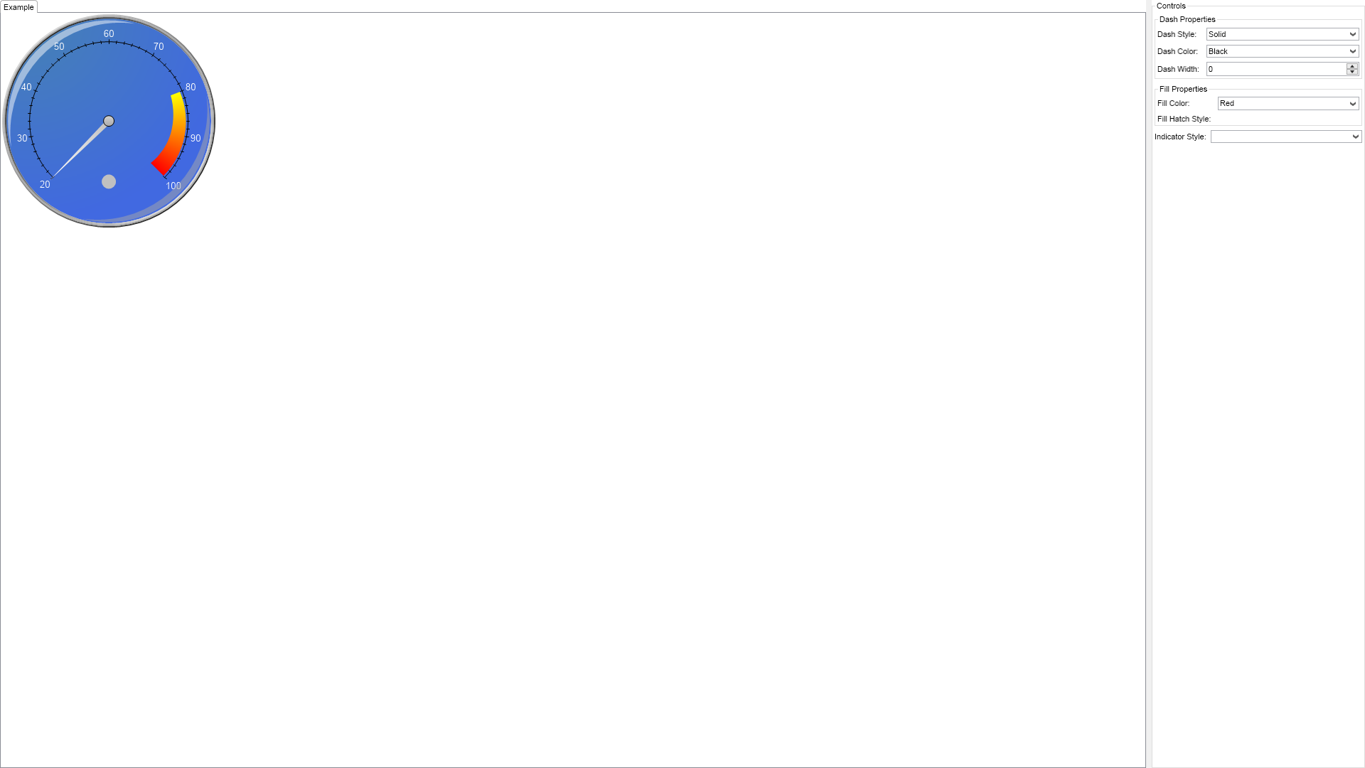
            return @" This sample demostrates various styles and appearance properties of state indicators.
                         The state indicator, located at the bottom center of the above gauge, changes tate when its value is between 80 and 100.
                         The state indicator is considered inactive outside of this range. ";
        }

        ///
        /// Gets the relevant documentation links for the example
        ///
        ///
        public (string Name, string Url)[] GetDocumentationUrls()
        {
            return new[]
            {
                ("Gauges Indicators Overview", "https://www.nevron.com/docs/openvision/gauges-indicators-overview.html"),
                ("Gauges Overview", "https://www.nevron.com/docs/openvision/gauges-overview.html"),
                ("Instrumentation Overview", "https://www.nevron.com/docs/openvision/instrumentation-overview.html"),
            };
        }

        #endregion

        #region Implementation

        #endregion

        #region Event Handlers

        private void OnDataFeedTimerTick()
        {
            // update the value indicator
            m_FirstIndicatorAngle += 0.02;
            double value = 50.0 - Math.Cos(m_FirstIndicatorAngle) * 50.0;
            m_ValueIndicator.Value = value;
        }

        private void OnStateIndicatorStyleComboBoxSelectedIndexChanged(NValueChangeEventArgs arg)
        {
            // Get the selected symbol shape from the combo box
            ENSymbolShape symbolShape = (ENSymbolShape)arg.NewValue;

            // Create a new state with the selected symbol shape
            NIndicatorState indicatorState = new NIndicatorState(new NRange(0, 100), symbolShape, new NSize(10, 10), new NColorFill(NColor.Red), null);

            // Set the state of the state indicator
            m_StateIndicator.States.Clear();
            m_StateIndicator.States.Add(indicatorState);

            //// Get the selected symbol shape from the combo box
            //ENSymbolShape symbolShape = (ENSymbolShape)arg.NewValue;

            //// Create a new symbol with the selected shape and the existing size
            //NSymbol symbol = NSymbol.Create(symbolShape, new NSize(10, 10), m_StateIndicator.States[0].Symbol.Fill, m_StateIndicator.States[0].Symbol.Stroke);

            //// Update the symbol of the existing state
            //m_StateIndicator.States[0].Symbol = symbol;
        }

        private void OnStateIndicatorFillComboBoxSelectedIndexChanged(NValueChangeEventArgs arg)
        {
            NColor color = NColor.Silver;

            if (m_RadialGauge.Indicators[0].Value <= 80)
            {
                color = NColor.Silver;
            }
            else
            {
                switch (m_StateIndicatorFillComboBox.SelectedIndex)
                {
                    case 0:
                        color = NColor.Red;
                        break;

                    case 1:
                        color = NColor.Lime;
                        break;

                    case 2:
                        color = NColor.Aqua;
                        break;

                    case 3:
                        color = NColor.Yellow;
                        break;
                }
            }

            NColorFill colorFill = new NColorFill(color);

            // Get the selected symbol shape from the combo box
            ENSymbolShape symbolShape = (ENSymbolShape)m_StateIndicatorStyleComboBox.SelectedIndex;

            // Create a new state with the selected symbol shape and color

            // Set the state of the state indicator
            m_StateIndicator.States.Clear();
          //  m_StateIndicator.States.Add(indicatorState);

        }

        private void OnStateIndicatorHatchFillComboBoxSelectedIndexChanged(NValueChangeEventArgs arg)
        {
            // Get the selected symbol shape from the combo box
            ENHatchStyle hatchStyle = (ENHatchStyle)arg.NewValue;

        }

        private void OnStrokeDashStyleComboBoxSelectedIndexChanged(NValueChangeEventArgs arg)
        {
            // get the selected stroke dash style from the combo box
            ENDashStyle dashStyle = (ENDashStyle)arg.NewValue;

            // set the stroke dash style of the state indicator border
        }

        private void OnDashColorComboBoxSelectedIndexChanged(NValueChangeEventArgs arg)
        {
            NColor color;

            switch (m_DashColorComboBox.SelectedIndex)
            {
                case 0:
                    color = NColor.Black;

                    break;

                case 1:
                    color = NColor.Gray;

                    break;

                case 2:
                    color = NColor.Green;

                    break;

                case 3:
                    color = NColor.White;

                    break;

                case 4:
                    color = NColor.Red;

                    break;

                case 5:
                    color = NColor.Blue;

                    break;
            }
        }

        private void OnUpDownWidthChanged(NValueChangeEventArgs arg)
        {
            int value = (int)m_DashWidthUpDown.Value;

            // Set the dash width of the stroke
            //m_StateIndicator.Stroke.DashStyle = ENDashStyle.DashDot;
            //m_StateIndicator.Stroke.Width = value;

        }

        #endregion

        #region Fields

        NRadialGauge m_RadialGauge;
        NStandardScale m_Scale;
        NNeedleValueIndicator m_ValueIndicator;
        NStateIndicator m_StateIndicator;

        NComboBox m_StateIndicatorStyleComboBox;
        NComboBox m_StateIndicatorFillComboBox;
        NComboBox m_StateIndicatorHatchFillComboBox;
        NComboBox m_DashStyleComboBox;
        NComboBox m_DashColorComboBox;

        NNumericUpDown m_DashWidthUpDown;

        NTimer m_DataFeedTimer;
        double m_FirstIndicatorAngle;

        #endregion

        #region Static Methods

        #endregion

        #region Constants

        private static readonly NSize defaultRadialGaugeSize = new NSize(300, 300);

        #endregion

		#region Nested Types
		#endregion
	}
}

 Chart for .NET
 Diagram for .NET
 User Interface for .NET
 Vision for SSRS
 Chart for SSRS
 Gauge for SSRS
 Map for SSRS
 Barcode for SSRS
 Vision for SharePoint
 Chart for SharePoint
 Gauge for SharePoint
 Map for SharePoint
 Barcode for SharePoint
 Open Vision for .NET


 Vision for .NET