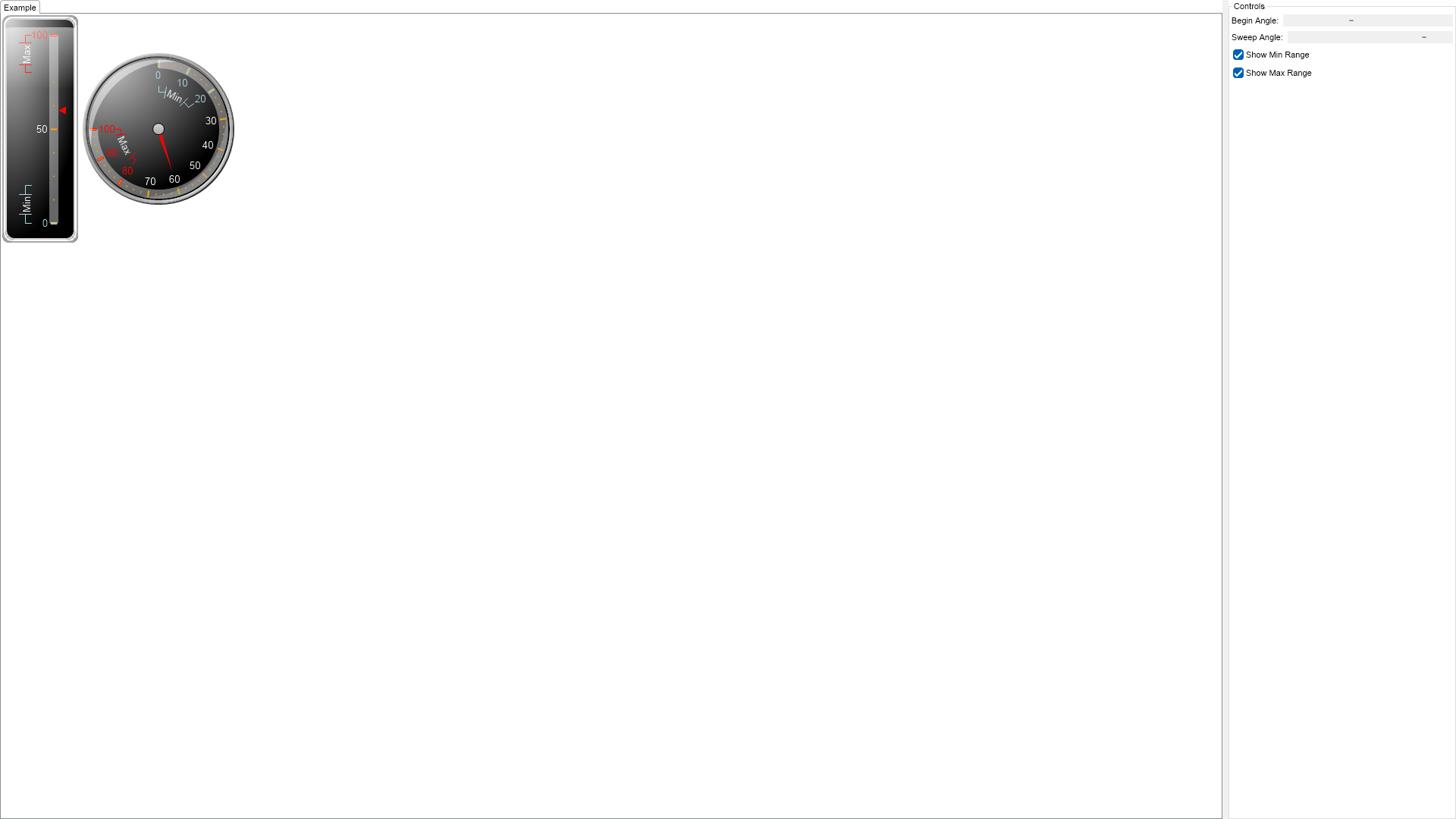
using Nevron.Nov;
using Nevron.Nov.Chart;
using Nevron.Nov.Dom;
using Nevron.Nov.Editors;
using Nevron.Nov.Graphics;
using Nevron.Nov.Layout;
using Nevron.Nov.UI;
using Nevron.Nov.Windows.Forms;
using System.Windows.Forms;
namespace NovWinFormsProject
{
public partial class Form1 : Form
{
#region Constructors
public Form1()
{
InitializeComponent();
// Set form title
Text = "NOV WinForms - NGaugeCustomRangeLabelsExample";
// Create the NOV example and its controls
NWidget exampleContent = CreateExampleContent();
NWidget exampleControls = CreateExampleControls();
if (exampleControls != null)
{
exampleControls.PreferredWidth = 300;
}
// Place the example and its controls in a pair box
NPairBox pairBox = new NPairBox(exampleContent, exampleControls);
pairBox.FillMode = ENStackFillMode.First;
pairBox.FitMode = ENStackFitMode.First;
pairBox.Margins = new NMargins(NDesign.HorizontalSpacing, NDesign.VerticalSpacing);
// Host the example in the form
NNovWidgetHost host = new NNovWidgetHost(pairBox);
host.Dock = DockStyle.Fill;
Controls.Add(host);
}
#endregion
#region Example
public NWidget CreateExampleContent()
{
NStackPanel stack = new NStackPanel();
NStackPanel controlStack = new NStackPanel();
controlStack.Direction = ENHVDirection.LeftToRight;
stack.Add(controlStack);
m_LinearGauge = new NLinearGauge();
m_LinearGauge.Orientation = ENLinearGaugeOrientation.Vertical;
m_LinearGauge.PreferredSize = defaultLinearVerticalGaugeSize;
m_LinearGauge.CapEffect = new NGelCapEffect();
m_LinearGauge.Border = CreateBorder();
m_LinearGauge.Padding = new NMargins(20);
m_LinearGauge.BorderThickness = new NMargins(6);
controlStack.Add(m_LinearGauge);
// create the background panel
NAdvancedGradientFill advGradient = new NAdvancedGradientFill();
advGradient.BackgroundColor = NColor.Black;
advGradient.Points.Add(new NAdvancedGradientPoint(NColor.LightGray, new NAngle(10, NUnit.Degree), 0.1f, 0, 1.0f, ENAdvancedGradientPointShape.Circle));
m_LinearGauge.BackgroundFill = advGradient;
m_LinearGauge.Axes.Clear();
NGaugeAxis axis = new NGaugeAxis();
m_LinearGauge.Axes.Add(axis);
axis.Anchor = new NModelGaugeAxisAnchor(24.0, ENVerticalAlignment.Center, ENScaleOrientation.Left);
ConfigureScale((NLinearScale)axis.Scale);
// add some indicators
m_LinearGauge.Indicators.Add(new NMarkerValueIndicator(60));
// create the radial gauge
m_RadialGauge = new NRadialGauge();
controlStack.Add(m_RadialGauge);
m_RadialGauge.CapEffect = new NGlassCapEffect();
m_RadialGauge.Dial = new NDial(ENDialShape.Circle, new NEdgeDialRim());
// set some background
advGradient = new NAdvancedGradientFill();
advGradient.BackgroundColor = NColor.Black;
advGradient.Points.Add(new NAdvancedGradientPoint(NColor.LightGray, new NAngle(10, NUnit.Degree), 0.1f, 0, 1.0f, ENAdvancedGradientPointShape.Circle));
m_RadialGauge.Dial.BackgroundFill = advGradient;
m_RadialGauge.CapEffect = new NGlassCapEffect(ENCapEffectShape.Ellipse);
// create the radial gauge
m_RadialGauge.SweepAngle = new NAngle(270, NUnit.Degree);
m_RadialGauge.BeginAngle = new NAngle(-90, NUnit.Degree);
NStandardScale scale = axis.Scale as NStandardScale;
scale.MajorTickMode = ENMajorTickMode.AutoMinDistance;
scale.MinTickDistance = 50;
// configure the axis
m_RadialGauge.Axes.Clear();
axis = new NGaugeAxis();
axis.Range = new NRange(0, 100);
axis.Anchor.ScaleOrientation = ENScaleOrientation.Right;
axis.Anchor = new NDockGaugeAxisAnchor(ENGaugeAxisDockZone.Top, true, ENScaleOrientation.Right, 0, 100);
m_RadialGauge.Axes.Add(axis);
ConfigureScale((NLinearScale)axis.Scale);
// add some indicators
NNeedleValueIndicator needle = new NNeedleValueIndicator(60);
needle.OffsetOriginMode = ENIndicatorOffsetOriginMode.ScaleMiddle;
needle.OffsetFromScale = 15;
m_RadialGauge.Indicators.Add(needle);
return stack;
}
public NWidget CreateExampleControls()
{
NStackPanel stack = new NStackPanel();
NStackPanel propertyStack = new NStackPanel();
stack.Add(new NUniSizeBoxGroup(propertyStack));
// begin angle scroll
m_BeginAngleScrollBar = new NHScrollBar();
m_BeginAngleScrollBar.Minimum = -360;
m_BeginAngleScrollBar.Maximum = 360;
m_BeginAngleScrollBar.Value = m_RadialGauge.BeginAngle.ToDegrees();
propertyStack.Add(new NPairBox("Begin Angle:", m_BeginAngleScrollBar));
// sweep angle scroll
m_SweepAngleScrollBar = new NHScrollBar();
m_SweepAngleScrollBar.Minimum = -360;
m_SweepAngleScrollBar.Maximum = 360;
m_SweepAngleScrollBar.Value = m_RadialGauge.SweepAngle.ToDegrees();
propertyStack.Add(new NPairBox("Sweep Angle:", m_SweepAngleScrollBar));
// show max check box
m_ShowMinRangeCheckBox = new NCheckBox("Show Min Range");
m_ShowMinRangeCheckBox.Checked = true;
propertyStack.Add(m_ShowMinRangeCheckBox);
// show min check box
m_ShowMaxRangeCheckBox = new NCheckBox("Show Max Range");
m_ShowMaxRangeCheckBox.Checked = true;
propertyStack.Add(m_ShowMaxRangeCheckBox);
m_BeginAngleScrollBar.ValueChanged += OnBeginAngleScrollBarValueChanged;
m_SweepAngleScrollBar.ValueChanged += OnSweepAngleScrollBarValueChanged;
m_ShowMinRangeCheckBox.CheckedChanged += OnShowMinRangeCheckBoxCheckedChanged;
m_ShowMaxRangeCheckBox.CheckedChanged += OnShowMaxRangeCheckBoxCheckedChanged;
UpdateAxisRanges();
return stack;
}
public string GetExampleDescription()
{
return @"The example demonstrates how to create range labels on the gauge scale.
";
}
///
/// Gets the relevant documentation links for the example
///
///
public (string Name, string Url)[] GetDocumentationUrls()
{
return new[]
{
("Scale Range Label Settings", "https://www.nevron.com/docs/openvision/scale-range-label-settings.html"),
("Gauges Axes", "https://www.nevron.com/docs/openvision/gauges-axes.html"),
};
}
#endregion
#region Implementation
private void ConfigureScale(NLinearScale scale)
{
scale.SetPredefinedScale(ENPredefinedScaleStyle.PresentationNoStroke);
scale.Labels.OverlapResolveLayouts = new NDomArray();
scale.MinorTickCount = 3;
scale.Ruler.Fill = new NColorFill(NColor.FromColor(NColor.White, 0.4f));
scale.OuterMajorTicks.Fill = new NColorFill(NColor.Orange);
scale.Labels.Style.TextStyle.Font = new NFont("Arimo", 10.0, ENFontStyle.Bold);
scale.Labels.Style.TextStyle.Fill = new NColorFill(NColor.White);
}
private void UpdateAxisRanges()
{
NLinearScale linearGaugeScale = ((NGaugeAxis)m_LinearGauge.Axes[0]).Scale as NLinearScale;
NLinearScale radialGaugeScale = ((NGaugeAxis)m_RadialGauge.Axes[0]).Scale as NLinearScale;
linearGaugeScale.CustomLabels.Clear();
linearGaugeScale.Sections.Clear();
radialGaugeScale.CustomLabels.Clear();
radialGaugeScale.Sections.Clear();
if (m_ShowMinRangeCheckBox.Checked)
{
ApplyScaleSectionToAxis(linearGaugeScale, "Min", new NRange(0, 20), NColor.LightBlue);
ApplyScaleSectionToAxis(radialGaugeScale, "Min", new NRange(0, 20), NColor.LightBlue);
}
if (m_ShowMaxRangeCheckBox.Checked)
{
ApplyScaleSectionToAxis(linearGaugeScale, "Max", new NRange(80, 100), NColor.Red);
ApplyScaleSectionToAxis(radialGaugeScale, "Max", new NRange(80, 100), NColor.Red);
}
}
private void ApplyScaleSectionToAxis(NLinearScale scale, string text, NRange range, NColor color)
{
NScaleSection scaleSection = new NScaleSection();
scaleSection.Range = range;
scaleSection.LabelTextStyle = new NTextStyle();
scaleSection.LabelTextStyle.Fill = new NColorFill(color);
scaleSection.LabelTextStyle.Font = new NFont("Arimo", 10, ENFontStyle.Bold | ENFontStyle.Italic);
scaleSection.MajorTickStroke = new NStroke(color);
scale.Sections.Add(scaleSection);
NCustomRangeLabel rangeLabel = new NCustomRangeLabel(range, text);
rangeLabel.LabelStyle.AlwaysInsideScale = false;
rangeLabel.LabelStyle.VisibilityMode = ENScaleLabelVisibilityMode.TextInRuler;
rangeLabel.LabelStyle.Stroke.Color = color;
rangeLabel.LabelStyle.TextStyle.Fill = new NColorFill(NColor.White);
rangeLabel.LabelStyle.Angle = new NScaleLabelAngle(ENScaleLabelAngleMode.Scale, 0);
rangeLabel.LabelStyle.TickMode = ENRangeLabelTickMode.Center;
scale.CustomLabels.Add(rangeLabel);
}
#endregion
#region Event Handlers
void OnShowMaxRangeCheckBoxCheckedChanged(NValueChangeEventArgs arg)
{
UpdateAxisRanges();
}
void OnShowMinRangeCheckBoxCheckedChanged(NValueChangeEventArgs arg)
{
UpdateAxisRanges();
}
void OnSweepAngleScrollBarValueChanged(NValueChangeEventArgs arg)
{
m_RadialGauge.SweepAngle = new NAngle(m_SweepAngleScrollBar.Value, NUnit.Degree);
}
void OnBeginAngleScrollBarValueChanged(NValueChangeEventArgs arg)
{
m_RadialGauge.BeginAngle = new NAngle(m_BeginAngleScrollBar.Value, NUnit.Degree);
}
#endregion
#region Fields
NRadialGauge m_RadialGauge;
NLinearGauge m_LinearGauge;
NHScrollBar m_BeginAngleScrollBar;
NHScrollBar m_SweepAngleScrollBar;
NCheckBox m_ShowMinRangeCheckBox;
NCheckBox m_ShowMaxRangeCheckBox;
#endregion
#region Static Methods
protected NBorder CreateBorder()
{
return NBorder.CreateThreeColorBorder(NColor.LightGray, NColor.White, NColor.DarkGray, 10, 10);
}
#endregion
#region Constants
private static readonly NSize defaultLinearVerticalGaugeSize = new NSize(100, 300);
#endregion
#region Nested Types
#endregion
}
}

 Chart for .NET
 Diagram for .NET
 User Interface for .NET
 Vision for SSRS
 Chart for SSRS
 Gauge for SSRS
 Map for SSRS
 Barcode for SSRS
 Vision for SharePoint
 Chart for SharePoint
 Gauge for SharePoint
 Map for SharePoint
 Barcode for SharePoint
 Open Vision for .NET


 Vision for .NET