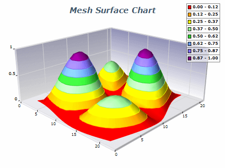
Nevron Logo

Mesh Surface Chart

A Mesh Surface chart is a type of graphical representation that displays a surface with user-defined Y-position, X-position, and Z-position values for each data point. Unlike a Grid Surface chart, which only allows users to define the y-position or elevation, Mesh Surface provides more precise control over the position of each data point. The data points are organized in a regular network, creating a mesh-like appearance. A variation of the Mesh Surface chart allows the user to specify a color per each data point, thus adding a fourth dimension of data to the chart. Mesh Surface charts are commonly used in scientific and engineering applications, allowing for more detailed visualizations of complex data sets.

Sample Table Format

X ValueY ValueZ Value
1110
1220
1330
2140

The table includes x, y, and z positions for each data point. The x values represent the horizontal position, the y values represent the vertical position or elevation, and the z values represent the data or measurement at each point. This table can be used for creating a Mesh Surface chart that displays a surface with a regular network of data points.

Best practices for using mesh surface charts

  • Choose the right type of chart: Mesh Surface charts are best used when displaying data with multiple dimensions or parameters. Consider whether a Mesh Surface chart is the best way to represent your data or if a different chart type, such as a 3D Scatter plot or a Heatmap, would be more appropriate.
  • Simplify the data: Mesh Surface charts can be complex and overwhelming if there are too many data points or if the data is too detailed. Simplify your data by removing unnecessary data points or grouping data into larger categories.
  • Choose an appropriate color scheme: Colors are important in Mesh Surface charts, as they help to differentiate between different data points. Choose a color scheme that is appropriate for your data and easy to interpret. Use a legend to explain the meaning of each color.
  • Label axes clearly: Label the x, y, and z axes to ensure the chart is easily interpretable. Include units of measurement if necessary.
  • Use lighting and shading appropriately: Lighting and shading can enhance the 3D effect of Mesh Surface charts. Experiment with different lighting and shading options to find the best way to represent your data.
  • Provide context for the data by including a title, captions, and annotations. Explain the purpose of the chart, the meaning of the data, and any relevant background information.