Nevron Logo

WinForms Triangulated Surface Chart

Triangulated Surface Chart

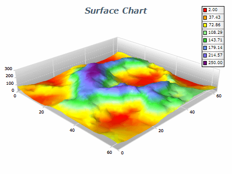
The Triangulated Surface Chart is a powerful visualization tool that displays three-dimensional data sets using a mesh of triangles to represent the surface of the data. It is ideal for displaying large and complex data sets clearly and concisely. The Triangulated Surface Chart is widely used in various industries such as engineering, scientific research, and finance.

The Triangulated Surface Chart offers many features that allow users to customize their charts according to their needs. The chart provides various shading options, including smooth and flat shading, and users can choose from a range of color maps to represent their data. The chart also allows users to add annotations and labels to help users better understand the data they view.

Sample Table Format

X ValueY ValueZ Value
2 5 10
4 5 20
6 5 15
8 5 5
10 5 30

In this table, the X, Y, and Z values represent the coordinates of each data point. Users can input as many data points as necessary to create a comprehensive and detailed visualization of their data.

Best practices for using triangulated surface charts

  • Choose the Right Data: The Triangulated Surface Chart best displays continuous data sets with many data points. Ensure that your data is well-suited to this type of visualization before creating a Triangulated Surface Chart.
  • Choose the Right Color Map: Choose a color map that best represents your data. A good color map should provide contrast and allow users to identify areas of interest easily.
  • Label Your Chart: Add labels and annotations to your chart to provide context and make it easier for users to understand the data they view.
  • Customize Your Chart: Use the chart's customization features to customize the appearance of your chart, including shading, labels, and annotations. This can help make your data stand out and make it easier to read.
  • Use Appropriate Scaling: Ensure your chart is scaled appropriately to represent your data accurately. Use the chart's axis scaling features to adjust the scaling as necessary.