
ProductsAll Products
.NET Components
 Open Vision for .NET
 NOV Chart for .NET
 NOV Diagram for .NET
 NOV Rich Text Editor for .NET
 NOV Grid for .NET
 NOV Schedule for .NET
 NOV Gauge for .NET
 NOV Barcode for .NET
 NOV User Interface for .NET
 Vision for .NET
 Chart for .NET
 Diagram for .NET
 User Interface for .NET
 Vision for SSRS
 Chart for SSRS
 Gauge for SSRS
 Map for SSRS
 Barcode for SSRS
 Vision for SharePoint
 Chart for SharePoint
 Gauge for SharePoint
 Map for SharePoint
 Barcode for SharePoint
DownloadsAll Downloads
NOV Chart for .NET is a powerful charting framework for creating professional business dashboards, management applications, analytical tools, and reports with C# and .NET. It provides all classic business chart types, including Bar, Pie, Line, Area, Bubble, and many others, with extensive control over their appearance, layout, axes, labels, legends, and interaction.
Most chart types are available in both 2D and 3D, allowing developers to choose between cleaner and more analytical 2D charts and visually engaging 3D ones. Multiple chart types can be combined in the same plot area, making it easy to visualize comparisons, trends, and proportions. Further, charts can be annotated with reference lines, ranges, and scale sections to highlight targets of interest such as reference levels, safe ranges, etc.
Developers can use NOV Chart to build sales dashboards, financial overviews, operational reports, marketing analytics, project-tracking applications, executive scorecards, and other business intelligence solutions for WinForms, WPF, Blazor, and macOS from a single code base.
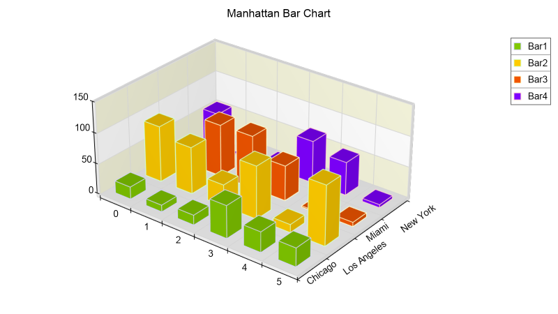
Bar and Column charts are among the most widely used charting series in business visualizations. They make it easy to compare values across products, regions, periods, or other categories.
NOV Chart supports conventional, stacked, 100% percent-stacked, clustered, floating, and range-based Bar and Column charts. In addition, chart orientation can also be modfied so that series can be displayed horizontally or vertically. They can also be customized with individual fill effects, outlines, labels, and markers. In the case of 3D charts, the developer can choose from a large set of predefined lighting schemes for greater visual impact.
These bar chart variations can be used to present revenue by region, actual versus budget values, product performance, survey results, inventory levels, project progress, and many other categorical comparisons.
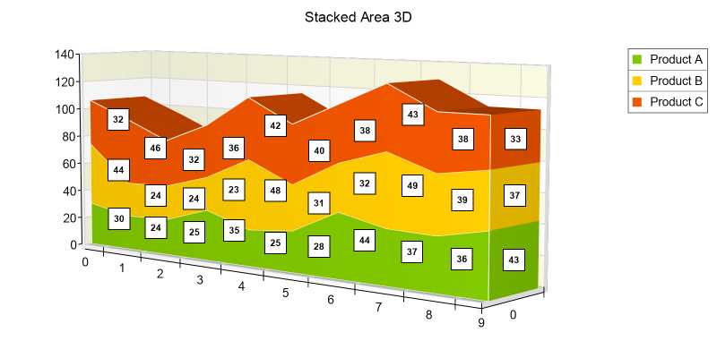
Line charts show how values change across time or another continuous sequence. They are commonly used to visualize sales, expenses, customer activity, website traffic, market share, productivity, and other business metrics whose direction and rate of change are important.
Area charts are similar to line charts but emphasize the magnitude of those changes by filling the region between the series and its baseline. Stacked and percent-stacked Area charts can also show how individual categories contribute to a total over time.
NOV Chart supports conventional, stacked, and XY scatter variations of the Line and Area series.
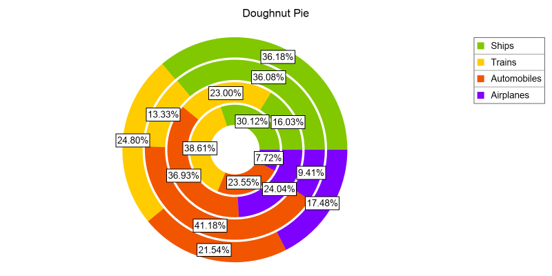
Pie and Doughnut charts show how individual categories contribute to a whole. They are widely used for compact summaries of market share, budget allocation, revenue composition, customer segments, expense distribution, and portfolio structure.
NOV Chart supports 2D and 3D Pie charts and their Doughnut, Semi-Pie, and Exploded Pie variations. Developers can configure all aspects of the Pie series, including exploded segments, begin/end angles, labels, and the appearance of individual data points.
One of the most challenging aspects of pie charts is the ability of the chart to annotate pie segments in a consistent way without label overlapping. NOV Chart addresses those issues using several pie chart labelling modes (Spired No Overlap and Rim No Overlap), which internally use a force-directed layout to resolve label overlapping while also aiming for the label to stay as close to the original proposed point as possible.
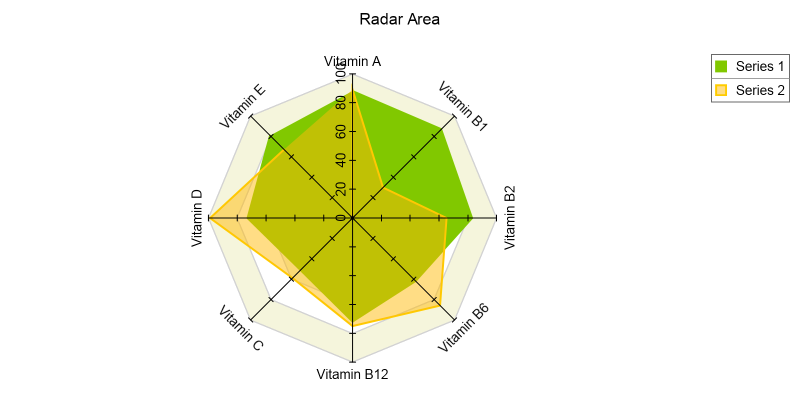
NOV Chart also supports some less common business charts such as the Funnel, Radar, and Treemap.
Funnel charts represent the successive stages of an elimination process. They are commonly used to visualize sales pipelines, lead conversion, recruitment workflows, order fulfillment, and other processes in which the initial quantity is progressively reduced. NOV Chart supports Funnel charts in both 2D and 3D.
Radar charts, also known as Spider or Star charts, compare three or more variables on axes that radiate from a common center. Radar Line and Radar Area series are useful for comparing product profiles, employee assessments, departmental performance, service quality, and other multivariable business data. NOV Chart also supports single and multi-measure Radar charts.
Treemap charts display hierarchical data as nested rectangles whose areas are proportional to the values associated with the corresponding nodes. They provide a compact way to analyze portfolios, organizational structures, product categories, market segments, and other hierarchical part-to-whole relationships.
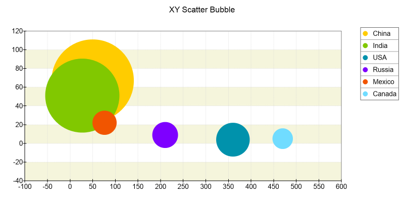
Scatter charts reveal relationships between two numerical variables by positioning observations according to independent X and Y values. They are useful for examining correlations between price and demand, cost and output, advertising spend and sales, customer age and revenue, or risk and return.
Bubble charts add a third dimension through the size of each marker, which can be separately visualized on a specified legend type. Further, color can provide an additional category or measurement, allowing a single chart to compare several dimensions of business performance without unnecessary clutter.
NOV Chart provides full support for Bubble charts including their XY and XYZ scatter variations.
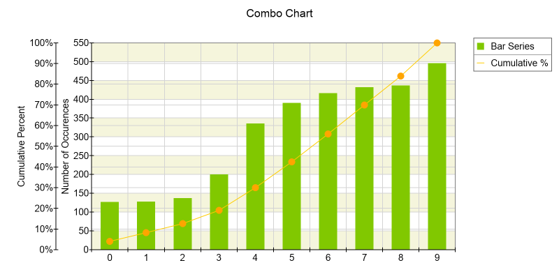
Business analysis often requires several related metrics to be shown together. NOV Chart can combine different series types in the same plot area, such as Columns for monthly revenue, a Line for profit margin, and an Area for a forecast or target range.
Series can use separate value axes when their units or ranges differ. This makes it possible to compare revenue with growth rate, units sold with average price, website visits with conversion rate, or actual results with budgets and forecasts.
Multiple plot areas can also be aligned and synchronized to create coordinated views in which related metrics share a common time or category axis while remaining visually distinct.
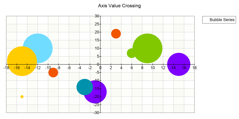
NOV Chart supports an unlimited number of X, Y, and Depth axes, allowing a single chart to display business measures that use different units, scales, or value ranges. For example, revenue, profit margin, and sales volume can be presented together while each measure retains an appropriate axis.
Axes can be docked to any side of the plot area, positioned at custom locations, or configured to cross another axis at a specified value. Developers can also control axis orientation, tick marks, labels, titles, rulers, gridlines, and visual appearance.
Axis cursors and value indicators enable interactive data inspection, while synchronized axes make it easier to compare related measures across multiple chart areas. These capabilities provide the flexibility required to build sophisticated financial, operational, analytical, and executive dashboards.
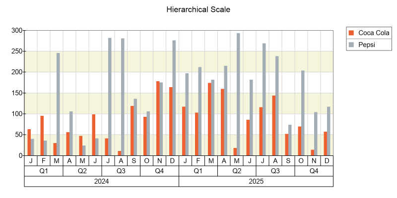
NOV Chart supports commonly used ordinal, numeric, logarithmic, and date-time scales, as well as advanced scale types such as hierarchical, table, value-timeline, and range-timeline scales.
Date-time scales can use configurable work calendars that exclude weekends, holidays, and other nonworking periods. This allows business data to be displayed using only the time intervals relevant to the analysis.
These scale types cover a wide range of business applications, from simple category comparisons to historical analysis, project timelines, and the visualization of data produced through grouping and pivot aggregation.
All scales support automatic and custom scale breaks that can exclude unimportant ranges or reduce the visual impact of outliers. Scale sections, constant lines, stripes, range selections, and axis cursors can emphasize budgets, targets, deadlines, acceptable ranges, and other important business thresholds.
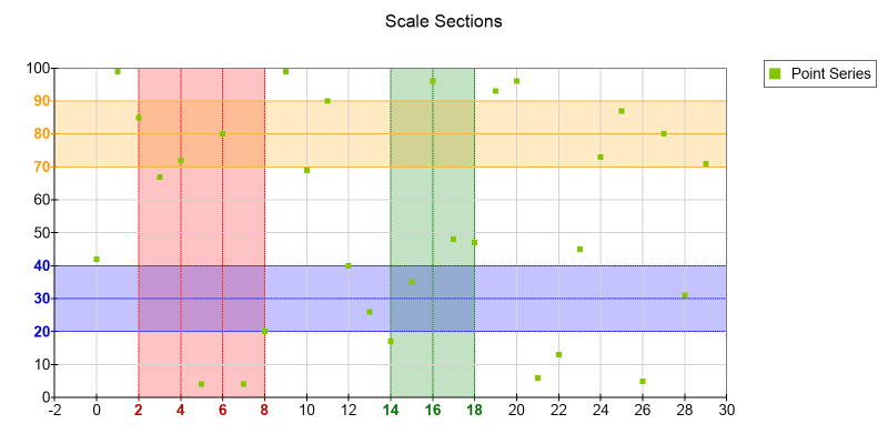
Clear labeling is essential for effective business communication. NOV Chart provides flexible data labels, axis labels, chart titles, legends, tooltips, and annotations that can display values, percentages, category names, series names, dates, or custom text.
NOV Chart provides a two-stage automatic data-label layout system. Initial positioning selects suitable locations around each data point, while label adjustment moves intersecting labels apart. The layout can also protect data points from being covered and remove labels when a suitable non-overlapping position cannot be found.
Legends can be populated automatically from series or manually with custom items, and can represent multiple series or charts. Constant lines, stripes, scale sections, and custom labels can highlight product launches, campaign periods, targets, deadlines, and exceptional results without modifying the underlying dataset.
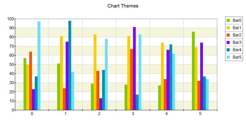
NOV Chart offers extensive appearance customization so that charts can match an application's visual identity or an organization's branding. Developers can configure colors, palettes, fonts, strokes, fills, gradients, transparency, antialiasing, alpha blending, and lighting for individual chart elements.
CSS-like styling rules and reusable themes help maintain a consistent appearance across dashboards, reports, and application screens. Individual data points can also be formatted independently to emphasize top performers, negative results, selected categories, forecasts, or values that require attention.
The resolution-independent, WYSIWYG rendering engine produces clean output on screen and preserves the same high quality in exported images and printed reports.
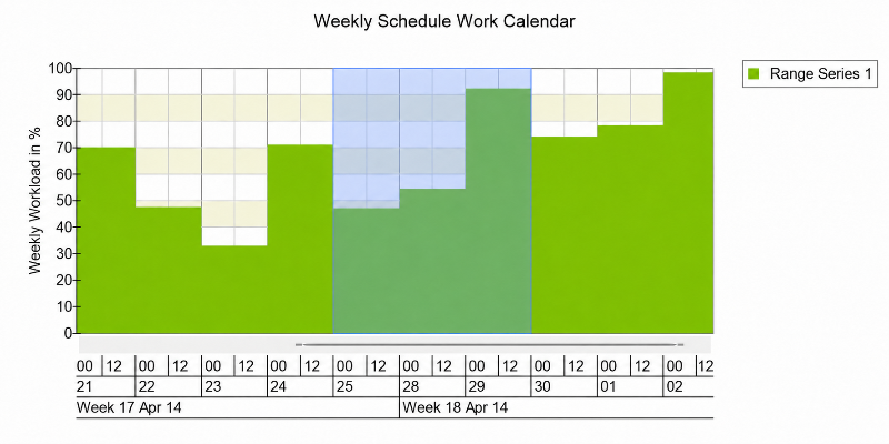
NOV Chart includes built-in tools for exploring business data interactively. Users can zoom into a time period or category range, pan across the plot area, and navigate larger datasets using axis scrollbars and mouse-wheel zooming.
Tooltips, axis cursors, trackball interaction, hit testing, and data-point selection make it possible to inspect exact values and identify the series, category, or observation beneath the pointer. These capabilities are useful for dashboards in which users need to move quickly from an overview to a detailed examination of individual results.
Application code can respond to selections and chart events to update supporting tables, filters, detail panels, or related charts, enabling coordinated analysis and drill-down workflows.
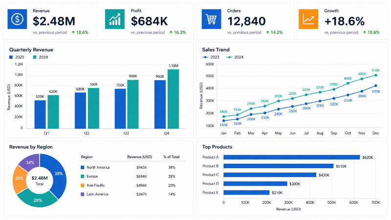
NOV Chart can be combined with NOV Gauge, NOV Grid, NOV Diagram and NOV Rich Text Editor to build complete business dashboards and executive scorecards. A single view can present detailed charts alongside headline KPIs, targets, status indicators, and raw tabular information.
Dashboards can monitor sales performance, operational efficiency, financial results, customer activity, project status, service levels, inventory, or any other measurable business process.
The flexible layout system supports responsive layouts, high res displays, and WYSIWYG printing out of the box.
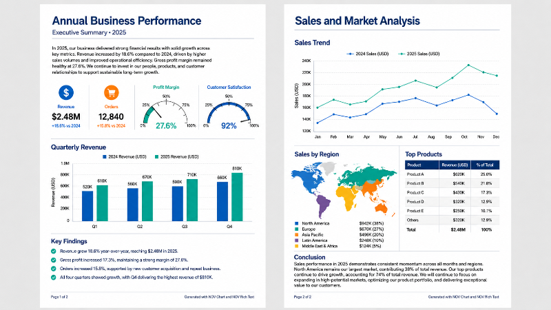
NOV Chart can be used alongside NOV Rich Text Editor, NOV Diagram, and the other controls in the suite to generate programmatic business reports containing charts, tables, KPIs, diagrams, and formatted explanatory content.
Because the NOV controls can operate on any .NET Core server, they are well suited for automated report generation on AWS, Azure, Docker, and other ASP.NET Core-compatible environments. Reports can be created on demand or produced as part of scheduled business processes.
Charts can be printed or exported to raster formats such as PNG, JPEG, BMP, GIF, and TIFF, as well as vector formats such as SVG, PDF, WMF, EMF, and EMF+. Output can be written to a file or memory stream for use in presentations, management reports, websites, email summaries, and high-resolution printing.
Create Bar, Column, Pie, Doughnut, Semi-Pie, Line, Area, Bubble, Scatter, Funnel, Radar, Treemap, and many other charts for common business-analysis requirements.
Present most chart types in precise 2D views or visually engaging 3D views using a consistent charting API.
Combine multiple series types and axes to compare business metrics with different units, scales, targets, and forecasts.
Configure numeric, logarithmic, date-time, ordinal, hierarchical, value-timeline, and range-timeline scales with custom ranges, labels, breaks, sections, and reference lines.
Apply branded palettes, fonts, fills, strokes, labels, legends, reference elements, lighting, and visual effects throughout dashboards and reports.
Enable users to explore results through zooming, panning, scrolling, selection, axis cursors, tooltips, trackball interaction, hit testing, and interactive 3D viewing.
Combine charts with gauges, grids, labels, diagrams, and other NOV UI controls to create integrated dashboards and executive scorecards.
Print charts, export them to raster and vector formats, or combine NOV Chart with NOV Rich Text Editor to generate comprehensive business reports.
Create business-charting applications for WPF, WinForms, Blazor WebAssembly, and macOS using a consistent API and a single C# codebase.
Integrate professional business visualizations into analytics tools, reporting systems, management applications, operational dashboards, and custom enterprise software built with .NET.


