
ProductsAll Products
.NET Components
 Open Vision for .NET
 NOV Chart for .NET
 NOV Diagram for .NET
 NOV Rich Text Editor for .NET
 NOV Grid for .NET
 NOV Schedule for .NET
 NOV Gauge for .NET
 NOV Barcode for .NET
 NOV User Interface for .NET
 Vision for .NET
 Chart for .NET
 Diagram for .NET
 User Interface for .NET
 Vision for SSRS
 Chart for SSRS
 Gauge for SSRS
 Map for SSRS
 Barcode for SSRS
 Vision for SharePoint
 Chart for SharePoint
 Gauge for SharePoint
 Map for SharePoint
 Barcode for SharePoint
DownloadsAll Downloads
NOV Chart for .NET is a powerful framework for building statistical analysis and data-visualization applications with C# and .NET. It provides a rich selection of 2D and 3D chart types, advanced axes, and combines them with a set of predefined statistical formulas covering descriptive statistics, regression and trend analysis, statistical distributions, correlation relationships, statistical process control, and others.
The built-in Formula Calculator gives developers access to an Excel-like formula engine, which allows them to mix statistical functions with common math and other predefined functions. Calculated results can be visualized directly in the chart and linked to different series such as point, line, and area, making it possible to transform the calculated results into clear analytical views for business intelligence, scientific research, quality control, finance, healthcare, education, and engineering.
The easy, out-of-the-box integration of NOV chart with the other controls in the suite allows you to easily build statistical dashboards, analysis tools, forecasting applications, and automated reports with embedded statistical charts for from a single codebase.
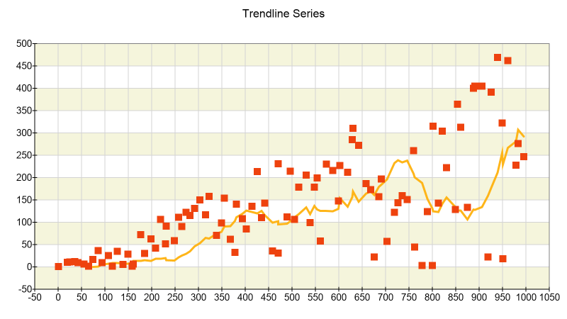
The Trendline Series provides built-in support for the visualization of exponential, linear, polynomial, logarithmic, and power regression along with moving average analysis.
The Trendline series can be used to analyze growth, demand, performance, degradation, adoption, experimental response, and other relationships in which the dependent variable changes according to one or more independent variables.
It also allows you to easily mix the underlying content with other series such as XY scatter points, thus showing the relationship between the raw data and the trend to the user.
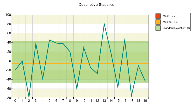
Descriptive statistics aims to summarize characteristics of a dataset like distribution and variability. Charts showing those data set characteristics are widely used in scientific research, financial analysis, quality control, business reporting, process monitoring, and other applications.
NOV Chart can calculate and visualize all common descriptive measures, including minimum, maximum, mean, median, range, variance, standard deviation, percentiles, and others. These values calculated by the built-in statistical functions can be presented alongside the raw data using reference lines, error bars, range/fan charts, and other chart elements.
Multiple statistical measures can be combined in a single chart or shown alongside in several charts to compare datasets and identify trends, evaluate variability, detect outliers, and reveal patterns that may not be immediately apparent from the raw data itself.
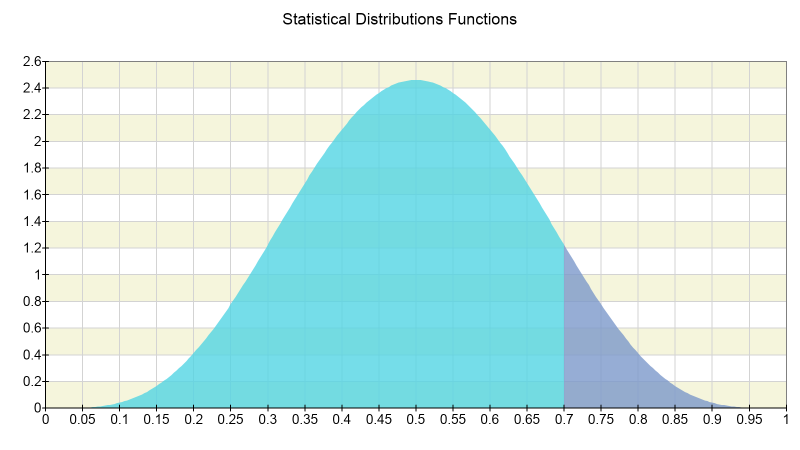
Statistical distributions describe how values or probabilities are distributed across a range of possible outcomes. NOV formulas can be used to calculate probability density, probability mass, cumulative distribution, and inverse distribution values and then visualize the results using line, area, bar, point, and other chart types.
Both continuous and discrete distributions are supported, including commonly used models such as the normal, log-normal, exponential, binomial, Poisson, chi-square, Student's t, and F distributions. Developers can control distribution parameters and compare theoretical models with observed data.
Statistical distributions are useful for probability analysis, hypothesis testing, confidence interval estimation, quality control, reliability analysis, risk modeling, forecasting, scientific research, and many other applications involving uncertainty and variation.
Correlation and covariance help users investigate how two variables change in relation to one another.
NOV Chart supports mixing these calculations with Bars, XY Scatter Points, Bubble Charts, trendlines and other chart elements to create informative charts that visualize the data and and supporting statistics together.
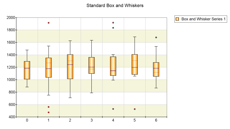
Box and Whisker charts summarize the distribution of a dataset using its central value, quartiles, spread, and extreme observations. They make it easy to compare the location and variability of several samples or categories without plotting every observation individually.
NOV Chart supports standard, XY, and Date-Time Box and Whisker series. They are suitable for comparing experimental groups, manufacturing batches, regional results, financial returns, response times, clinical measurements, and other grouped data.
Multiple series can be displayed in the same chart with customized fills, outlines, labels, axes, and tooltips, allowing developers to create clear statistical comparisons that remain consistent with the visual design of the surrounding application.
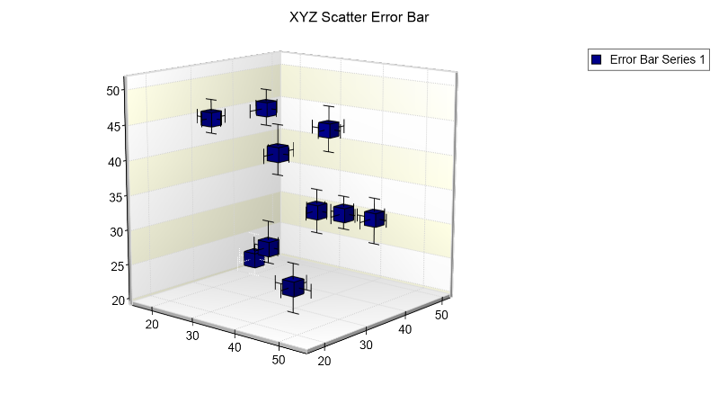
Error Bar charts visualize uncertainty or expected variation around measured and calculated values. They can represent standard deviation, standard error, confidence intervals, measurement tolerance, minimum and maximum ranges, or other application-specific bounds.
NOV Chart supports categorical Error Bar, XY Error Bar, and XYZ Error Bar series. In addition Range, High-Low, and other chart series can also be used to display intervals, envelopes, acceptable limits, and differences between lower and upper values.
Axis constant lines (reference lines), stripes, and scale sections can be used to emphasize targets, control limits, warning zones, and acceptance ranges. This makes NOV Chart very useful for statistical process control, laboratory measurements, quality assurance, forecasting, and performance analysis.
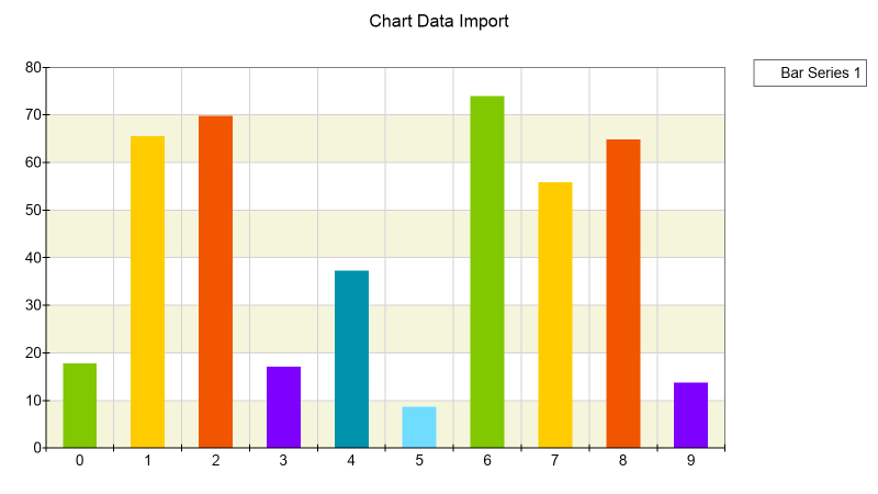
NOV Chart can import single- and multi-series data from common .NET data sources, including enumerable collections, NOV data tables, and database readers. Data binding can keep chart series synchronized with a changing source, reducing the amount of application code.
Raw data, calculated values, fitted curves, moving averages, and statistical thresholds can be presented as separate series in the same chart. Multiple axes allow datasets with different units or numerical ranges to remain readable while sharing a common plot area.
This architecture supports both predefined statistical dashboards and applications in which users select variables, parameters, aggregation methods, or models at runtime.
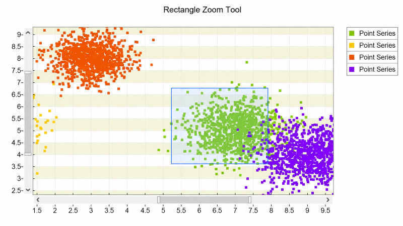
NOV Chart provides built-in tools for examining statistical data in detail. Users can zoom into a region of interest, pan across large datasets, and scroll through observations using interactive axis scrollbars. Mouse-wheel zooming can focus on the current pointer position for precise exploration.
Crosshair cursors, tooltips, data labels, and hit testing make it possible to inspect individual observations, fitted values, ranges, and calculated series directly within the chart. Range selections can also help users focus on a particular time interval or subset of values.
Interactive analysis is especially valuable when users need to investigate anomalies, compare model predictions with actual observations, or identify the values responsible for an aggregate statistical result.
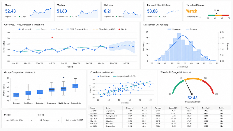
NOV Chart can be used to build interactive dashboards for business intelligence, quality control, forecasting, risk analysis, research, healthcare, education, and engineering. Dashboards can combine several synchronized charts with tables, gauges, labels, and other analytical views.
A single dashboard can display source observations, fitted trendlines, distribution summaries, key statistical measures, and threshold indicators. Users can compare groups, filter periods, inspect outliers, and evaluate relationships without switching between disconnected tools.
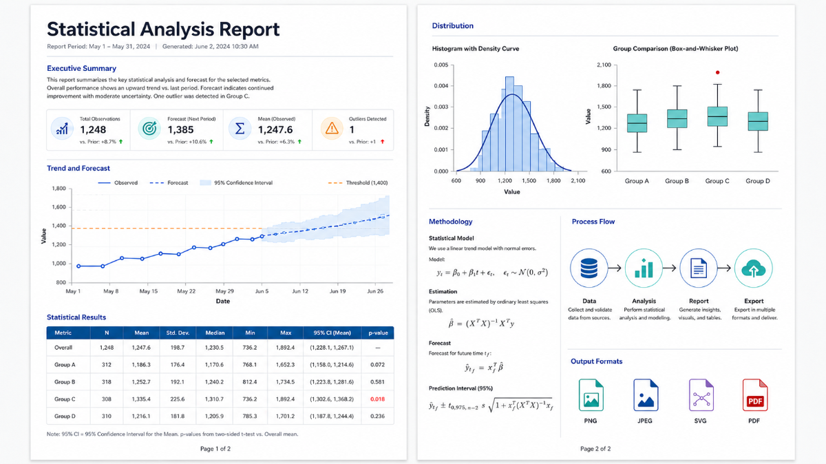
NOV Chart can be used alongside NOV Rich Text Editor, NOV Diagram, and the other controls in the suite to generate programmatic reports containing statistical charts, tables, formulas, explanatory text, and diagrams.
Because the NOV controls can operate on any .NET Core server, they are well suited for automated report generation on AWS, Azure, Docker, and other ASP.NET Core-compatible environments. Reports can be created on demand, in scheduled batches, or in response to newly available data.
Statistical visualizations can be exported to raster and vector formats, including PNG, JPEG, SVG, and PDF, for use in presentations, technical publications, management reports, and high-resolution printing.
Visualize Linear, Exponential, Logarithmic, Polynomial, and Power Regressions as well as Moving Average trendlines together with the original data.
Calculate regression models, averages, variability measures, correlations, covariances, probability distributions, inverse distributions, and other analytical results.
Use Box and Whisker, Error Bar, Range, High-Low, Scatter, Bubble, Line, Area, and Bar charts to communicate distributions, uncertainty, relationships, and comparisons.
The output of the precalculated values can easily combine source data, fitted curves, moving averages, calculated series, thresholds, and reference ranges in the same chart.
Enable users to explore statistical datasets through zooming, panning, scrolling, range selection, crosshair cursors, tooltips, and hit testing.
Populate and update analytical charts from enumerable collections, NOV data tables, database readers, and other common .NET data sources.
Generate statistical reports programmatically and export visualizations to raster and vector formats for documents, presentations, and technical publications.
Create statistical charting applications for WPF, WinForms, Blazor WebAssembly, and macOS using a consistent API and a single C# codebase.


