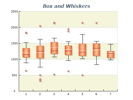
Nevron Logo

ASP.NET Box And Whiskers Chart

Box and Whiskers Chart

A Box and Whisker chart, or a Box plot, is a powerful chart for visualizing statistical data. It displays the distribution of a dataset using quartiles and outliers, allowing users to quickly identify patterns and trends. The chart consists of a box representing the middle 50% of the data, with a line inside indicating the median value. The chart displays the minimum and maximum values as whiskers that extend from the box, and any outliers are represented as individual data points beyond the whiskers. Furthermore, it is highly customizable with options to adjust colors and labeling, making it an effective tool for data analysis.

Sample Table Format

Sample NameMinimumLower QuartileMedianUpper QuartileMaximum
Sample A 58101520
Sample B 1012151825
Sample C 810121622

This table represents three different samples of numerical data, each with five statistical measures. The minimum and maximum values indicate the range of values in each sample, while the lower and upper quartiles represent the 25th and 75th percentiles, respectively. The median is the value that divides the data into two halves. Comparing the values across the samples, we can observe differences in their distributions, ranges, and central tendencies. The box and whisker chart is a valuable tool to visually compare these characteristics and identify any outliers or unusual patterns in the data.

Best practices for using box and whiskers charts

  • Use Box and Whiskers charts to compare data: Box and Whiskers charts are excellent for comparing data between different groups. Use them to compare data points across multiple categories or periods.
  • Label your chart clearly: It's important to label it with a clear and descriptive title and label the axes with meaningful units of measure.
  • Ensure your data is accurate: Check it carefully before creating your chart to ensure it is accurate and up-to-date.
  • Use colors carefully: Sparingly and purposefully highlight important information in your chart. Avoid using too many bright colors that may distract from the data
  • Include relevant statistical information: Include relevant statistical data in your chart, such as the median, quartiles, and outliers.
  • Choose an appropriate scale: Choose a scale appropriate for the displayed data. A smaller scale may be more suitable if the data is tightly clustered.
  • Avoid clutter: Avoid cluttering your chart with too much information. Use a clear and simple design to make it easy to interpret the data.