Nevron Logo

Stock Chart

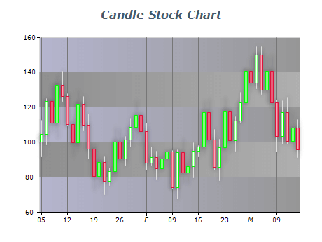
Stock charts are essential in data visualization for investors and traders to analyze historical market data and current trends, helping them to stay ahead of the curve, minimize risk, and maximize returns. These charts visualize stock prices over a period of time, such as days, weeks, months etc. The stock chart supports the two most common variations - candlestick and stick. Stock charts can easily be combined with build in technical analysis tools and indicators like moving averages, trend lines, and oscillators. By doing so, investors and traders can identify potential buy and sell signals, devise risk management strategies and determine entry and exit points for better investment decision-making.

Sample Table Format

DateOpenHighLowCloseVolume
2022-01-03 142.55 144.81 141.71 142.77 15574100
2022-01-04 141.23 141.79 138.64 139.53 17719200
2022-01-05 139.97 140.78 138.10 140.41 12134700

This is a simple example of a stock market data table with columns for Date, Open, High, Low, Close, and Volume. Each row represents a day's worth of data, with the date in the first column and the corresponding values for the other metrics in the subsequent columns. This format allows for easy sorting and analysis of the data and can be used to create charts and visualizations.

Best practices for using stock charts

  • Choose the right chart type: There are stock charts, such as line charts, candlestick charts, and bar charts. Choose the chart type best suits your data and the insights you want to convey.
  • Use a consistent time frame: When presenting historical stock data, use a consistent time frame throughout the chart. This allows viewers to easily compare trends and patterns over time.
  • Label your axes: Clearly label your chart's x and y axes so that viewers can understand the data. Use descriptive labels that include units of measurement and periods.
  • Avoid clutter: Avoid adding too much information to your stock chart, such as multiple indicators or excessive annotations. This can make the chart difficult to read and understand.
  • Use color strategically: Use color to highlight important data points or trends. However, be careful not to use too many colors or color schemes that are difficult to interpret.