Nevron Logo

Tree Map Chart

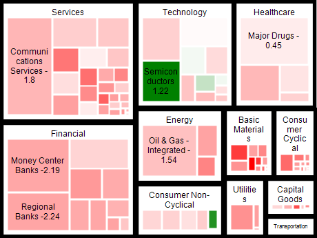
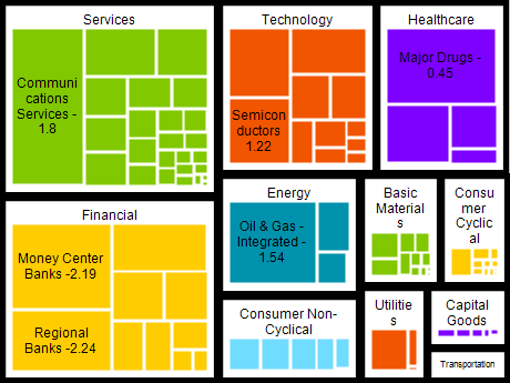
The Tree Map Chart Series is a type of chart series that enables you to create visually appealing and interactive treemap charts. Treemap charts are a type of visualization that displays hierarchical data using nested rectangles or boxes, where the size and color of each rectangle represent different variables.
The TreeMap Chart Series is widely used in data analysis, finance, and business intelligence, enabling users to represent complex data in an easy-to-understand format. The TreeMap Chart Series allows users to create charts that display data in a hierarchical structure, allowing them to drill down into the data and analyze it at different levels of granularity.
One of the key advantages of the TreeMap Chart Series is that it allows users to visualize large amounts of data in a small space. The TreeMap Chart Series automatically adjusts the size of each rectangle based on the data, ensuring that the chart is visually appealing and informative. Additionally, the TreeMap Chart Series allows users to customize the color and style of each rectangle, making it easy to highlight specific trends or data points.
TreeMap Chart Series is a valuable tool for anyone who needs to visualize hierarchical data. It provides an intuitive and easy-to-understand format for displaying complex data sets, making it an ideal tool for data analysts, finance professionals, and business intelligence experts.

Sample Table Format

GroupSubgroupValue
A A1 10
A A2 20
B B1 15
... ... ...

The data is organized into groups and subgroups in this table, with a corresponding value for each subgroup. This table format can be easily visualized using a TreeMap Chart Series, with each group represented as a large rectangle and each subgroup represented as a smaller rectangle within the group rectangle. The size and color of each rectangle can be customized to reflect the value of the subgroup, making it easy to identify trends and patterns within the data.

Best practices for using tree map charts

  • Keep it simple: The TreeMap Chart Series is a powerful tool, but avoiding cluttering the chart with too much information is important. Stick to a few key variables and try to make the chart as easy to understand as possible.
  • Use color wisely: Color can be a powerful tool for highlighting trends or patterns within the data, but it can also be overwhelming if misused. Use color sparingly and ensure that each color has a clear meaning
  • Group similar data: Grouping similar data together can make identifying patterns within the data easier. Consider grouping data by category, region, or period, depending on your data set.
  • Provide context: Always provide context for your chart by including a title, axis labels, and a legend. This will help users understand what they are looking at and interpret the data correctly.