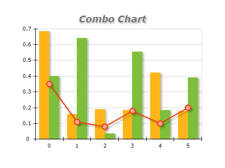
Combo charts are helpful when you want to display multiple data types on a single chart. Here are some best practices for using combo charts:
- Choose the right chart types: Combo charts can include any combination of charts, such as bar, line, scatter, etc. Choose the chart types that best represent the data you want to display. For example, if you show how sales revenue and profit margin change over time, a line chart might be best for revenue, while a bar chart might be best for profit margin.
- Use consistent axes: When using multiple chart types on a single chart, it's important to ensure they are consistent across all the chart types. This means that the scales and units used on the axes should be the same. If the scales or units differ, it can be difficult for viewers to compare the data accurately.
- Limit the number of chart types: While combo charts can help display multiple data types, it's important not to overload the chart with too many. Generally, limiting the chart to at least two or three chart types is best.
- Use color and labeling effectively: To help viewers understand the chart, use color and labeling. Use different colors for each chart type to clarify which data points belong to which one. Label each chart type clearly, and include a legend to help viewers understand what each color represents.
- Choose the proper chart layout: There are different ways to layout a combo chart, such as overlaying the chart types or using multiple axes. Choose the layout that best suits the data you want to display and makes it easy for viewers to understand the relationships between the data points.