| | |
 | The Custom Series allows for painting of custom geometry within a 2D chart. It has the abilities of the chart’s custom painting feature and at the same time behaves like the other series, allowing you to specify its depth order and axis ranges. The image demonstrates one of the countless possible uses of the custom series. |
|
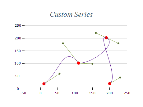
The Custom Series is a feature that enables you to create custom geometry within a 2D chart. This feature has the same capabilities as the chart's custom painting functionality while behaving like other series, allowing you to specify its depth order and axis ranges. The Custom Series can be used for various applications, providing countless opportunities to create unique and customized visualizations.
They are is commonly used in data analysis, engineering, and finance to visualize complex data sets. It allows users to create tailored visualizations that make understanding the data and uncovering insights easier. The Custom Series can also highlight specific trends, outliers, or patterns within the data, helping users make informed decisions based on their findings.
The Custom Series is a valuable tool that allows users to create sophisticated and informative visualizations that can be used in various contexts. Using the Custom Series allows users to improve their data analysis and gain deeper insights into their data. This feature provides endless possibilities for visualizing data, and it can be used in conjunction with other chart features to create comprehensive and insightful visualizations.
|
X Value | Y Value | Color |
---|
10 | 20 | Red | 20 | 30 | Blue | 30 | 40 | Green | 40 | 50 | Red | 50 | 60 | Blue |
In this table, the X and Y values represent the coordinates of each data point, while the Color column specifies the color of each point. This data could be used to create a Custom Series visualization that highlights different trends or patterns in the data based on color.
|
- Understand your data: Before creating a Custom Series, it's important to understand the data you're working with. Consider the dimensions, range, and structure of the data, as well as any trends, patterns, or outliers that may be present.
- Plan your visualization: Think about the story you want to tell with your data and how you want to present it. Consider the audience, the context, and the purpose of your visualization.
- Use appropriate chart type: The Custom Series is a powerful tool that can be used to create a wide range of visualizations, but it's important to choose the appropriate chart type for your data. Consider whether a line chart, bar chart, scatter plot, or other chart type best suits your needs.
- Keep it simple: While the Custom Series allows for complex visualizations, it's important to keep it simple and avoid clutter. Use color, shape, and other visual elements sparingly to highlight the most important aspects of your data.
- Test and refine: Once you've created your Custom Series, test it with different data sets and scenarios to ensure it's effective and informative. Refine your visualization as needed to improve its clarity and impact.
|
|