Nevron Logo

Funnel Chart

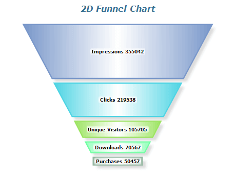
Funnel charts represent stages in a process or data progression through a sequence. With a funnel chart, you can quickly see how the data flows through each stage and identify areas where the flow is hindered. Funnel charts get their name from their unique shape, which is widest at the top and narrowest at the bottom, resembling a funnel. This shape makes it easy to compare the values of each stage, and the colors can be customized to provide additional context or highlight specific stages. Funnel charts are versatile tools that analyze data types, such as sales or website traffic. By visualizing data in a funnel chart, you can gain insights into the progression of your data through different stages and identify areas for improvement. This makes funnel charts an effective way to optimize processes and achieve better results.

Sample Table Format

StageVisitorsLeadsOpportunitiesSales
Awareness100050010020
Interest5002507515
Consideration2001005010
Decision10050255

In this example, each row represents a process stage, such as awareness or consideration. The columns in the Funnel Chart represent the number of visitors at each stage and the number of conversions that occur, such as leads, opportunities, and sales. This helps to visualize the flow of potential customers through various stages and identify areas where the process may need improvement. This table can be used to create a funnel chart that visualizes the data flow through each stage, making it easy to spot any bottlenecks or areas where the flow is impeded.

Best practices for using funnel charts

  • Keep it simple: The funnel chart should be easy to read and understand, so it's best to avoid cluttering it with unnecessary details.
  • Use meaningful categories: The categories should be descriptive and meaningful so it's clear what each stage of the funnel represents.
  • Order the categories logically: The categories should be ordered in a logical sequence that reflects the data flow through the funnel.
  • Use consistent units: Make sure the units used for each funnel stage are consistent throughout the chart.
  • Avoid too many categories: A funnel chart with too many categories can be overwhelming and difficult to read. It's best to limit the number of categories to 5-7, if possible.
  • Highlight the drop-off rate: Use color or other visual cues to highlight the drop-off rate at each stage of the funnel, as this can help identify areas for improvement.