|
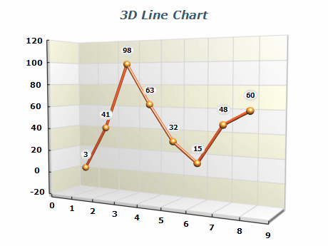 | A standard 3D categorical line chart is a visualization that represents data points connected by lines. It's a helpful tool for displaying trends and patterns in data. The chart can be customized with markers of various shapes and fill options to highlight specific data points. This makes it easier for viewers to interpret and understand the presented data. |
|
|
A 2D line chart with different image effects such as soft shadows and gradients. To create visually appealing designs, the chart can be stylized with image effects like shadow, glow, bevel/emboss, and lighting. |  |
|
|
 | Smooth line charts connect the distincst data points with cubic curves, making it easier to identify trends and patterns in the data. Each data point can be highlighted with markers of various shapes and fill options. |
|
|
An XYZ line chart represents a line that connects data points with custom XYZ coordinates. With this chart, you can visualize how data points are distributed across the x, y, and z axes and detect trends and patterns that might be missed with other chart types. This charting type is commonly used in scientific charts. |  |
|
|
 | Date-Time Step Line Chart is type of XY scatter line chart, where the X values represent dates or times when the measurement has happened. This chart is handy for visualizing trends and patterns in data collected over a period of time. The Date-Time Step Line Chart allows you to see the general direction of the movement while also showing the specific points at which changes occurred. |
|
|
A stacked line chart is similar to a stacked bar chart and allows the user to compare the contribution of different measurements to a total over different categories or time spans. By stacking the lines on top of each other, you can easily see which categories are growing or declining and how they affect the overall trend. |  |
|
|
 | Several categorical line series visualized a tapes in 3D. The chart can be useful when comparing data sets with similar or overlapping trends. |
|
|
The multi series line chart allows the visualization of several trends over a common set of categories or time spans in a single chart. This allows you to easily compare and contrast the trends of each series. This approach can provide insights into complex data, enabling the user to spot different trends and patterns. |  |
|
|
 | A parallel line chart is a variation of the standard line chart in which each data point represents a distinct category. Instead of explicit x-values, the horizontal position of each point is determined by the axis corresponding to its category. Multiple parallel line charts can share axes across categories, enabling users to quickly compare and analyze multivariable data. |
|
|
A 3D parallel line chart is similar to its 2D counterpart, but line series can also be positioned along the depth axis. This enables the visualization of multiple stacked or overlapping parallel line series that share a common set of categories. |  |
|
|
 | XYZ Line Chart representing Lorenz Attractor – a complex fractal structure corresponding to the long-term behavior of a 3-dimensional dynamical system that exhibits chaotic flow and evolving without ever crossing itself. |
|
|
3D Step line chart with dimension scale X-axis. Step line chart series display data points connected with HV segments. Markers with various shapes and fill options can be used for each data point. |  |
|
|
 | A special variation of the line chart series called "fast line series" allows you to plot millions of data points in real time using GPU acceleration. In this image, two 2D signals are represented using the fast line series. For the second custom color is assigned per data point to emphasize the amplitude of the signal. |
|
|
A 3D Fast Line Series used to plot millions of randomly generated points connected with line segments with custom colors using GPU acceleration. |  |
|
|


