Nevron Logo

.NET Error Bar Chart

Error Bar Chart

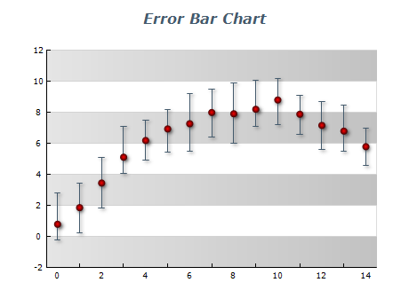
An Error Bar chart is a statistical chart used to represent data variability. It displays the range and distribution of a data set by indicating the degree of uncertainty or error associated with each data point. Error bars can show standard deviation, standard error, confidence intervals, and other statistical measures. They are typically displayed as vertical or horizontal lines extending from each data point, with the line length indicating the magnitude of the error. Error Bar charts are useful for comparing data sets, identifying outliers, and determining the level of uncertainty associated with each data point.

Sample Table Format

SampleMeanStandart Deviation
A102
B203
C151.5
D122.2
E181.8

To create an Error Bar chart, you can use a table that lists each data point with its corresponding mean value and standard deviation. The table can also include other statistical measures, such as standard error or confidence intervals, depending on the specific needs of your analysis. By incorporating this data into the chart, you can easily visualize the range and distribution of each data point, making it simpler to identify patterns and outliers.

Best practices for using error bar charts

  • Choose the appropriate type of error bar: Error bars can be vertical or horizontal, representing different statistical measures such as standard deviation or standard error. It's important to choose the type of error bar that best describes your data and your research question.
  • Ensure the error bars are clearly visible: It's essential to ensure that the error bars in your chart are clearly visible. They should be sized appropriately to make them easily distinguishable but not so large that they overpower the data points. Additionally, the color and thickness of the error bars should match the overall chart design to maintain consistency and clarity. By taking these measures, you can create an Error Bar chart that presents the data accurately and is easy to interpret.
  • Use appropriate scaling: The scale of the chart should be suitable for the range of the data. The error bars may be difficult to interpret if the scale is too large or too small.
  • Provide context: Error bars should be interpreted in the context of the data set and the research question. Providing labels, titles, and captions can help provide context and clarity.
  • Consider the audience: The chart's level of detail and information should be appropriate for the intended audience. It's important to keep in mind the level of statistical knowledge of your audience and tailor the chart accordingly.