Nevron Logo

Heat Map Chart

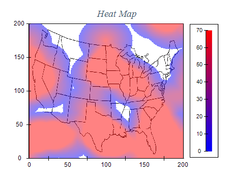
Heat Map Chart Series is a chart that uses color coding to represent data values in a matrix or tabular format. This type of chart is often used to visualize large data sets, allowing users to quickly identify patterns and trends.
The Heat Map Chart Series is widely used in various industries, including finance, healthcare, and marketing, to help analysts make data-driven decisions. The chart provides a simple yet effective way of representing complex data sets in a visually appealing format.
Heat maps are created by assigning different colors to different data points based on their values. The colors range from light to dark, with lighter shades indicating lower values and darker colors indicating higher values. This makes it easy for users to identify patterns and trends within the data and outliers and anomalies.
One of the main advantages of the Heat Map Chart Series is that it enables users to identify trends and patterns in their data quickly. It is also helpful for identifying correlations between variables and potential outliers in the data set.

Sample Table Format

MonthNew YorkLos AngelesMiamiChicago
January 32F 65F 70F 20F
February 30F 68F 72F 23F
March 40F 70F 75F 32F
... ... ... ... ...

This table shows the average temperature in Fahrenheit for different cities across different months of the year. The table can be used to create a Heat Map Chart to visually represent the temperature data more intuitively.

Best practices for using heat map charts

  • Choose the right data: Heat map charts work best with large datasets with a clear structure. Be sure to choose data that can be quickly sorted and displayed in a grid-like format.
  • Use a color scheme that makes sense: Color is a critical element of heat map charts. Use a color scheme that is easy to understand and does not distract from the data. Consider using a gradient that moves from light to dark or cool to warm colors.
  • Choose an appropriate scale: The scale of your heat map chart should be appropriate for the data you're displaying. Consider using a logarithmic scale for data that spans multiple orders of magnitude.
  • Label your axes and legend: Clearly label your heat map chart's x and y axes so that viewers can easily understand the data. Also, provide a code that explains the color scale.
  • Don't overload the chart: Heat map charts can quickly become overwhelming if there is too much data on the chart. Consider breaking up your data into multiple charts or using a different type of visualization for some of the data.
  • Use heat maps to identify patterns: Heat map charts are especially useful for identifying patterns in data, such as hotspots or clusters. Use these patterns to guide your analysis and decision-making.