Include a zero-baseline
It is a good practice to have a zero baseline when using shading in a line chart or an area chart, as this allows for an accurate comparison of the sizes of each group's values. Without a zero baseline, the group values ratio may not match what is shown in the plot.
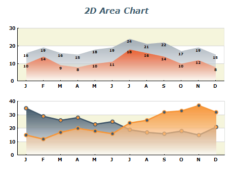
While it is generally recommended to have a zero baseline in a shaded area chart to compare the sizes of different groups accurately, there are some exceptions. For instance, when comparing two series in an overlapping area chart, limiting the shading to the area between the lines instead of extending to a common baseline allows for zooming the vertical axis limits into the area of interest without requiring a baseline. In such cases, the shading represents which group has a higher value, and the color's intensity indicates the difference's magnitude.
Limit the number of series in overlapping area chart
As the number of series increases in an overlapping area chart, the number of color combinations also increases. This can make it challenging to interpret the chart, as most colors will only be associated with one group. When comparing two series in an overlapping area chart, it is easy to mistake it for a stacked area plot if one series is consistently larger. The overlapping colors can also confuse readers, as they are not included in the general legend. It is best to limit overlapping area charts to only two series and consider using a line chart to show the comparison between groups more clearly.
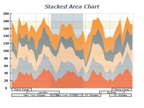
Consider the order of areas in the stacked area chart
The sequence in which the areas of different groups are arranged for plotting does not change the shape of a plot, but it can affect visualization reading. Placing the largest or most stable groups at the bottom and the smallest or most variable groups at the top can improve readability. This makes the most important group easily distinguishable as the bottom-most.