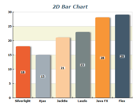
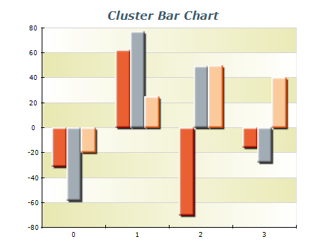
| | |
 | Nevron’s graphics engine provides the 2D scene with state-of-the-art image quality and legibility, and also conforms to Windows standards for 2D graphics rendering. Image effects such as shadow, glow, bevel/emboss and lighting make it possible to apply complex visual styles to any 2D scene. |
|
|
![3 D Bar Chart]() | Bar series provide the capability to display discrete data ranges with marked delimitation between data points. Multiple bar series with vertical or horizontal orientation may be combined using stacked bars, clustered bars, or arranged in different depths in order to provide full data visibility and legibility. |
|
|
![Cluster Bars Chart]() | Cluster bar charts allow visual comparison between corresponding values of synchronized data ranges. |
|
|
![Stacked Bars Chart]() | Stacked bar series provide the capability to present data in cumulative sections and their totals. |
|
|
![xyz Stack Bars Chart]() | XYZ rendering of stacking and clustering. |
|
|
![Manhattan Bar Chart]() | Use Multiseries in a 3D scene to create Manhattan Bar charts, perfect to compare different items over a period of time and to effectively display changes from one category to another. |
|
|
![Dual Horizontal Bars Chart]() | Horizontal orientation of the bars is required by many real-life scenarios. This particular sample demonstrates the use of horizontal bar series in multiple charts positioned within the same scene as an alternative to the Clustered bar series. |
|
|
![Cluster Stack Bars Chart]() | Clustering and stacking may be combined into the same chart. In a 3D scene, clustered and stacked series may be distributed in different depths. |
|
|
![Horizontal Stacked Percent Bar Chart]() | Stacked-percent bar series represent the contribution of data series to the total. |
|
|
![xyz Scatter Cluster Bars Chart]() | XYZ rendering of stacking and clustering. |
|
| |
Bar series is commonly used for visualizing discrete data ranges with clear boundaries between data points. They can be oriented vertically or horizontally and combined in various ways, such as stacked bars or clustered bars, to enhance data visibility and legibility. You can create visually
compelling graphics communicating complex data by arranging multiple bar series in different depths. Overall, the bar series is a must for any data visualization component.
|
Item | Quantity |
---|
Product A | 50 | Product B | 80 | Product C | 120 | Product D | 70 | Product E | 90 | Product F | 110 | Product G | 60 | Product H | 100 |
In this sample, the table shows the quantity of each product. The item names are listed in the first column, while the corresponding quantities are listed in the second column. This table can create a vertical bar chart, with the item names on the x-axis and the quantities on the y-axis.
Each product's quantity will be represented by a vertical bar, making it easy to compare the quantities of different products.
|
-
Keep it simple: Use a simple and clean design for your bar chart.
Avoid adding too many colors or other design elements that can distract from the data.
-
Choose the correct type of bar chart: There are many different bar charts, such as stacked, grouped, or horizontal. Choose the type that best suits the data you are trying to visualize.
-
Label your axes:Always label the x and y axes to clarify what the data represents. Include units of measurement, if applicable.
-
Provide context to the data by including a title or subtitle explaining what the chart represents and any meaningful information relevant to interpreting the data.
-
Order your bars: Order your bars logically, making it easy to compare data. For example, you may want to order bars alphabetically or chronologically by size.
-
Use appropriate scales: Choose an appropriate scale for your y-axis. This will depend on the range of values you are visualizing. Avoid using a scale that exaggerates differences between bars, as this can be misleading.
-
Highlight important data: Use color or other visual elements to highlight important data or trends. For example, you may want to use a different color for the highest bar in a group.
-
Avoid clutter: Avoid cluttering your bar chart with too much data. Suppose you have a large amount of data to present. In that case, it may be beneficial to consider using a combination of multiple charts or alternative visualization types to display the information more effectively and in a more manageable way.
|
|