Nevron Logo

Range Series

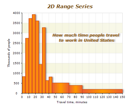
Range charts are types of charts that use 2D or 3D shapes defined by the beginning and end values of their bounding boxes. They are versatile tools that can be used to display histograms, bars with custom sizes, and 3D ranges, among other things.
With Range charts, you can easily define 2D data points by four values, forming two ranges: [Begin X - End X] and [Begin Y - End Y]. This allows you to have precise control over the size and shape of each data point, making it easier to visualize complex data sets easily.

Sample Table Format

Data PointBegin XEnd XBegin YEnd Y
Data point 4 20 22 2 8
Data point 5 20 22 2 8
Data point 6 20 22 2 8

In this table, each data point is defined by four values: Begin X, End X, Begin Y, and End Y. These values define the size and shape of the 2D range displayed in the Range chart.

Best practices for using range charts

  • Use appropriate data: The Range series is best suited for displaying data defined by two ranges, such as histograms or custom-sized bars. Ensure your data fits this criteria.
  • Choose the appropriate chart type: Nevron Chart component offers a variety of chart types, including 2D and 3D Range charts. Choose the appropriate chart type for your data to ensure it is displayed most effectively.
  • Customize the appearance: Use the range chart's appearance properties to customize the color, border, and shape of your ranges. This can help your data stand out and make it easier to read.
  • Use axis labels and titles: Use axis labels and titles to provide context and make it easier for your audience to understand your data. Ensure that the labels are clearly visible and legible.