using Nevron.Nov;
using Nevron.Nov.Dom;
using Nevron.Nov.Graphics;
using Nevron.Nov.Layout;
using Nevron.Nov.UI;
using Nevron.Nov.Windows.Forms;
using System;
using System.Windows.Forms;

namespace NovWinFormsProject
{
	public partial class Form1 : Form
	{
		#region Constructors

		public Form1()
		{
			InitializeComponent();

			// Set form title
			Text = "NOV WinForms - NToolBarExample";

			// Create the NOV example and its controls
			NWidget exampleContent = CreateExampleContent();
			NWidget exampleControls = CreateExampleControls();
			if (exampleControls != null)
			{
				exampleControls.PreferredWidth = 300;
			}

			// Place the example and its controls in a pair box
			NPairBox pairBox = new NPairBox(exampleContent, exampleControls);
			pairBox.FillMode = ENStackFillMode.First;
			pairBox.FitMode = ENStackFitMode.First;
			pairBox.Margins = new NMargins(NDesign.HorizontalSpacing, NDesign.VerticalSpacing);

			// Host the example in the form
			NNovWidgetHost host = new NNovWidgetHost(pairBox);
			host.Dock = DockStyle.Fill;
			Controls.Add(host);
		}

		#endregion

		#region Example

		public NWidget CreateExampleContent()
		{
			m_ToolBar = new NToolBar();
			m_ToolBar.Text = "My Toolbar";
			m_ToolBar.VerticalPlacement = ENVerticalPlacement.Top;

			return m_ToolBar;
		}
		public NWidget CreateExampleControls()
		{
			NStackPanel stack = new NStackPanel();
			stack.FillMode = ENStackFillMode.Last;
			stack.FitMode = ENStackFitMode.Last;

			// Create the tool bar button type radio group
			NStackPanel buttonTypeStack = new NStackPanel();

			ENToolBarButtonType[] buttonTypes = NEnum.GetValues();
			for (int i = 0, count = buttonTypes.Length; i < count; i++)
			{
				// Get the current button type and its string representation
				ENToolBarButtonType buttonType = buttonTypes[i];
				string text = NStringHelpers.InsertSpacesBeforeUppersAndDigits(buttonType.ToString());

				// Create a radio button for the current button type
				NRadioButton radioButton = new NRadioButton(text);
				buttonTypeStack.Add(radioButton);
			}

			NRadioButtonGroup buttonTypeGroup = new NRadioButtonGroup(buttonTypeStack);
			buttonTypeGroup.SelectedIndexChanged += OnButtonTypeGroupSelectedIndexChanged;
			buttonTypeGroup.SelectedIndex = 2;
			stack.Add(new NGroupBox("Button Type", buttonTypeGroup));

			// Create the events log
			m_EventsLog = new NExampleEventsLog();
			stack.Add(m_EventsLog);

			return stack;
		}
		public string GetExampleDescription()
		{
			return @"

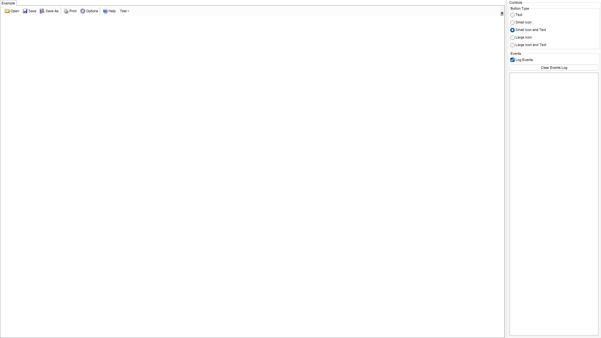
	This example demonstrates how to create a toolbar and populate it with buttons, which consist of image and text.
	Using the controls to the right you can change the size and the visibility of the images, which will result in
	recreation of the toolbar buttons.

";
		}

		///
		/// Gets the relevant documentation links for the example
		///
		///
		public (string Name, string Url)[] GetDocumentationUrls()
		{
			return new[]
			{
				("Toolbars", "https://www.nevron.com/docs/openvision/ui-toolbars.html"),
				("Command Bars Overview", "https://www.nevron.com/docs/openvision/ui-command-bars-overview.html"),
			};
		}

		#endregion

		#region Implementation

		private NImage GetSmallImage(int index)
		{
			NEmbeddedResourceRef resourceRef = new NEmbeddedResourceRef(SmallImages[index]);
			return new NImage(resourceRef);
		}
		private NImage GetLargeImage(int index)
		{
			NEmbeddedResourceRef resourceRef = new NEmbeddedResourceRef(LargeImages[index]);
			return new NImage(resourceRef);
		}
		private NPairBox CreatePairBox(NImage image, string text)
		{
			NPairBox pairBox = new NPairBox(image, text);
			pairBox.Box2.VerticalPlacement = ENVerticalPlacement.Center;
			pairBox.Spacing = 3;
			return pairBox;
		}
		private NButton CreateButton(ENToolBarButtonType buttonType, string text, int imageIndex)
		{
			NButton button = null;
			NImage image = null;

			switch (buttonType)
			{
				case ENToolBarButtonType.Text:
					button = new NButton(text);
					break;
				case ENToolBarButtonType.SmallIcon:
					image = GetSmallImage(imageIndex);
					button = new NButton(image);
					break;
				case ENToolBarButtonType.SmallIconAndText:
					image = GetSmallImage(imageIndex);
					button = new NButton(CreatePairBox(image, text));
					break;
				case ENToolBarButtonType.LargeIcon:
					image = GetLargeImage(imageIndex);
					button = new NButton(image);
					break;
				case ENToolBarButtonType.LargeIconAndText:
					image = GetLargeImage(imageIndex);
					button = new NButton(CreatePairBox(image, text));
					break;
				default:
					throw new Exception("New ENToolBarButtonType?");
			}

			NCommandBar.SetText(button, text);
			NCommandBar.SetImage(button, image);

			button.Click += OnToolBarButtonClick;
			return button;
		}
		private void RecreateToolBarButtons(ENToolBarButtonType buttonType)
		{
			m_ToolBar.Items.Clear();

			for (int i = 0, buttonCount = ButtonTexts.Length; i < buttonCount; i++)
			{
				string buttonText = ButtonTexts[i];
				if (buttonText == null || buttonText.Length == 0)
				{
					m_ToolBar.Items.Add(new NCommandBarSeparator());
				}
				else
				{
					m_ToolBar.Items.Add(CreateButton(buttonType, buttonText, i));
				}
			}

			m_ToolBar.Items.Add(new NMenuDropDown("Test"));
		}

		#endregion

		#region Event Handlers

		///
		/// Called when the user has checked a new button type radio button.
		///
		///
		private void OnButtonTypeGroupSelectedIndexChanged(NValueChangeEventArgs arg)
		{
			RecreateToolBarButtons((ENToolBarButtonType)(int)arg.NewValue);
		}
		///
		/// Occurs when the user clicks on a tool bar button.
		///
		///
		private void OnToolBarButtonClick(NEventArgs args)
		{
			string buttonText = NCommandBar.GetText((NButton)args.TargetNode);
			m_EventsLog.LogEvent("<" + buttonText + "> button clicked");
		}

		#endregion

		#region Fields

		private NToolBar m_ToolBar;
		private NExampleEventsLog m_EventsLog;

		#endregion

		#region Static Methods
		#endregion

		#region Constants

		private static readonly string[] ButtonTexts = new string[] { "Open", "Save", "Save As", null, "Print", "Options", null, "Help" };

        private static readonly NEmbeddedResource[] SmallImages = new NEmbeddedResource[]
        {
    Nevron.Nov.Examples.NResources.RIMG_ToolBar_16x16_Open_png,
    Nevron.Nov.Examples.NResources.RIMG_ToolBar_16x16_Save_png,
    Nevron.Nov.Examples.NResources.RIMG_ToolBar_16x16_SaveAs_png,
    null,
    Nevron.Nov.Examples.NResources.RIMG_ToolBar_16x16_Print_png,
    Nevron.Nov.Examples.NResources.RIMG_ToolBar_16x16_Options_png,
    null,
    Nevron.Nov.Examples.NResources.RIMG_ToolBar_16x16_Help_png
        };

        private static readonly NEmbeddedResource[] LargeImages = new NEmbeddedResource[]
        {
    Nevron.Nov.Examples.NResources.RIMG_ToolBar_32x32_Open_png,
    Nevron.Nov.Examples.NResources.RIMG_ToolBar_32x32_Save_png,
    Nevron.Nov.Examples.NResources.RIMG_ToolBar_32x32_SaveAs_png,
    null,
    Nevron.Nov.Examples.NResources.RIMG_ToolBar_32x32_Print_png,
    Nevron.Nov.Examples.NResources.RIMG_ToolBar_32x32_Options_png,
    null,
    Nevron.Nov.Examples.NResources.RIMG_ToolBar_32x32_Help_png
        };

        #endregion

        #region Nested Types

        public enum ENToolBarButtonType
		{
			Text,
			SmallIcon,
			SmallIconAndText,
			LargeIcon,
			LargeIconAndText
		}

		#endregion
	}
}

 Chart for .NET
 Diagram for .NET
 User Interface for .NET
 Vision for SSRS
 Chart for SSRS
 Gauge for SSRS
 Map for SSRS
 Barcode for SSRS
 Vision for SharePoint
 Chart for SharePoint
 Gauge for SharePoint
 Map for SharePoint
 Barcode for SharePoint
 Open Vision for .NET


 Vision for .NET