using Nevron.Nov;
using Nevron.Nov.Dom;
using Nevron.Nov.Graphics;
using Nevron.Nov.Layout;
using Nevron.Nov.UI;
using Nevron.Nov.Windows.Forms;
using System.Windows.Forms;
namespace NovWinFormsProject
{
public partial class Form1 : Form
{
#region Constructors
public Form1()
{
InitializeComponent();
// Set form title
Text = "NOV WinForms - NProgressBarExample";
// Create the NOV example and its controls
NWidget exampleContent = CreateExampleContent();
NWidget exampleControls = CreateExampleControls();
if (exampleControls != null)
{
exampleControls.PreferredWidth = 300;
}
// Place the example and its controls in a pair box
NPairBox pairBox = new NPairBox(exampleContent, exampleControls);
pairBox.FillMode = ENStackFillMode.First;
pairBox.FitMode = ENStackFitMode.First;
pairBox.Margins = new NMargins(NDesign.HorizontalSpacing, NDesign.VerticalSpacing);
// Host the example in the form
NNovWidgetHost host = new NNovWidgetHost(pairBox);
host.Dock = DockStyle.Fill;
Controls.Add(host);
}
#endregion
#region Example
public NWidget CreateExampleContent()
{
NStackPanel stack = new NStackPanel();
stack.HorizontalPlacement = ENHorizontalPlacement.Left;
stack.VerticalPlacement = ENVerticalPlacement.Top;
// Horizontal progress bar
m_HorizontalProgressBar = new NProgressBar();
m_HorizontalProgressBar.Style = ENProgressBarStyle.Horizontal;
m_HorizontalProgressBar.Mode = DefaultMode;
m_HorizontalProgressBar.Value = DefaultValue;
m_HorizontalProgressBar.BufferedValue = DefaultBufferedValue;
m_HorizontalProgressBar.PreferredSize = new NSize(300, 30);
m_HorizontalProgressBar.VerticalPlacement = ENVerticalPlacement.Top;
stack.Add(new NGroupBox("Horizontal", m_HorizontalProgressBar));
// Vertical progress bar
m_VerticalProgressBar = new NProgressBar();
m_VerticalProgressBar.Style = ENProgressBarStyle.Vertical;
m_VerticalProgressBar.Mode = DefaultMode;
m_VerticalProgressBar.Value = DefaultValue;
m_VerticalProgressBar.BufferedValue = DefaultBufferedValue;
m_VerticalProgressBar.PreferredSize = new NSize(30, 300);
m_VerticalProgressBar.HorizontalPlacement = ENHorizontalPlacement.Left;
stack.Add(new NGroupBox("Vertical", m_VerticalProgressBar));
// Circular progress bar - 50% rim
m_CircularProgressBar1 = new NProgressBar();
m_CircularProgressBar1.Style = ENProgressBarStyle.Circular;
m_CircularProgressBar1.Mode = DefaultMode;
m_CircularProgressBar1.Value = DefaultValue;
m_CircularProgressBar1.BufferedValue = DefaultBufferedValue;
m_CircularProgressBar1.PreferredSize = new NSize(150, 150);
// Circular progress bar - 100% rim
m_CircularProgressBar2 = new NProgressBar();
m_CircularProgressBar2.Style = ENProgressBarStyle.Circular;
m_CircularProgressBar2.Mode = DefaultMode;
m_CircularProgressBar2.Value = DefaultValue;
m_CircularProgressBar2.BufferedValue = DefaultBufferedValue;
m_CircularProgressBar2.RimWidthPercent = 100;
m_CircularProgressBar2.PreferredSize = new NSize(150, 150);
NPairBox pairBox = new NPairBox(m_CircularProgressBar1, m_CircularProgressBar2);
pairBox.Spacing = 30;
stack.Add(new NGroupBox("Circular", pairBox));
// Create the Progress bars array
m_ProgressBars = new NProgressBar[4];
m_ProgressBars[0] = m_HorizontalProgressBar;
m_ProgressBars[1] = m_VerticalProgressBar;
m_ProgressBars[2] = m_CircularProgressBar1;
m_ProgressBars[3] = m_CircularProgressBar2;
return stack;
}
public NWidget CreateExampleControls()
{
NStackPanel stack = new NStackPanel();
stack.HorizontalPlacement = ENHorizontalPlacement.Left;
stack.Direction = ENHVDirection.TopToBottom;
// The Mode combo box
NComboBox comboBox = new NComboBox();
comboBox.Items.FillFromEnum();
comboBox.SelectedIndex = (int)m_HorizontalProgressBar.Mode;
comboBox.SelectedIndexChanged += OnModeSelected;
stack.Add(NPairBox.Create("Mode:", comboBox));
// The Label style combo box
comboBox = new NComboBox();
comboBox.Items.FillFromEnum();
comboBox.SelectedIndex = (int)m_HorizontalProgressBar.LabelStyle;
comboBox.SelectedIndexChanged += OnLabelStyleSelected;
stack.Add(NPairBox.Create("Label Style:", comboBox));
// The Value numeric up down
NNumericUpDown valueUpDown = new NNumericUpDown(0, 100, DefaultValue);
valueUpDown.ValueChanged += OnValueChanged;
m_ValuePairBox = NPairBox.Create("Value:", valueUpDown);
stack.Add(m_ValuePairBox);
// The Buffered value numeric up down
NNumericUpDown bufferedValueUpDown = new NNumericUpDown(0, 100, DefaultBufferedValue);
bufferedValueUpDown.ValueChanged += OnBufferedValueChanged;
m_BufferedValuePairBox = NPairBox.Create("Buffered Value:", bufferedValueUpDown);
stack.Add(m_BufferedValuePairBox);
// The Indeterminate part size numeric up down
NNumericUpDown indeterminateSizeUpDown = new NNumericUpDown(1, 100, 25);
indeterminateSizeUpDown.ValueChanged += OnIndeterminateSizeUpDownValueChanged;
m_IndeterminatePartSizePairBox = NPairBox.Create("Indeterminate Size (%):", indeterminateSizeUpDown);
stack.Add(m_IndeterminatePartSizePairBox);
// The Animation speed numeric up down
NNumericUpDown animationSpeedUpDown = new NNumericUpDown(0.1, 99, 2);
animationSpeedUpDown.DecimalPlaces = 1;
animationSpeedUpDown.Step = 0.1;
animationSpeedUpDown.ValueChanged += OnAnimationSpeedUpDownValueChanged;
m_AnimationSpeedPairBox = NPairBox.Create("Animation Speed (%):", animationSpeedUpDown);
stack.Add(m_AnimationSpeedPairBox);
// Update controls visibility
UpdateControlsVisibility(DefaultMode);
return new NUniSizeBoxGroup(stack);
}
public string GetExampleDescription()
{
return @"
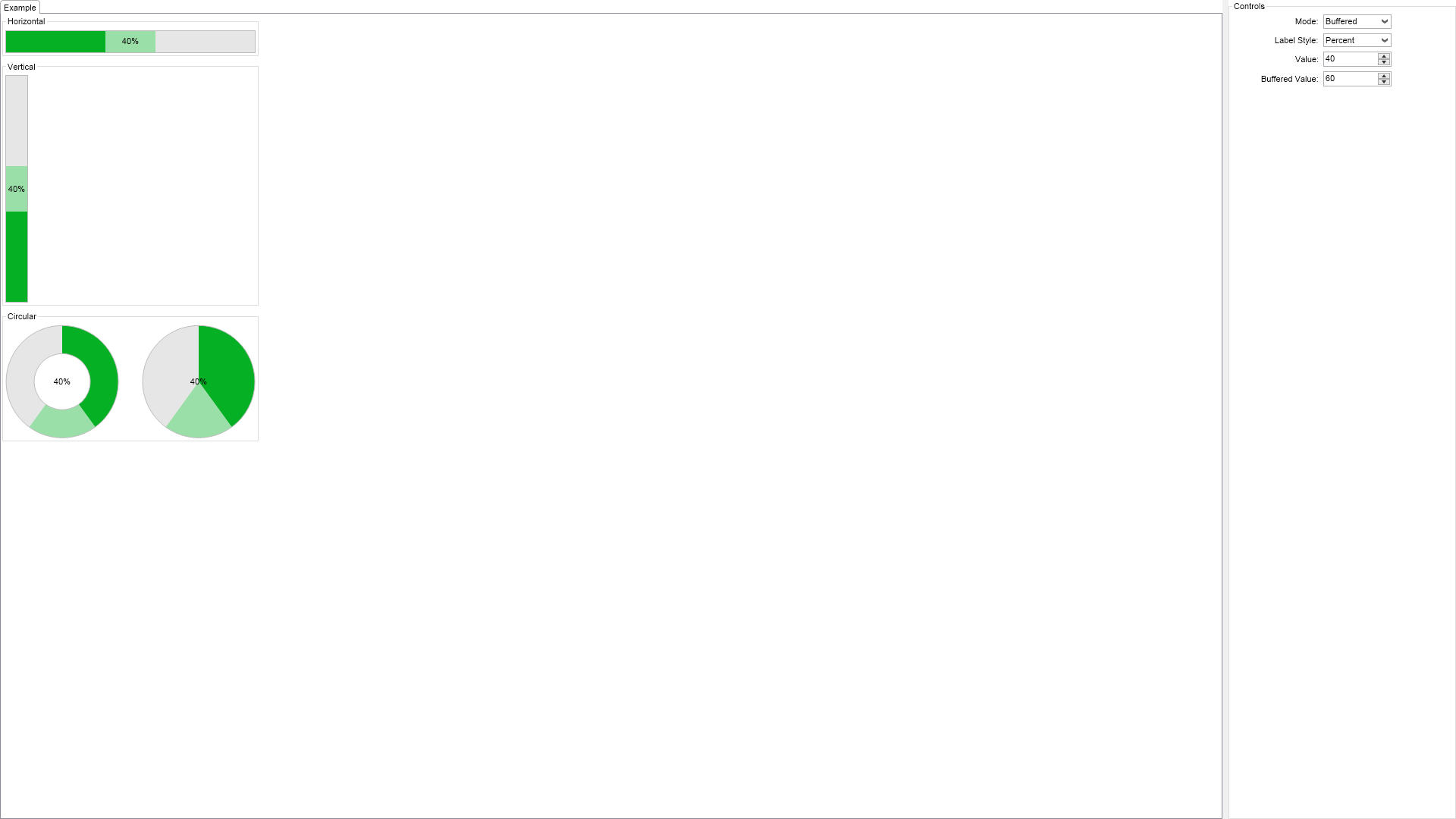
This example demonstrates how to create and use progress bars. The progress bar is a widget that
fills to indicate the progress of an operation. The Style property determines whether
it is horizontally, vertically oriented or circular. The Minimum and Maximum properties
determine the start and the end of the operation and the Value property indicates its current progress.
All progress bars can have a label and its style is controlled through the LabelStyle property.
Circular progress bars let you specify the width of their rim in percent relative to the size of the
progress bar as this example demonstrates.
The Mode property determines the progress bar mode and can be:
- Determinate - the progress bar shows the progress of an operation from 0 to 100%. This is the default mode.
- Indeterminate - the progress bar shows an animation indicating that a long-running operation is executing. No specific
progress is shown. This mode should be used for operations whose progress cannot be estimated, for example a long-running database query.
- Buffered - the progress bar shows the progress of an operation from 0 to 100%. It also additionally shows the buffered
value of the operation with a lighter color. The buffered value is specified through the BufferedValue property.
";
}
///
/// Gets the relevant documentation links for the example
///
///
public (string Name, string Url)[] GetDocumentationUrls()
{
return new[]
{
("Progress Bar", "https://www.nevron.com/docs/openvision/ui-progress-bar.html"),
("Range Based Widgets Overview", "https://www.nevron.com/docs/openvision/ui-range-based-widgets-overview.html"),
};
}
#endregion
#region Implementation
private void UpdateControlsVisibility(ENProgressBarMode mode)
{
switch (mode)
{
case ENProgressBarMode.Determinate:
m_ValuePairBox.Visibility = ENVisibility.Visible;
m_BufferedValuePairBox.Visibility = ENVisibility.Collapsed;
m_IndeterminatePartSizePairBox.Visibility = ENVisibility.Collapsed;
m_AnimationSpeedPairBox.Visibility = ENVisibility.Collapsed;
break;
case ENProgressBarMode.Indeterminate:
m_ValuePairBox.Visibility = ENVisibility.Collapsed;
m_BufferedValuePairBox.Visibility = ENVisibility.Collapsed;
m_IndeterminatePartSizePairBox.Visibility = ENVisibility.Visible;
m_AnimationSpeedPairBox.Visibility = ENVisibility.Visible;
break;
case ENProgressBarMode.Buffered:
m_ValuePairBox.Visibility = ENVisibility.Visible;
m_BufferedValuePairBox.Visibility = ENVisibility.Visible;
m_IndeterminatePartSizePairBox.Visibility = ENVisibility.Collapsed;
m_AnimationSpeedPairBox.Visibility = ENVisibility.Collapsed;
break;
}
}
#endregion
#region Event Handlers
private void OnModeSelected(NValueChangeEventArgs arg)
{
ENProgressBarMode mode = (ENProgressBarMode)(int)arg.NewValue;
for (int i = 0; i < m_ProgressBars.Length; i++)
{
m_ProgressBars[i].Mode = mode;
}
UpdateControlsVisibility(mode);
}
private void OnLabelStyleSelected(NValueChangeEventArgs arg)
{
ENProgressBarLabelStyle labelStyle = (ENProgressBarLabelStyle)(int)arg.NewValue;
for (int i = 0; i < m_ProgressBars.Length; i++)
{
m_ProgressBars[i].LabelStyle = labelStyle;
}
}
private void OnValueChanged(NValueChangeEventArgs args)
{
double value = (double)args.NewValue;
for (int i = 0; i < m_ProgressBars.Length; i++)
{
m_ProgressBars[i].Value = value;
}
}
private void OnBufferedValueChanged(NValueChangeEventArgs args)
{
double bufferedValue = (double)args.NewValue;
for (int i = 0; i < m_ProgressBars.Length; i++)
{
m_ProgressBars[i].BufferedValue = bufferedValue;
}
}
private void OnIndeterminateSizeUpDownValueChanged(NValueChangeEventArgs arg)
{
double indeterminateSize = (double)arg.NewValue;
for (int i = 0; i < m_ProgressBars.Length; i++)
{
m_ProgressBars[i].IndeterminatePartSizePercent = indeterminateSize;
}
}
private void OnAnimationSpeedUpDownValueChanged(NValueChangeEventArgs arg)
{
double animationSpeed = (double)arg.NewValue;
for (int i = 0; i < m_ProgressBars.Length; i++)
{
m_ProgressBars[i].AnimationSpeed = animationSpeed;
}
}
#endregion
#region Fields
private NProgressBar m_HorizontalProgressBar;
private NProgressBar m_VerticalProgressBar;
private NProgressBar m_CircularProgressBar1;
private NProgressBar m_CircularProgressBar2;
private NProgressBar[] m_ProgressBars;
private NPairBox m_ValuePairBox;
private NPairBox m_BufferedValuePairBox;
private NPairBox m_IndeterminatePartSizePairBox;
private NPairBox m_AnimationSpeedPairBox;
#endregion
#region Static Methods
#endregion
#region Constants
private const ENProgressBarMode DefaultMode = ENProgressBarMode.Buffered;
private const double DefaultValue = 40;
private const double DefaultBufferedValue = 60;
#endregion
#region Nested Types
#endregion
}
}

 Chart for .NET
 Diagram for .NET
 User Interface for .NET
 Vision for SSRS
 Chart for SSRS
 Gauge for SSRS
 Map for SSRS
 Barcode for SSRS
 Vision for SharePoint
 Chart for SharePoint
 Gauge for SharePoint
 Map for SharePoint
 Barcode for SharePoint
 Open Vision for .NET


 Vision for .NET