using Nevron.Nov;
using Nevron.Nov.DataStructures;
using Nevron.Nov.Dom;
using Nevron.Nov.Editors;
using Nevron.Nov.Graphics;
using Nevron.Nov.Layout;
using Nevron.Nov.Presentation;
using Nevron.Nov.UI;
using Nevron.Nov.Windows.Forms;
using System;
using System.Windows.Forms;

namespace NovWinFormsProject
{
	public partial class Form1 : Form
	{
		#region Constructors

		public Form1()
		{
			InitializeComponent();

			// Set form title
			Text = "NOV WinForms - NFlexBoxPanelExample";

			// Create the NOV example and its controls
			NWidget exampleContent = CreateExampleContent();
			NWidget exampleControls = CreateExampleControls();
			if (exampleControls != null)
			{
				exampleControls.PreferredWidth = 300;
			}

			// Place the example and its controls in a pair box
			NPairBox pairBox = new NPairBox(exampleContent, exampleControls);
			pairBox.FillMode = ENStackFillMode.First;
			pairBox.FitMode = ENStackFitMode.First;
			pairBox.Margins = new NMargins(NDesign.HorizontalSpacing, NDesign.VerticalSpacing);

			// Host the example in the form
			NNovWidgetHost host = new NNovWidgetHost(pairBox);
			host.Dock = DockStyle.Fill;
			Controls.Add(host);
		}

		#endregion

		#region Example

		public NWidget CreateExampleContent()
		{
			NMargins labelPadding = new NMargins(2);

			m_FlexBoxPanel = new NFlexBoxPanel();
			m_FlexBoxPanel.HorizontalPlacement = ENHorizontalPlacement.Left;
			m_FlexBoxPanel.VerticalPlacement = ENVerticalPlacement.Top;
			m_FlexBoxPanel.PreferredHeight = 200;

			// Set the Grow and Shrink extended properties of the first label explicitly
			NLabel label1 = new NLabel("Label 1 - Grow: 1, Shrink: 1");
			label1.BackgroundFill = new NColorFill(NColor.Gold);
			label1.Padding = labelPadding;
			NFlexBoxLayout.SetGrow(label1, 1);
			NFlexBoxLayout.SetShrink(label1, 1);
			m_FlexBoxPanel.Add(label1);

			// Pass the values of the Grow and Shrink extended properties of the second label
			// to the Add method of the panel
			NLabel label2 = new NLabel("Label 2 - Grow: 3, Shrink: 3");
			label2.BackgroundFill = new NColorFill(NColor.Orange);
			label2.Padding = labelPadding;
			m_FlexBoxPanel.Add(label2, 3, 3);

			// The third label will have the default values for Grow and Shrink - 0
			NLabel label3 = new NLabel("Label 3 - Grow: 0, Shrink: 0");
			label3.BackgroundFill = new NColorFill(NColor.Red);
			label3.Padding = labelPadding;
			m_FlexBoxPanel.Add(label3);

			return m_FlexBoxPanel;
		}
		public NWidget CreateExampleControls()
		{
			NStackPanel stack = new NStackPanel();

			// properties stack
			NList editors = NDesigner.GetDesigner(m_FlexBoxPanel).CreateMemberEditors(
				m_FlexBoxPanel,
				NFlexBoxPanel.EnabledProperty,
				NFlexBoxPanel.HorizontalPlacementProperty,
				NFlexBoxPanel.VerticalPlacementProperty,
				NFlexBoxPanel.DirectionProperty,
				NFlexBoxPanel.VerticalSpacingProperty,
				NFlexBoxPanel.HorizontalSpacingProperty,
				NFlexBoxPanel.UniformWidthsProperty,
				NFlexBoxPanel.UniformHeightsProperty);

			NStackPanel propertiesStack = new NStackPanel();
			for (int i = 0; i < editors.Count; i++)
			{
				propertiesStack.Add(editors[i]);
			}

			stack.Add(new NGroupBox("Properties", new NUniSizeBoxGroup(propertiesStack)));

			// items stack
			NStackPanel itemsStack = new NStackPanel();

			m_GrowUpDown = new NNumericUpDown(0, 100, 0);
			itemsStack.Add(NPairBox.Create("Grow Factor: ", m_GrowUpDown));

			m_ShrinkUpDown = new NNumericUpDown(0, 100, 0);
			itemsStack.Add(NPairBox.Create("Shrink Factor: ", m_ShrinkUpDown));

			NButton addSmallItemButton = new NButton("Add Small Item");
			addSmallItemButton.Click += OnAddSmallItemButtonClick;
			itemsStack.Add(addSmallItemButton);

			NButton addLargeItemButton = new NButton("Add Large Item");
			addLargeItemButton.Click += OnAddLargeItemButtonClick;
			itemsStack.Add(addLargeItemButton);

			NButton addRandomItemButton = new NButton("Add Random Item");
			addRandomItemButton.Click += OnAddRandomItemButtonClick;
			itemsStack.Add(addRandomItemButton);

			NButton removeAllItemsButton = new NButton("Remove All Items");
			removeAllItemsButton.Click += OnRemoveAllItemsButtonClick;
			itemsStack.Add(removeAllItemsButton);

			stack.Add(new NGroupBox("Items", new NUniSizeBoxGroup(itemsStack)));

			return stack;
		}
		public string GetExampleDescription()
		{
			return @"

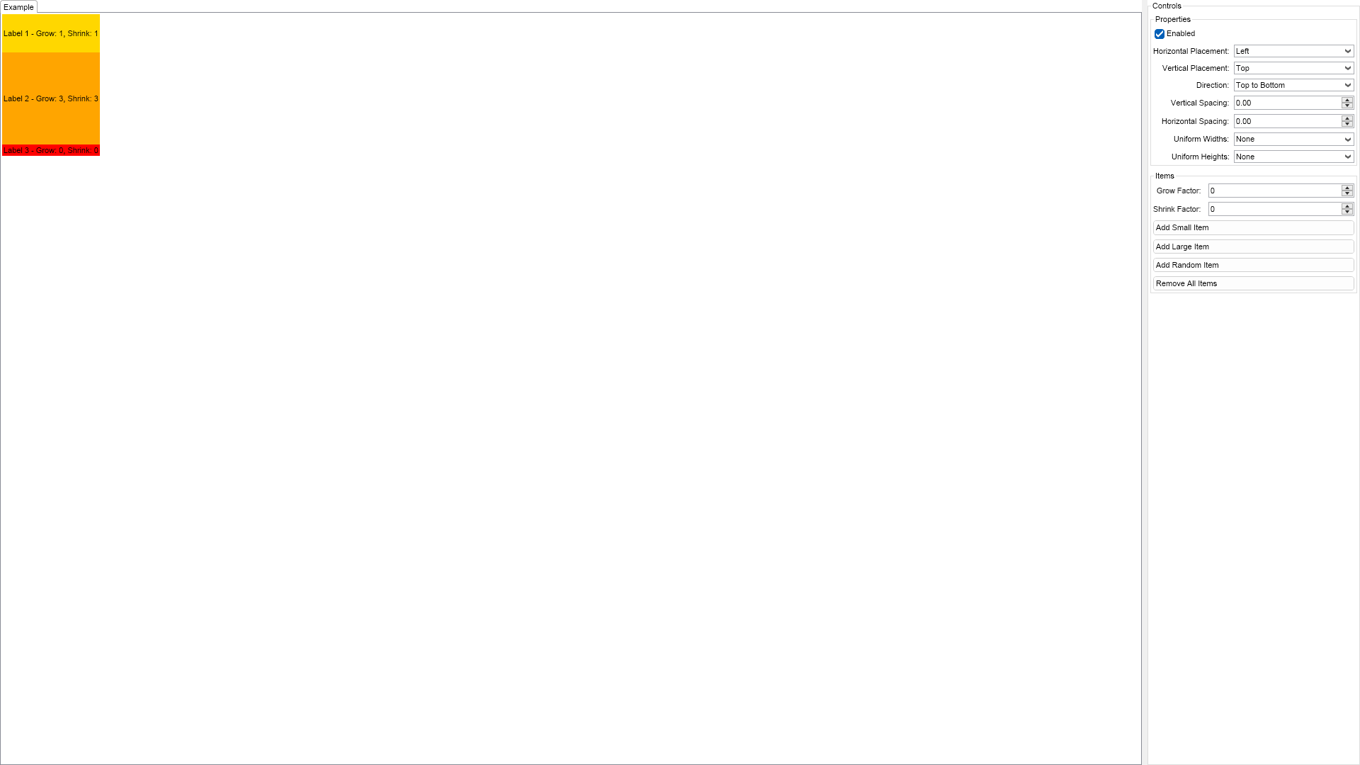
	This example demonstrates how to create a flexbox layout panel and add widgets to it.
	You can control the parameters of the layout algorithm using the controls on the right.
	The Grow and Shrink factors of the widgets determine the portion of area to use for growing/shrinking.
	They are by default set to 0, which means that the widget will not grow or shrink.


	To test how the Grow and Shrink factors affect the layout, click the Remove All Items button
	on the right, then set Grow and Shrink factor and click any of the Add ... Item buttons.
	Then update the Grow and Shrink factor if you want, click any of the Add ... Item buttons again and so on.

";
		}

		///
		/// Gets the relevant documentation links for the example
		///
		///
		public (string Name, string Url)[] GetDocumentationUrls()
		{
			return new[]
			{
				("Flex Box Panel", "https://www.nevron.com/docs/openvision/ui-flex-box-panel.html"),
				("Panels Overview", "https://www.nevron.com/docs/openvision/ui-panels-overview.html"),
			};
		}

		#endregion

		#region Implementation

		private void SetGrowAndShrink(NWidget widget)
		{
			double grow = m_GrowUpDown.Value;
			if (grow != 0)
			{
				NFlexBoxLayout.SetGrow(widget, grow);
			}

			double shrink = m_ShrinkUpDown.Value;
			if (shrink != 0)
			{
				NFlexBoxLayout.SetShrink(widget, shrink);
			}
		}

		#endregion

		#region Event Handlers

		private void OnAddSmallItemButtonClick(NEventArgs args)
		{
			NButton item = new NButton("Small " + m_FlexBoxPanel.Count.ToString());
			item.MinSize = new NSize(5, 5);
			item.PreferredSize = new NSize(25, 25);
			SetGrowAndShrink(item);
			m_FlexBoxPanel.Add(item);
		}
		private void OnAddLargeItemButtonClick(NEventArgs args)
		{
			NButton item = new NButton("Large " + m_FlexBoxPanel.Count.ToString());
			item.MinSize = new NSize(20, 20);
			item.PreferredSize = new NSize(60, 60);
			SetGrowAndShrink(item);
			m_FlexBoxPanel.Add(item);
		}
		private void OnAddRandomItemButtonClick(NEventArgs args)
		{
			int range = 30;
			Random rnd = new Random();

			NButton item = new NButton("Random " + m_FlexBoxPanel.Count.ToString());
			item.MinSize = new NSize(rnd.Next(range), rnd.Next(range));
			item.PreferredSize = new NSize(rnd.Next(range) + range, rnd.Next(range) + range);
			SetGrowAndShrink(item);
			m_FlexBoxPanel.Add(item);
		}
		private void OnRemoveAllItemsButtonClick(NEventArgs args)
		{
			m_FlexBoxPanel.Clear();
		}

		#endregion

		#region Fields

		private NFlexBoxPanel m_FlexBoxPanel;
		private NNumericUpDown m_GrowUpDown;
		private NNumericUpDown m_ShrinkUpDown;

		#endregion

		#region Static Methods
		#endregion

		#region Constants
		#endregion

		#region Nested Types
		#endregion
	}
}

 Chart for .NET
 Diagram for .NET
 User Interface for .NET
 Vision for SSRS
 Chart for SSRS
 Gauge for SSRS
 Map for SSRS
 Barcode for SSRS
 Vision for SharePoint
 Chart for SharePoint
 Gauge for SharePoint
 Map for SharePoint
 Barcode for SharePoint
 Open Vision for .NET


 Vision for .NET