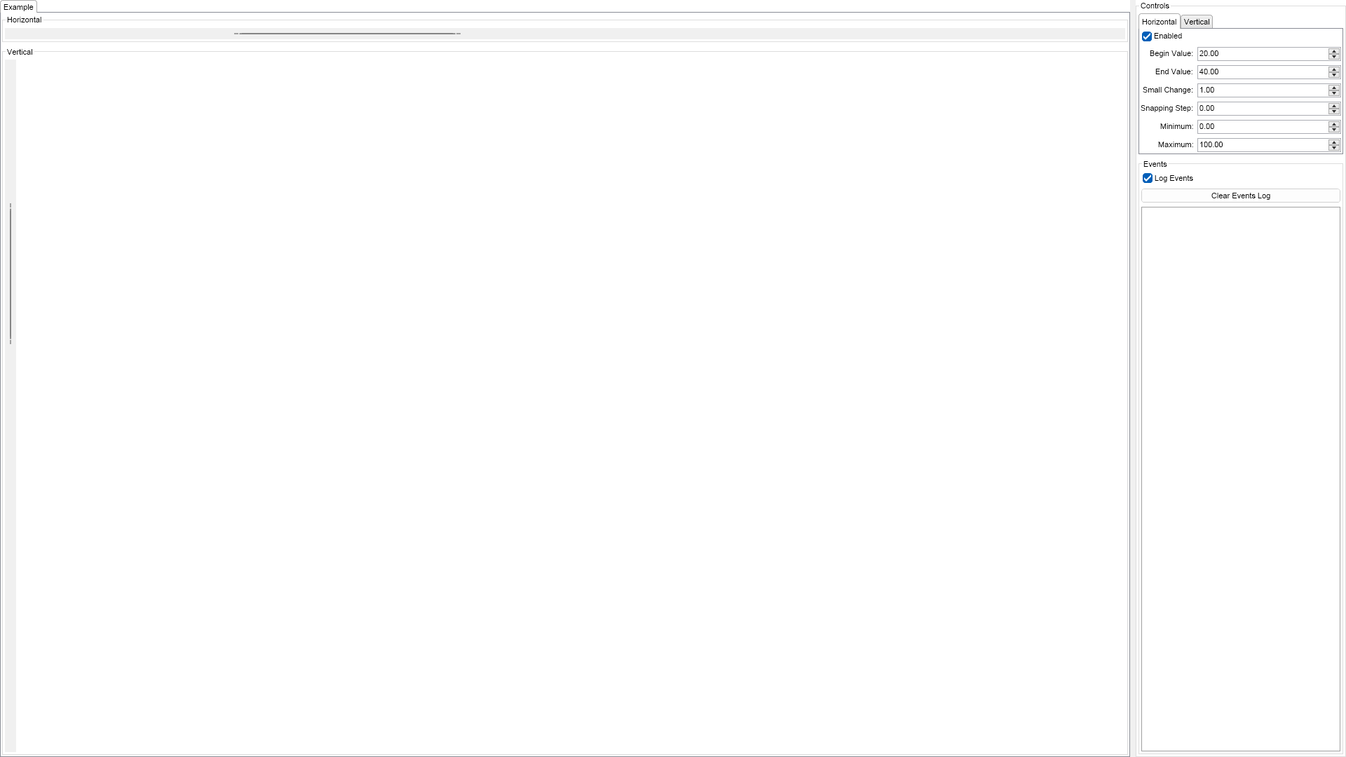
Range Scroll Bars Example for Blazor

Nevron NOV UserInterface for Blazor ships with hundreds of examples with full source code, as part of the Nevron Open Vision Suite. All Blazor UserInterface examples are also available as a stand-alone Visual Studio solution in C#, which you can download from the links below.

Range Scroll Bars Example for Blazor Description

This example demonstrates how to create and use range scroll bars. Range scroll bars are range based widgets, which are used for selecting a range defined by a begin and an end value. They can be horizontal and vertical and expose a set of properties, which you can use to control their appearance and behavior.


Range Scroll Bars Example

C# Range Scroll Bars Example Code for Nevron UserInterface for Blazor
Language: C#

using Nevron.Nov;
using Nevron.Nov.DataStructures;
using Nevron.Nov.Dom;
using Nevron.Nov.Editors;
using Nevron.Nov.Graphics;
using Nevron.Nov.Layout;
using Nevron.Nov.Presentation;
using Nevron.Nov.UI;
using Nevron.Nov.Windows.Forms;
using System.Windows.Forms;

namespace NovWinFormsProject
{
	public partial class Form1 : Form
	{
		#region Constructors

		public Form1()
		{
			InitializeComponent();

			// Set form title
			Text = "NOV WinForms - NRangeScrollBarsExample";

			// Create the NOV example and its controls
			NWidget exampleContent = CreateExampleContent();
			NWidget exampleControls = CreateExampleControls();
			if (exampleControls != null)
			{
				exampleControls.PreferredWidth = 300;
			}

			// Place the example and its controls in a pair box
			NPairBox pairBox = new NPairBox(exampleContent, exampleControls);
			pairBox.FillMode = ENStackFillMode.First;
			pairBox.FitMode = ENStackFitMode.First;
			pairBox.Margins = new NMargins(NDesign.HorizontalSpacing, NDesign.VerticalSpacing);

			// Host the example in the form
			NNovWidgetHost host = new NNovWidgetHost(pairBox);
			host.Dock = DockStyle.Fill;
			Controls.Add(host);
		}

		#endregion

		#region Example

		public NWidget CreateExampleContent()
		{
			// Create a stack for the scroll bars
			NStackPanel stack = new NStackPanel();
			stack.FillMode = ENStackFillMode.Last;
			stack.FitMode = ENStackFitMode.Last;
			
			// Create the HScrollBar
			m_HScrollBar = new NHRangeScrollBar();
			m_HScrollBar.BeginValue = 20;
			m_HScrollBar.EndValue = 40;
			m_HScrollBar.VerticalPlacement = ENVerticalPlacement.Top;
			m_HScrollBar.BeginValueChanged += OnScrollBarValueChanged;
			m_HScrollBar.EndValueChanged += OnScrollBarValueChanged;
			stack.Add(new NGroupBox("Horizontal", m_HScrollBar));

			// Create the VScrollBar
			m_VScrollBar = new NVRangeScrollBar();
			m_VScrollBar.BeginValue = 20;
			m_VScrollBar.EndValue = 40;
			m_VScrollBar.HorizontalPlacement = ENHorizontalPlacement.Left;
			m_VScrollBar.BeginValueChanged += OnScrollBarValueChanged;
			m_VScrollBar.EndValueChanged += OnScrollBarValueChanged;
			stack.Add(new NGroupBox("Vertical", m_VScrollBar));

			return stack;
		}
		public NWidget CreateExampleControls()
		{
			NStackPanel stack = new NStackPanel();
			stack.FillMode = ENStackFillMode.Last;
			stack.FitMode = ENStackFitMode.Last;

			// Create a tab
			NTab tab = new NTab();
			stack.Add(tab);

			// Create the Horizontal scrollbar properties
			NStackPanel hsbStack = new NStackPanel();
			NList editors = NDesigner.GetDesigner(m_HScrollBar).CreateMemberEditors(
				m_HScrollBar,
				NHRangeScrollBar.EnabledProperty,
				NHRangeScrollBar.BeginValueProperty,
				NHRangeScrollBar.EndValueProperty,
				NHRangeScrollBar.SmallChangeProperty,
				NHRangeScrollBar.SnappingStepProperty,
				NHRangeScrollBar.MinimumProperty,
				NHRangeScrollBar.MaximumProperty);
			
			for (int i = 0; i < editors.Count; i++)
			{
				hsbStack.Add(editors[i]);
			}

			tab.TabPages.Add(new NTabPage("Horizontal", hsbStack));

			// Create the Vertical scrollbar properties
			NStackPanel vsbStack = new NStackPanel();
			editors = NDesigner.GetDesigner(m_VScrollBar).CreateMemberEditors(
				m_VScrollBar,
				NVRangeScrollBar.EnabledProperty,
				NVRangeScrollBar.BeginValueProperty,
				NVRangeScrollBar.EndValueProperty,
				NVRangeScrollBar.SmallChangeProperty,
				NVRangeScrollBar.SnappingStepProperty,
				NVRangeScrollBar.MinimumProperty,
				NVRangeScrollBar.MaximumProperty
			);

			for (int i = 0; i < editors.Count; i++)
			{
				vsbStack.Add(editors[i]);
			}

			tab.TabPages.Add(new NTabPage("Vertical", vsbStack));

			// Add events log
			m_EventsLog = new NExampleEventsLog();
			stack.Add(m_EventsLog);

			return new NUniSizeBoxGroup(stack);
		}
		public string GetExampleDescription()
		{
			return @"

This example demonstrates how to create and use range scroll bars. Range scroll bars are range based widgets, which are used for selecting a range defined by a begin and an end value. They can be horizontal and vertical and expose a set of properties, which you can use to control their appearance and behavior.

"; } /// /// Gets the relevant documentation links for the example /// /// public (string Name, string Url)[] GetDocumentationUrls() { return new[] { ("Scrollbars", "https://www.nevron.com/docs/openvision/ui-scrollbars.html"), ("Range Based Widgets Overview", "https://www.nevron.com/docs/openvision/ui-range-based-widgets-overview.html"), }; } #endregion #region Implementation #endregion #region Event Handlers private void OnScrollBarValueChanged(NValueChangeEventArgs args) { string text; if (args.TargetNode == m_HScrollBar) { text = "Horizontal Range: " + m_HScrollBar.BeginValue.ToString("0.###") + " - " + m_HScrollBar.EndValue.ToString("0.###"); } else { text = "Vertical Range: " + m_VScrollBar.BeginValue.ToString("0.###") + " - " + m_VScrollBar.EndValue.ToString("0.###"); ; } m_EventsLog.LogEvent(text); } #endregion #region Fields private NExampleEventsLog m_EventsLog; private NHRangeScrollBar m_HScrollBar; private NVRangeScrollBar m_VScrollBar; #endregion #region Static Methods #endregion #region Constants #endregion #region Nested Types #endregion } }

Download a fully functional C# (.cs) Range Scroll Bars Example for Blazor Solution

Related Documentation Links