Tab Example for Blazor

Nevron NOV UserInterface for Blazor ships with hundreds of examples with full source code, as part of the Nevron Open Vision Suite. All Blazor UserInterface examples are also available as a stand-alone Visual Studio solution in C#, which you can download from the links below.

Tab Example for Blazor Description

This example demonstrates how to create tab widgets. The tab is a widget that contains tab pages. Their order in the TabPages collection of the tab widget reflects the order they appear in the widget. The SelectedIndex property stores the index of the currently selected tab page. The HeadersPosition property determines the way the tab page headers are position in respect to the tab widget. The possible values are: Left, Top (default), Right and Bottom. You can also specify the spacing between the headers. To do so, use the HeadersSpacing property. The HeadersAlignment property determines how the tab page headers are aligned on the tab widget side they are placed on. The supported values are Near (default), Center and Far. The CycleTablePages instructs the control to cycle pages when the tab has focus and the user presseses the left or right arrow keys.
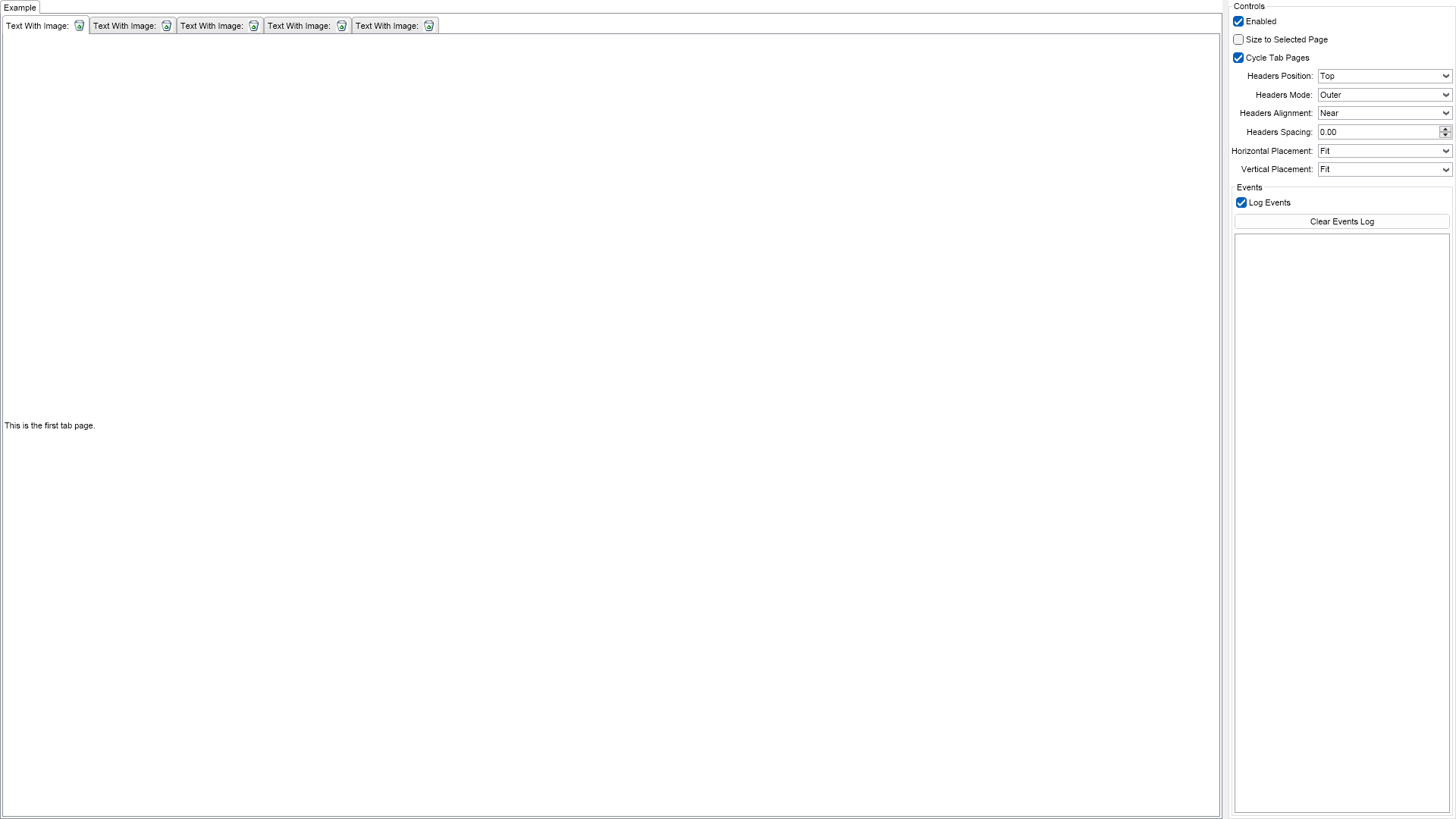

Tab Example

C# Tab Example Code for Nevron UserInterface for Blazor
Language: C#

using Nevron.Nov;
using Nevron.Nov.DataStructures;
using Nevron.Nov.Dom;
using Nevron.Nov.Editors;
using Nevron.Nov.Graphics;
using Nevron.Nov.Layout;
using Nevron.Nov.Presentation;
using Nevron.Nov.UI;
using Nevron.Nov.Windows.Forms;
using System.Windows.Forms;

namespace NovWinFormsProject
{
	public partial class Form1 : Form
	{
		#region Constructors

		public Form1()
		{
			InitializeComponent();

			// Set form title
			Text = "NOV WinForms - NTabExample";

			// Create the NOV example and its controls
			NWidget exampleContent = CreateExampleContent();
			NWidget exampleControls = CreateExampleControls();
			if (exampleControls != null)
			{
				exampleControls.PreferredWidth = 300;
			}

			// Place the example and its controls in a pair box
			NPairBox pairBox = new NPairBox(exampleContent, exampleControls);
			pairBox.FillMode = ENStackFillMode.First;
			pairBox.FitMode = ENStackFitMode.First;
			pairBox.Margins = new NMargins(NDesign.HorizontalSpacing, NDesign.VerticalSpacing);

			// Host the example in the form
			NNovWidgetHost host = new NNovWidgetHost(pairBox);
			host.Dock = DockStyle.Fill;
			Controls.Add(host);
		}

		#endregion

		#region Example

		public NWidget CreateExampleContent()
		{
			// create a tab
			m_Tab = new NTab();

			m_Tab.TabPages.Add(CreatePage("Page 1", "This is the first tab page."));
			m_Tab.TabPages.Add(CreatePage("Page 2", "This is the second tab page."));
			m_Tab.TabPages.Add(CreatePage("Page 3", "This is the third tab page.\nIt is the largest both horizontally and vertically."));
			m_Tab.TabPages.Add(CreatePage("Page 4", "This is the fourth tab page."));
			m_Tab.TabPages.Add(CreatePage("Page 5", "This is the fifth tab page."));

			m_Tab.SelectedIndex = 0;
			m_Tab.SelectedIndexChanged += OnTabSelectedIndexChanged;

			// host it
			return m_Tab;
		}
		public NWidget CreateExampleControls()
		{
			NList editors = NDesigner.GetDesigner(m_Tab).CreateMemberEditors(
				m_Tab,
				NTab.EnabledProperty,
				NTab.SizeToSelectedPageProperty,
				NTab.CycleTabPagesProperty,
				NTab.HeadersPositionProperty,
				NTab.HeadersModeProperty,
				NTab.HeadersAlignmentProperty,
				NTab.HeadersSpacingProperty,
				NTab.HorizontalPlacementProperty,
				NTab.VerticalPlacementProperty);

			NStackPanel stack = new NStackPanel();
			stack.FillMode = ENStackFillMode.Last;
			stack.FitMode = ENStackFitMode.Last;

			for (int i = 0; i < editors.Count; i++)
			{
				stack.Add(editors[i]);
			}

			// create the events list box
			m_EventsLog = new NExampleEventsLog();
			stack.Add(m_EventsLog);

			return new NUniSizeBoxGroup(stack);
		}
		public string GetExampleDescription()
		{
			return @"

This example demonstrates how to create tab widgets. The tab is a widget that contains tab pages. Their order in the TabPages collection of the tab widget reflects the order they appear in the widget. The SelectedIndex property stores the index of the currently selected tab page. The HeadersPosition property determines the way the tab page headers are position in respect to the tab widget. The possible values are: Left, Top (default), Right and Bottom. You can also specify the spacing between the headers. To do so, use the HeadersSpacing property. The HeadersAlignment property determines how the tab page headers are aligned on the tab widget side they are placed on. The supported values are Near (default), Center and Far. The CycleTablePages instructs the control to cycle pages when the tab has focus and the user presseses the left or right arrow keys.

"; } /// /// Gets the relevant documentation links for the example /// /// public (string Name, string Url)[] GetDocumentationUrls() { return new[] { ("Tab", "https://www.nevron.com/docs/openvision/ui-tab.html"), ("Containers Overview", "https://www.nevron.com/docs/openvision/ui-containers-overview.html"), }; } #endregion #region Implementation private NTabPage CreatePage(string name, string content) { NTabPage tabPage = new NTabPage(name, content); tabPage.Header.Content = NPairBox.Create("Text With Image:", new NImageBox(Nevron.Nov.Graphics.NImage.FromBytes(Nevron.Nov.NConvert.FromBase64String("iVBORw0KGgoAAAANSUhEUgAAABAAAAAQCAIAAACQkWg2AAABtUlEQVR42o2RA4wkURBAO/Z07JxjHONbW9Hatm3btm3btm3bNmts1DdeEXmnlof7x3eWQgDu7x7i0vKd/WMsXYJsPEJhhq5j4SqgYCqvbXF9dUMF3N3dB0enuEdkdnR0XFxcvDy/kJ43NjY6e4YsPKOAIQN5Ve1WrsGgLyajdGZhFZjrewID+56B0cmZJX1zBwLw8PDoH5XhGZLkE5HqExAKM2WHe+gyGqb/eKXIFuCK6AmVgJ3tc2yvnjjlkVAgA2ABjNInZBsHTJ2/RFeMQuhkoKC8sbKmifRv/mUDU40JXwy/fsf+7tp/sQ5IdfePIAMLK5uRKUUk4FP3J8QIQTWRnM1WAKrWXyGG0ck5MoCP+wLk4cJ90f1z0me4/On5E7VCu9axAfwVVb25viUDeK9mF9cmLifgNz6emM7Sz5Zo9GBrRsuShLwObaUHR6YKSip3Hk61G00QLQQRw3aeyJ/VC6fWEaWmruG0wPr6BiQXNpBcfDbx4YJL0gaueWX1tABIbEZZ7dA6/NsmJidr/hUCEFOzPjg4ZABMTC8q6lr9+MWF77//i0MH75OzS25ubmkBzuUDyRRobn6CnbIAAAAASUVORK5CYII=")))); return tabPage; } #endregion #region Event Handlers private void OnHeadersPositionComboSelectedIndexChanged(NValueChangeEventArgs args) { NComboBox combo = (NComboBox)args.TargetNode; ENTabHeadersPosition headersPosition = (ENTabHeadersPosition)args.NewValue; m_Tab.HeadersPosition = headersPosition; } private void OnHeadersSpacingComboSelectedIndexChanged(NValueChangeEventArgs args) { NComboBox combo = (NComboBox)args.TargetNode; m_Tab.HeadersSpacing = combo.SelectedIndex; } private void OnTabSelectedIndexChanged(NValueChangeEventArgs args) { m_EventsLog.LogEvent("Selected Index: " + args.NewValue); } #endregion #region Fields private NTab m_Tab; private NExampleEventsLog m_EventsLog; #endregion #region Static Methods #endregion #region Constants #endregion #region Nested Types #endregion } }

Download a fully functional C# (.cs) Tab Example for Blazor Solution

Related Documentation Links