ProductsAll Products
.NET Components
 Open Vision for .NET
 NOV Chart for .NET
 NOV Diagram for .NET
 NOV Rich Text Editor for .NET
 NOV Grid for .NET
 NOV Schedule for .NET
 NOV Gauge for .NET
 NOV Barcode for .NET
 NOV User Interface for .NET
 Vision for .NET
 Chart for .NET
 Diagram for .NET
 User Interface for .NET
 Vision for SSRS
 Chart for SSRS
 Gauge for SSRS
 Map for SSRS
 Barcode for SSRS
 Vision for SharePoint
 Chart for SharePoint
 Gauge for SharePoint
 Map for SharePoint
 Barcode for SharePoint
DownloadsAll Downloads
| ||||||||
|
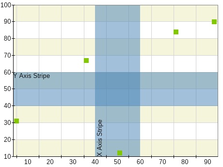
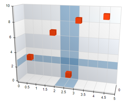
Use Stripes to Highlight Ranges
Apply axis stripes to indicate meaningful zones such as warning ranges, acceptable thresholds, or focus areas.
Keep It Subtle
Use light, semi-transparent colors to keep the focus on the actual data.
Label Clearly If Needed
Add optional labels inside or near the stripe to indicate what the range represents (e.g., “Safe Zone”, “Overload”).
Don't Overuse
Limit the number of stripes to avoid visual clutter—use them only where they help clarify the message.
Interlaced Stripes
Use interlaced axis stripes to guide reading along long axis ranges.
Alignment with Major Ticks
Align with tick intervals so that stripes align with the major axis ticks.
Use for Both Axes If Appropriate
Axis stripes can be applied to either horizontal or vertical axes depending on the context.
Match Chart Intent
Use stripes only when they support the analytical goal—don’t add them purely for decoration.