ProductsAll Products
.NET Components
 Open Vision for .NET
 NOV Chart for .NET
 NOV Diagram for .NET
 NOV Rich Text Editor for .NET
 NOV Grid for .NET
 NOV Schedule for .NET
 NOV Gauge for .NET
 NOV Barcode for .NET
 NOV User Interface for .NET
 Vision for .NET
 Chart for .NET
 Diagram for .NET
 User Interface for .NET
 Vision for SSRS
 Chart for SSRS
 Gauge for SSRS
 Map for SSRS
 Barcode for SSRS
 Vision for SharePoint
 Chart for SharePoint
 Gauge for SharePoint
 Map for SharePoint
 Barcode for SharePoint
DownloadsAll Downloads
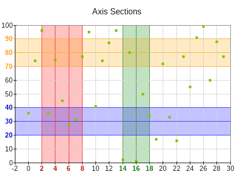
Scale sections (also called marked zones) allow the scale to modify the appearance of axis ticks, labels, and grid lines if they fall inside a certain range. This allows you to draw the user's attention to the data contained in those axis ranges.
| ||||||||
|
Highlighting Ranges and Labels
Use scale sections to mark ranges not just on the background of the chart but also on the automatically generated labels on the axis.
Meaningful Ranges
Divide the axis into meaningful sections to highlight different data ranges for example - danger zone, safe zone, optimal zone, etc.
Distinct Colors and Readable Labels
Apply distinct coloring or shading, but use subtle background colors for the scale section stripe at the chart plot. Use color with sufficient contrast from the chart background for the section scale labels.
Label Sections Clearly
Provide clear labels or legends to explain what each scale section represents.
Limit the Number of Sections
Use only as many sections as needed.