ProductsAll Products
.NET Components
 Open Vision for .NET
 NOV Chart for .NET
 NOV Diagram for .NET
 NOV Rich Text Editor for .NET
 NOV Grid for .NET
 NOV Schedule for .NET
 NOV Gauge for .NET
 NOV Barcode for .NET
 NOV User Interface for .NET
 Vision for .NET
 Chart for .NET
 Diagram for .NET
 User Interface for .NET
 Vision for SSRS
 Chart for SSRS
 Gauge for SSRS
 Map for SSRS
 Barcode for SSRS
 Vision for SharePoint
 Chart for SharePoint
 Gauge for SharePoint
 Map for SharePoint
 Barcode for SharePoint
DownloadsAll Downloads
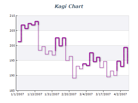
Kagi Chart | ||
|
| Date | Price | Direction | Line Thickness |
|---|---|---|---|
| 2022-01-01 | 100 | Up | Thick |
| 2022-01-02 | 95 | Down | Thin |
| 2022-01-03 | 100 | Up | Thick |
| 2022-01-04 | 100 | Up | Thick |
| 2022-01-05 | 100 | Down | Thin |
Choose the Right Time Frame
Kagi charts can be used for any time frame, but they are most effective for longer-term trends. Choose a time frame that best suits your data and the insights you want to convey.
Label Your Chart
Clearly label your Kagi chart with the asset's name and displayed time frame. This helps viewers understand the data and the context in which it was generated.
Avoid Over-analyzing
Kagi charts are best used for identifying long-term trends rather than short-term fluctuations. Avoid over-analyzing the chart or trying to make predictions based on short-term movements.