ProductsAll Products
.NET Components
 Open Vision for .NET
 NOV Chart for .NET
 NOV Diagram for .NET
 NOV Rich Text Editor for .NET
 NOV Grid for .NET
 NOV Schedule for .NET
 NOV Gauge for .NET
 NOV Barcode for .NET
 NOV User Interface for .NET
 Vision for .NET
 Chart for .NET
 Diagram for .NET
 User Interface for .NET
 Vision for SSRS
 Chart for SSRS
 Gauge for SSRS
 Map for SSRS
 Barcode for SSRS
 Vision for SharePoint
 Chart for SharePoint
 Gauge for SharePoint
 Map for SharePoint
 Barcode for SharePoint
DownloadsAll Downloads
| ||||||||||||
|
| Product | Sales | Revenue | Market Share |
|---|---|---|---|
| Product A | 100 | $10,000 | 5% |
| Product B | 200 | $20,000 | 10% |
| Product C | 300 | $30,000 | 15% |
Choosing the Right Data
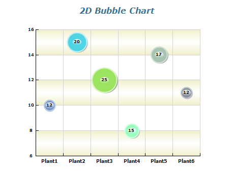
Firstly, choosing the right data to display in your bubble chart is essential. Bubble charts work best with data that has clear categories and a range of values. This will help ensure that your chart is easy to read and provides valuable insights into your data.
Choosing the Right Scale
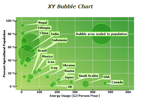
Next, choosing the right scale for your bubble chart is important. You should choose a scale that fits your data and is easy to read. It's also important to ensure that your bubble sizes are proportional to the data they represent.
Use Color Effectively
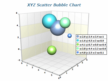
Another best practice for using a bubble chart is to use color effectively. Color can represent different categories in your data in which case you should aim to use visually distinct colors. Alternatively, color can be used to represent a dimension in the data set, and in this case, you can use a palette to denote a range of values for the different colors.
Labeling
Finally, it's crucial to label your bubble chart effectively. This means including clear and concise labels for each category or value and providing a legend to help users understand what each bubble represents.