ProductsAll Products
.NET Components
 Open Vision for .NET
 NOV Chart for .NET
 NOV Diagram for .NET
 NOV Rich Text Editor for .NET
 NOV Grid for .NET
 NOV Schedule for .NET
 NOV Gauge for .NET
 NOV Barcode for .NET
 NOV User Interface for .NET
 Vision for .NET
 Chart for .NET
 Diagram for .NET
 User Interface for .NET
 Vision for SSRS
 Chart for SSRS
 Gauge for SSRS
 Map for SSRS
 Barcode for SSRS
 Vision for SharePoint
 Chart for SharePoint
 Gauge for SharePoint
 Map for SharePoint
 Barcode for SharePoint
DownloadsAll Downloads
| ||||||||||||
|
|
Sample Name | Minimum |
Lower Quartile | Median |
Upper Quartile | Maximum |
|---|---|---|---|---|---|
| Sample A | 5 | 8 | 10 | 15 | 20 |
| Sample B | 10 | 12 | 15 | 18 | 25 |
| Sample C | 8 | 10 | 12 | 16 | 22 |
Use Box and Whiskers Charts to Compare Data
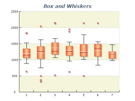
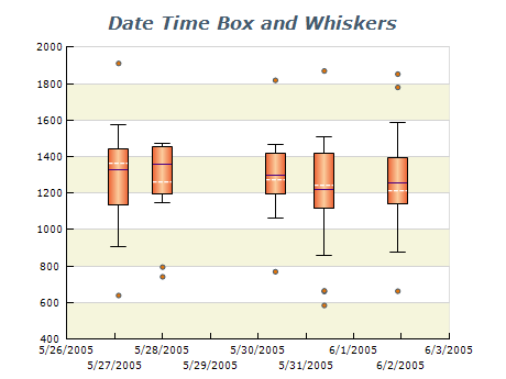
Box and Whiskers charts are excellent for comparing data between different groups. Use them to compare data points across multiple categories or periods.
Label Your Chart Clearly
It's important to label it with a clear and descriptive title and label the axes with meaningful units of measure.
Ensure Your Data Is Accurate
Check it carefully before creating your chart to ensure it is accurate and up-to-date.
Include Relevant Statistical Information
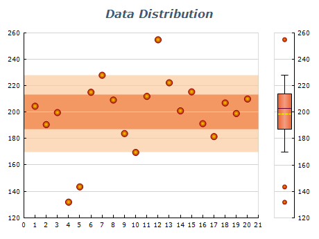
Include relevant statistical data in your chart, such as the median, quartiles, and outliers.
Avoid Clutter
Avoid cluttering your chart with too much information. Use a clear and simple design to make it easy to interpret the data.