Keep It Simple
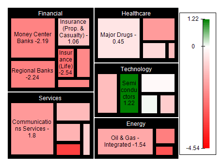
The TreeMap Chart Series is a powerful tool, but avoiding cluttering the chart with too much information is important. Stick to a few key variables and try to make the chart as easy to understand as possible.
Use Color Wisely
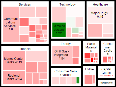
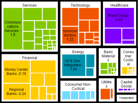
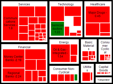
Color can be a powerful tool for highlighting trends or patterns within the data, but it can also be overwhelming if misused. Use color sparingly and ensure that each color has a clear meaning.
Group Similar Data
Grouping similar data together can make identifying patterns within the data easier. Consider grouping data by category, region, or period, depending on your data set.
Provide Context
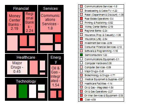
Always provide context for your chart by including a title, axis labels, and a legend. This will help users understand what they are looking at and interpret the data correctly.

 Open Vision for .NET
 NOV Chart for .NET
 NOV Diagram for .NET
 NOV Rich Text Editor for .NET
 NOV Grid for .NET
 NOV Schedule for .NET
 NOV Gauge for .NET
 NOV Barcode for .NET
 NOV User Interface for .NET
 Vision for .NET
 Chart for .NET
 Diagram for .NET
 User Interface for .NET
 Vision for SSRS
 Chart for SSRS
 Gauge for SSRS
 Map for SSRS
 Barcode for SSRS
 Vision for SharePoint
 Chart for SharePoint
 Gauge for SharePoint
 Map for SharePoint
 Barcode for SharePoint