Appropriate Measurement Intervals
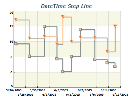
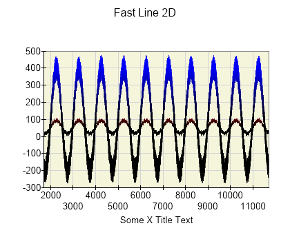
Choose a measurement interval that shows the changes relevant to your data. An interval that is too broad can hide useful detail, while one that is too narrow can emphasize noise. Compare different intervals using your knowledge of the data. If helpful, show the original measurements alongside a moving average to make the overall trend easier to see.
Limited Number of Lines
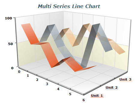
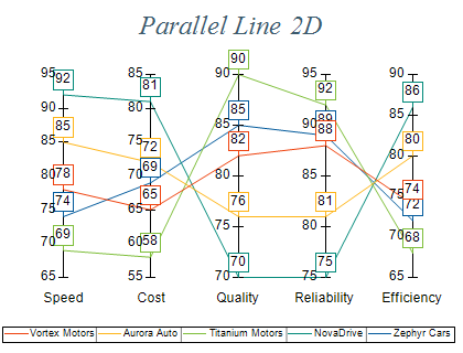
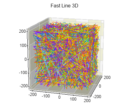
To prevent clutter and make the line chart easily interpretable, limiting the number of lines plotted is crucial. It's recommended to keep the number of lines to five or fewer. Too many lines on a chart make reading and understanding the data trends difficult. But if the lines are distinct and separated, it's possible to include more lines while maintaining the chart's readability.
Use Colors and Markers Effectively
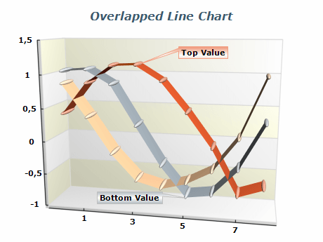
Using colors and markers effectively is key to creating a visually appealing and informative line chart. Colors can differentiate between multiple lines or data sets, making it easier for viewers to identify and track specific trends. Markers can be utilized to draw attention to particular data points or trends, emphasizing their significance in the overall pattern. It is essential to select appropriate colors and markers that complement each other and are easily distinguishable, ensuring that the chart remains straightforward and easy to interpret.

 Open Vision for .NET
 NOV Chart for .NET
 NOV Diagram for .NET
 NOV Rich Text Editor for .NET
 NOV Grid for .NET
 NOV Schedule for .NET
 NOV Gauge for .NET
 NOV Barcode for .NET
 NOV User Interface for .NET
 Vision for .NET
 Chart for .NET
 Diagram for .NET
 User Interface for .NET
 Vision for SSRS
 Chart for SSRS
 Gauge for SSRS
 Map for SSRS
 Barcode for SSRS
 Vision for SharePoint
 Chart for SharePoint
 Gauge for SharePoint
 Map for SharePoint
 Barcode for SharePoint