Keep It Simple
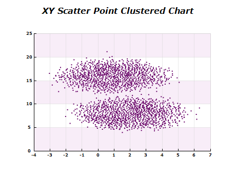
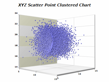
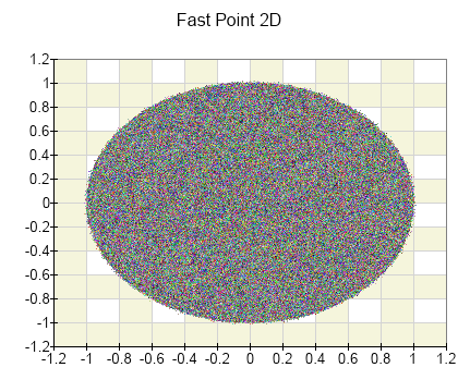
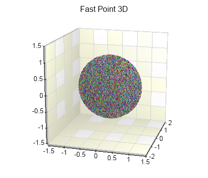
Avoid adding too many data points to the chart, as this will compromise its readability. For example, while the chart can handle easily hundreds of thousands of data points, plotting such a dataset will most likely result in a point cloud. Consider using sampling or clustering techniques to reduce the number of visible data points.
Use Consistent Colors
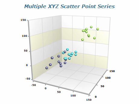
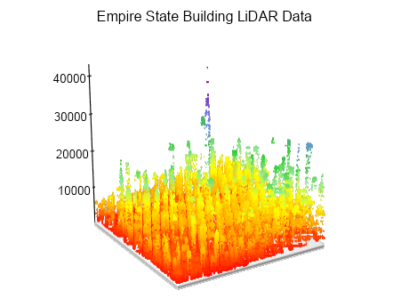
If a fourth dimension of data is not required, you can use colors that have sufficient contrast from the chart background - for example darker colors on a white background or vice versa. You should also avoid close colors if you plot different data sets as this can also compromise legibility.
Choose Correct Axis Scale
For datasets with values that differ drastically in magnitude, consider using a logarithmic scale to present the data more concisely.

 Open Vision for .NET
 NOV Chart for .NET
 NOV Diagram for .NET
 NOV Rich Text Editor for .NET
 NOV Grid for .NET
 NOV Schedule for .NET
 NOV Gauge for .NET
 NOV Barcode for .NET
 NOV User Interface for .NET
 Vision for .NET
 Chart for .NET
 Diagram for .NET
 User Interface for .NET
 Vision for SSRS
 Chart for SSRS
 Gauge for SSRS
 Map for SSRS
 Barcode for SSRS
 Vision for SharePoint
 Chart for SharePoint
 Gauge for SharePoint
 Map for SharePoint
 Barcode for SharePoint