ProductsAll Products
.NET Components
 Open Vision for .NET
 NOV Chart for .NET
 NOV Diagram for .NET
 NOV Rich Text Editor for .NET
 NOV Grid for .NET
 NOV Schedule for .NET
 NOV Gauge for .NET
 NOV Barcode for .NET
 NOV User Interface for .NET
 Vision for .NET
 Chart for .NET
 Diagram for .NET
 User Interface for .NET
 Vision for SSRS
 Chart for SSRS
 Gauge for SSRS
 Map for SSRS
 Barcode for SSRS
 Vision for SharePoint
 Chart for SharePoint
 Gauge for SharePoint
 Map for SharePoint
 Barcode for SharePoint
DownloadsAll Downloads
| ||||||||
|
| Date | Open | High | Low | Close | Volume |
|---|---|---|---|---|---|
| 2022-01-03 | 142.55 | 144.81 | 141.71 | 142.77 | 15574100 |
| 2022-01-04 | 141.23 | 141.79 | 138.64 | 139.53 | 17719200 |
| 2022-01-05 | 139.97 | 140.78 | 138.10 | 140.41 | 12134700 |
Use a Consistent Time Frame
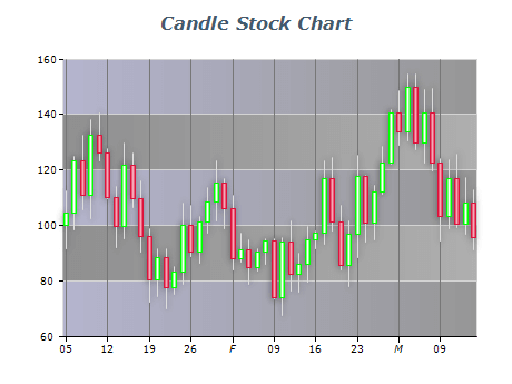
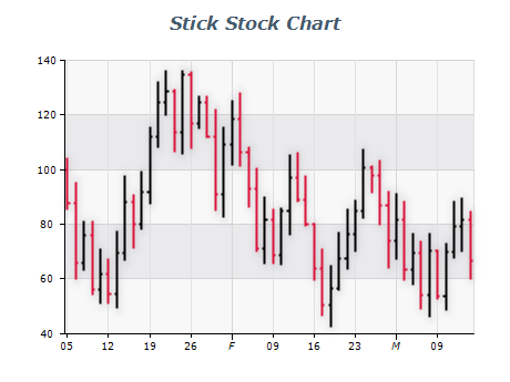
When presenting historical stock data, use a consistent time frame throughout the chart. This allows viewers to easily compare trends and patterns over time.
Label Your Axes
Clearly label your chart's x and y axes so that viewers can understand the data. Use descriptive labels that include units of measurement and periods.
Avoid Clutter
Avoid adding too much information to your stock chart, such as multiple indicators or excessive annotations. This can make the chart difficult to read and understand.
Use Color Strategically
Use color to highlight important data points or trends. However, be careful not to use too many colors or color schemes that are difficult to interpret.