ProductsAll Products
.NET Components
 Open Vision for .NET
 NOV Chart for .NET
 NOV Diagram for .NET
 NOV Rich Text Editor for .NET
 NOV Grid for .NET
 NOV Schedule for .NET
 NOV Gauge for .NET
 NOV Barcode for .NET
 NOV User Interface for .NET
 Vision for .NET
 Chart for .NET
 Diagram for .NET
 User Interface for .NET
 Vision for SSRS
 Chart for SSRS
 Gauge for SSRS
 Map for SSRS
 Barcode for SSRS
 Vision for SharePoint
 Chart for SharePoint
 Gauge for SharePoint
 Map for SharePoint
 Barcode for SharePoint
DownloadsAll Downloads
| ||||||||||||
|
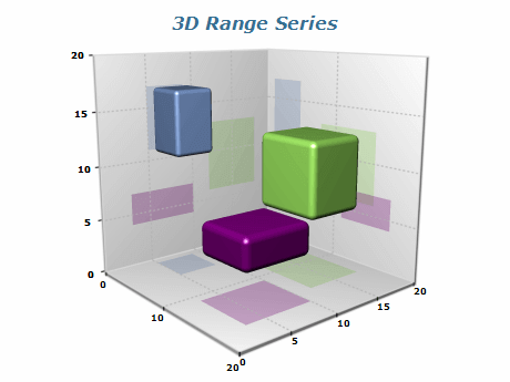
| Data Point | Begin X | End X | Begin Y | End Y |
|---|---|---|---|---|
| Data point 4 | 20 | 22 | 2 | 8 |
| Data point 5 | 20 | 22 | 2 | 8 |
| Data point 6 | 20 | 22 | 2 | 8 |
Use Appropriate Data
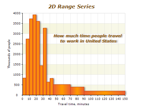
The Range series is best suited for displaying data defined by two ranges, such as histograms or custom-sized bars. Ensure your data fits these criteria.
Choose the Appropriate Chart Type
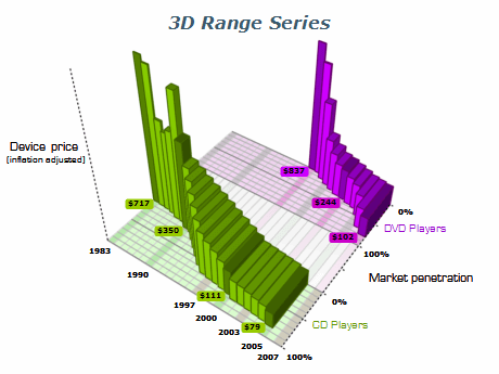
Nevron Chart component offers a variety of chart types, including 2D and 3D Range charts. Choose the appropriate chart type for your data to ensure it is displayed most effectively.
Customize the Appearance
Use the range chart's appearance properties to customize the color, border, and shape of your ranges. This can help your data stand out and make it easier to read.
Use Axis Labels and Titles
Use axis labels and titles to provide context and make it easier for your audience to understand your data. Ensure that the labels are clearly visible and legible.