ProductsAll Products
.NET Components
 Open Vision for .NET
 NOV Chart for .NET
 NOV Diagram for .NET
 NOV Rich Text Editor for .NET
 NOV Grid for .NET
 NOV Schedule for .NET
 NOV Gauge for .NET
 NOV Barcode for .NET
 NOV User Interface for .NET
 Vision for .NET
 Chart for .NET
 Diagram for .NET
 User Interface for .NET
 Vision for SSRS
 Chart for SSRS
 Gauge for SSRS
 Map for SSRS
 Barcode for SSRS
 Vision for SharePoint
 Chart for SharePoint
 Gauge for SharePoint
 Map for SharePoint
 Barcode for SharePoint
DownloadsAll Downloads
| ||||||||
|
| Sample | Sand(%) | Silt(%) | Clay(%) |
|---|---|---|---|
| A | 70 | 20 | 10 |
| B | 40 | 40 | 20 |
| C | 10 | 60 | 30 |
| ... | ... | ... | ... |
Appropriate Data
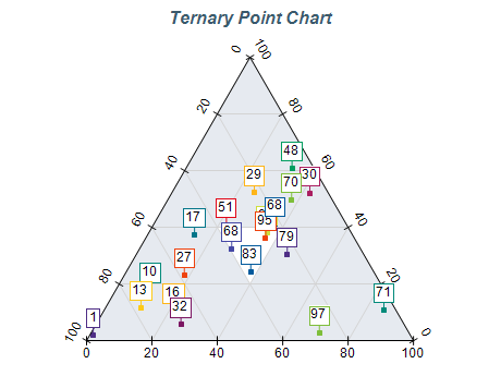
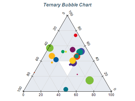
Ternary charts are only suitable when the data involves three components that sum to a constant value (e.g., percentages adding up to 100%). If the data does not match these requirements then you should use a different charting type.
Maintain Aspect
Ensure the ternary plot maintains an equilateral triangle shape so that distances and angles represent proportions accurately.
Use Color Wisely
Color can be a powerful tool for highlighting trends or patterns within the data, but it can also be overwhelming if misused. Use color sparingly and ensure that each color has a clear meaning.
Provide Context
Always provide context for your chart by including a title, axis labels, and a legend. This will help users understand what they are looking at and interpret the data correctly.