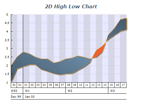
Choose the Appropriate Data
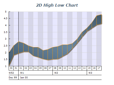
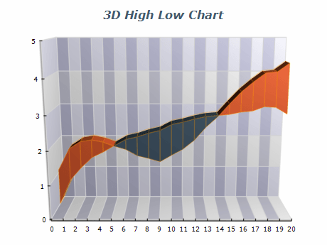
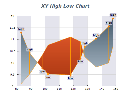
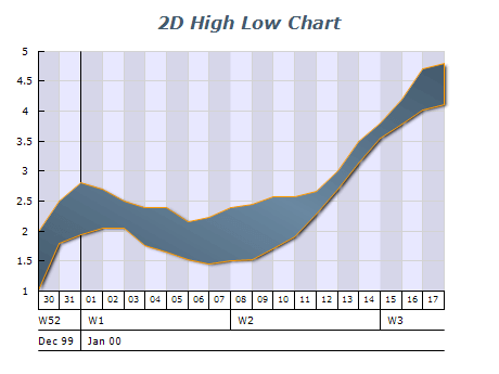
High-Low charts are most effective when used with data that consists of two variables (high and low), such as stock prices or weather conditions. Ensure that the data you are using is suitable for this chart type or it is best to use another one like Area.
Use Clear Labeling
Make sure to label each axis clearly and concisely to help users understand the displayed data. This includes marking the x-axis (usually time) and the y-axis (usually values).
Use Color Coding or Shading
Consider using color coding to differentiate between different data sets or to highlight specific trends or changes over time.

 Open Vision for .NET
 NOV Chart for .NET
 NOV Diagram for .NET
 NOV Rich Text Editor for .NET
 NOV Grid for .NET
 NOV Schedule for .NET
 NOV Gauge for .NET
 NOV Barcode for .NET
 NOV User Interface for .NET
 Vision for .NET
 Chart for .NET
 Diagram for .NET
 User Interface for .NET
 Vision for SSRS
 Chart for SSRS
 Gauge for SSRS
 Map for SSRS
 Barcode for SSRS
 Vision for SharePoint
 Chart for SharePoint
 Gauge for SharePoint
 Map for SharePoint
 Barcode for SharePoint