ProductsAll Products
.NET Components
 Open Vision for .NET
 NOV Chart for .NET
 NOV Diagram for .NET
 NOV Rich Text Editor for .NET
 NOV Grid for .NET
 NOV Schedule for .NET
 NOV Gauge for .NET
 NOV Barcode for .NET
 NOV User Interface for .NET
 Vision for .NET
 Chart for .NET
 Diagram for .NET
 User Interface for .NET
 Vision for SSRS
 Chart for SSRS
 Gauge for SSRS
 Map for SSRS
 Barcode for SSRS
 Vision for SharePoint
 Chart for SharePoint
 Gauge for SharePoint
 Map for SharePoint
 Barcode for SharePoint
DownloadsAll Downloads
| ||||||||||||||||||||
|
Choose the Right Type of Chart
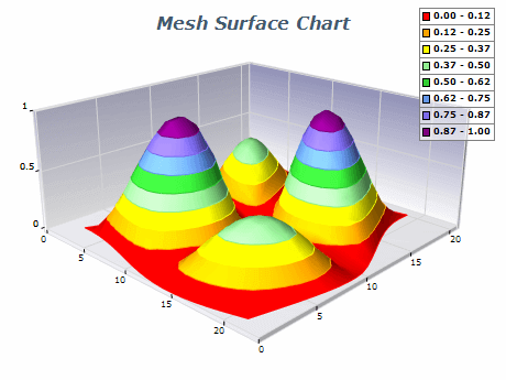
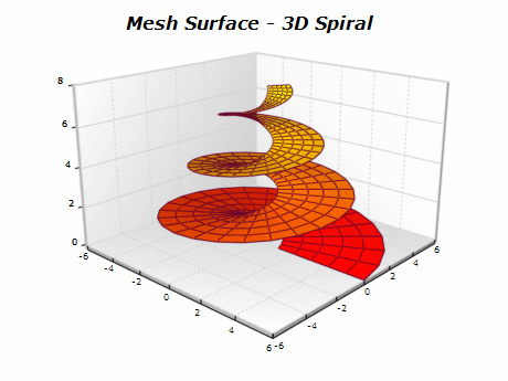
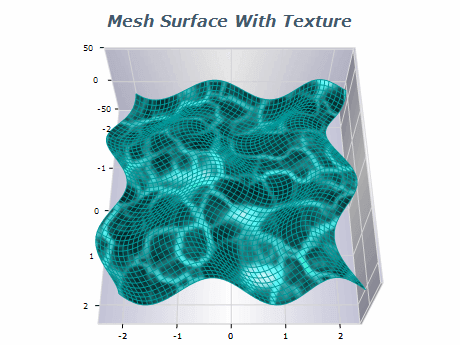
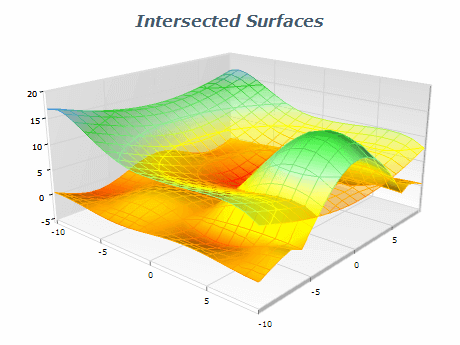
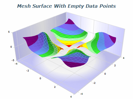
Mesh Surface charts are best used when displaying irregularly spaced 3D data that is ordered in a grid. In some cases it may be more appropriate to use a Grid Surface (when all data points have common X/Z coordinates), or Triangulated Surface (when the data points are not ordered in a grid).
Simplify the Data
Mesh Surface charts can contain millions of data points, and rendering such a large number of data points, especially interactively is very computationally expensive. You can use various methods to simplify the rendered data set like binning or clustering, which are built into the chart.
Label Axes Clearly
Label the x, y, and z axes to ensure the chart is easily interpretable. Include units of measurement if necessary.
Use Lighting and Shading Appropriately
Lighting and shading can enhance the 3D effect of Mesh Surface charts. Experiment with different lighting and shading options to find the best way to represent your data.
Context
Provide context for the data by including a title, captions, and annotations. Explain the purpose of the chart, the meaning of the data, and any relevant background information.
Choose the Right Type of Chart
Mesh Surface charts are best used when displaying irregularly spaced 3D data that is ordered in a grid. In some cases it may be more appropriate to use a Grid Surface (when all data points have common X/Z coordinates), or Triangulated Surface (when the data points are not ordered in a grid).
Simplify the Data
Mesh Surface charts can contain millions of data points, and rendering such a large number of data points, especially interactively is very computationally expensive. You can use various methods to simplify the rendered data set like binning or clustering, which are built into the chart.
Label Axes Clearly
Label the x, y, and z axes to ensure the chart is easily interpretable. Include units of measurement if necessary.
Use Lighting and Shading Appropriately
Lighting and shading can enhance the 3D effect of Mesh Surface charts. Experiment with different lighting and shading options to find the best way to represent your data.
Context
Provide context for the data by including a title, captions, and annotations. Explain the purpose of the chart, the meaning of the data, and any relevant background information.